Nature Photographers Network
This is the preserved archive of the original Nature Photographers Network. The community continues at naturephotographers.network.
Puddles
‹ PreviousLandscape GalleryNext ›

Puddles

by Lucy VanSwearingen

Gallery: LandscapePosted October 20, 201179 views6 comments
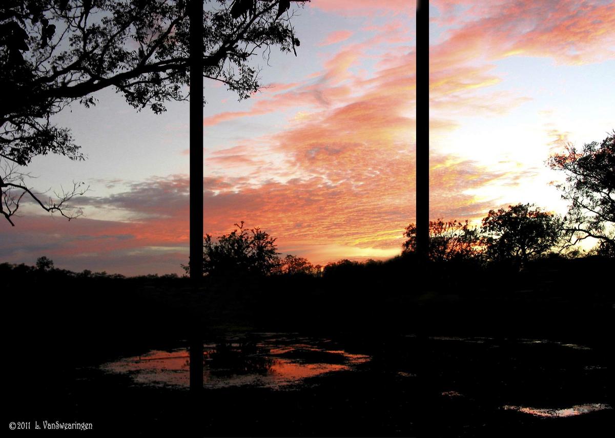
The sunsets are always gorgeous on my place. Here is a triptych of one just after a good rain. The original has a fence and path running behind the main tree. Lon suggested, that I clone it out. So, I did, and here is the "Man-free" landscape version.

this, of course, was taken last year. we still have had only about 2 inches of rain in an entire year. I think the one in Man and Nature is better, because of the path and fence. this separates the subject tree from the background treeline. I don't like the tree being part of the background. Any suggestion? Please compare the two photos, and tell me which looks best to you.

Comments

6 comments
Comment posted by Stan Rose on October 21, 2011 at 1:49 AM
I agree with your assessment--i think the railing helps break things up and add some interest to the dark fg. I'm not sure i get the point of the triptych (other than make it look like its shot through a window...) but its a purty sunset! :smile:
Registered on September 15, 2005, 836 Posts, 17099 Comments
Comment posted by Lon Overacker on October 21, 2011 at 2:39 AM
Lucy,

I like this version - and thank you btw for taking the time to work on my suggestion. I completely understand your thought that your original is a stronger image because of the path/fence - and I may agree. Understand that my comments and suggestion were about the "man-free" aspect as it related to the Landscape gallery as we try and maintain some sort of consistency. In the end though, I think the triptych application really gives this a "living room window" presentation and I think it's very effective and a plus for the image you've captured.

Lon
Registered on November 24, 2006, 521 Posts, 19147 Comments
Comment posted by John Williams on October 21, 2011 at 9:21 AM
Stan took all my wonderful insights and left me with nothing to add.
Registered on September 6, 2007, 221 Posts, 5985 Comments
Comment posted by Marc Adamus on October 21, 2011 at 11:31 AM
I find the triptych to be a bit distracting and don't really see the point personally. The image is solid enough, save for controlling those highlights off to the right side. Ideally you'd double-process and blend this, blend exposures from two different images or use a grad filter to balance the light and control the highlights.
Registered on September 17, 2005, 780 Posts, 8091 Comments
Comment posted by Lucy VanSwearingen on October 21, 2011 at 11:47 AM
Thanks everybody. Lon, I understand perfectly about the "man free" aspect. I liked this sunset so much, that I was happy to be able to put it in Landscape. I know some of you like the triptych and some don't. I just thought it would make it more interesting (confusing) to wonder, if it were taken through a window or not. I also wanted to see if the three photos out of one could be framed separately and placed side by side to keep the viewer's interest in a commercial setting with more wall space.

Please keep the comments coming. I'd really like to get this one right. Thanks so much!. :wavey:
Registered on May 23, 2009, 800 Posts, 2042 Comments
Comment posted by Harry Lichtman on October 21, 2011 at 2:26 PM
Lucy - A great sky, but too much black area for me. The most effective use of negative space for me is when the viewer can figure out what is hidden in the darkness without seeing it, based upon the edge of silhouette or within the context of the pictuer. I can tell there are 2 pools of water reflecting the sky and some trees, but much of the darkeness is just dark. Since you have this view daily, you might consider multiple exposures to open up the shadows as already mentioned, or maybe a different comp. as the lighting looks great from this vantage point.
Registered on September 17, 2010, 304 Posts, 3507 Comments