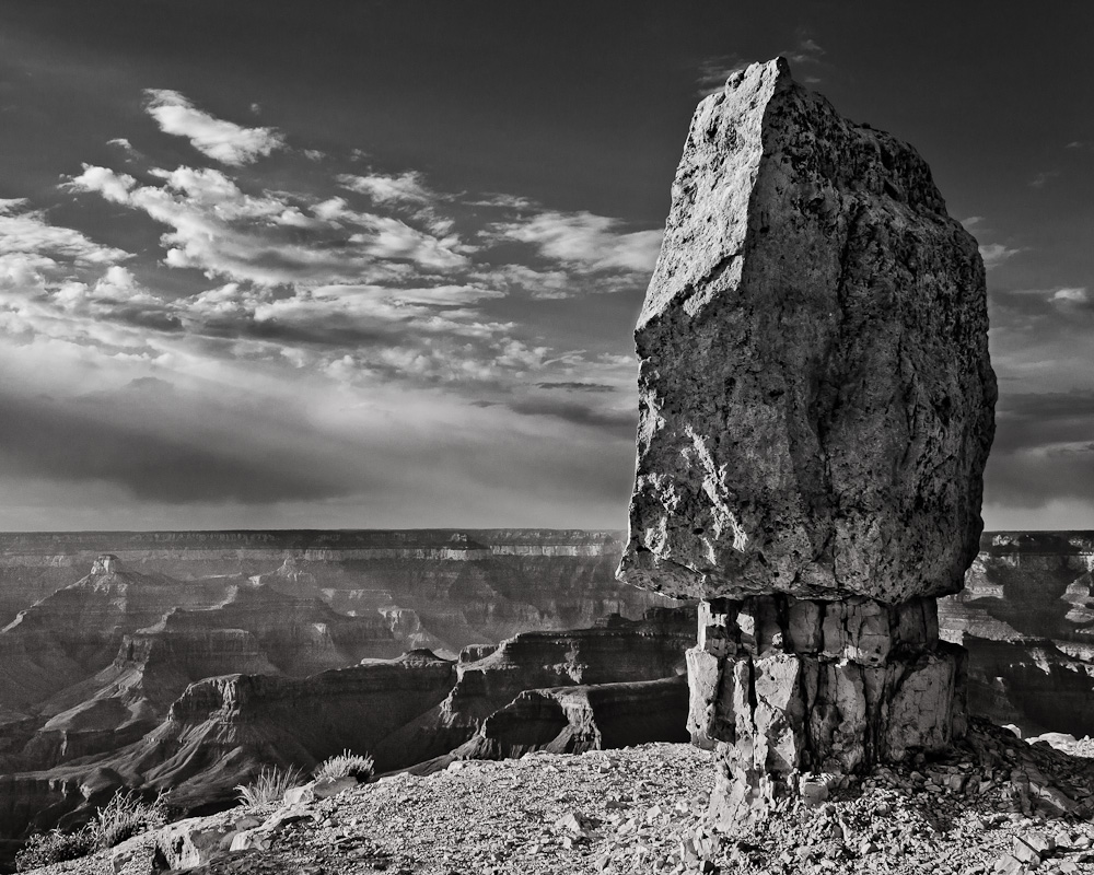
Processing this image to meet my ultimate vision has haunted me for over a year, but I think I have finally succeeded!
The capture itself was taken at Grand Canyon's Shoshone Point, an uncrowded but still very accessible gem of a spot on the south rim. I was here mid-afternoon, a time when the light is making its way toward the "prime" of the golden hour. As such, the colors in the RAW are not very spectacular, but the angle of the light, the dust in the canyon and overall atmosphere had the makings for a great black and white photo. Over the last year I've tried to process the image a couple of times, each time getting the midground right where I wanted it, the foreground reasonable, but struggling to bring the sky together as dramatic as I wanted without it looking fake and messy. This time I double-processed the raw file in Lightroom, once for the earth, and once for the sky, doing the black and white conversions with the RAW conversions. In CS5 I used Tony's luminosity masks to process the "earth file" and then blended it with the "sky file", the hard part being the horizon on the left side of the photo. This area of the photo, and how it relates to the rest of the photo is what I had most struggled with previously, and hopefully this time around I nailed it. After the blend, I did no other CS5 adjustments (including the sky), but did tweak the entire image a little back in Lightroom (mainly boosting contrast, clarity) and then added the toning using Color Efex Pro. It has a subtle cool to warm gradient that I think adds a unique touch.
As I said early, processing this image has haunted me for a long time. I would love to hear some opinions on how well this image works for everyone. If it does, great, if it doesn't, then back to the drawing board!

Canon T1i @ 23mm
ISO100
f/9
1/80 sec

Comments
5 commentsAnyway, your treatment of the light in the canyon and sky really make me want to see more of it. I think you've done a great job achieving your vision. It's only that my vision would have been different, which I guess goes without saying.
I like the composition and processing. You might consider burning down the foreground - the brightness there is eye catching.
Michael
Sky, rock and canyon is very pleasant. I agree with the foreground being
too bright. Otherwise an excellent photo.