Nature Photographers Network
This is the preserved archive of the original Nature Photographers Network. The community continues at naturephotographers.network.
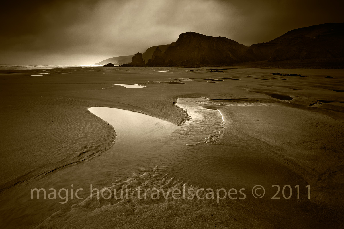
Moody Bude
‹ PreviousLandscape GalleryNext ›

Moody Bude

by Kah Kit Yoong

Gallery: LandscapePosted October 11, 2011260 views14 comments
Cornwall, England

It's been about half a year since my last landscape shoot and the conditions haven't been too kind since my arrival in Cornwall last week. I wanted to capture the mood of stark bleak weather on an empty rugged beach however.

Canon 5DMkII, 16-35mm, GND filter.

Comments

14 comments
Comment posted by Matt Anderson on October 11, 2011 at 9:34 AM
Nice moody light, and I like the tonal conversion.
Given the dark selective areas you've chosen, I might take a step further, and darken the lower left area to focus the bright pools even more....
:toast:
Registered on September 6, 2007, 346 Posts, 2696 Comments
Comment posted by Mark Seaver on October 11, 2011 at 10:11 AM
I like the flow from front to back and right to left and the b&w creates a bleak weather feeling. I'm viewing on a laptop (albeit calibrated) and the right 1/3 looks very dark. I'd like to see a bit of detail in those ridges.
Registered on January 23, 2011, 1103 Posts, 17270 Comments
Comment posted by Ian Cameron on October 11, 2011 at 11:17 AM
Very different from your previous work and subtley beautiful. The sepia tones are a little strong for my personal liking but the soft tonality and smooth rendering of the dynamic range in this image are mysteriously appealing. In other words it works a treat. I'm intrigued, why such a long gap between picture taking.
Registered on August 6, 2004, 1125 Posts, 3318 Comments
Comment posted by Hamed Musharbak on October 11, 2011 at 1:11 PM
very strange mood but beautiful

the tone you have used is very nice

Hamed
Registered on June 1, 2009, 372 Posts, 2282 Comments
Comment posted by Nick Bristol on October 11, 2011 at 2:53 PM
Fantastic mood and light. I like this very much.

Nick Bristol
Lone Rock, WI
Registered on February 1, 2004, 752 Posts, 14140 Comments
Comment posted by Kah Kit Yoong on October 11, 2011 at 6:08 PM
Mark, there's a bit more detail in the dark area on the right in the large version. However, I think the main solution as suggested by Matt would be to darken the left bottom for balance. Thanks.
Registered on September 27, 2006, 636 Posts, 10682 Comments
Comment posted by Mark Metternich on October 12, 2011 at 3:38 AM
As always Kah Kat your images are beautiful! Great shot. :toast:
Registered on June 19, 2009, 276 Posts, 6240 Comments
Comment posted by Hillary Younger on October 12, 2011 at 7:47 AM
I like the moodiness of the scape and processing, and the larger version certainly reveals more detail....I agree with the suggestion to darken the lower left corner.
Registered on October 2, 2011, 17 Posts, 167 Comments
Comment posted by Joseph Campisi on October 12, 2011 at 2:10 PM
I like the bleak and lonely feeling this image evokes Kah Kit. The sepia toning works here as well.
Registered on November 24, 2008, 304 Posts, 3211 Comments
Comment posted by Anthony Vincent on October 12, 2011 at 5:21 PM
Really enhance that feel of a desolate coast. The coffee toning further sells the mood. I too agree on either darkening the llhc.
Great job Kah Kit.
Registered on February 5, 2009, 199 Posts, 2775 Comments
Comment posted by Stan Rose on October 12, 2011 at 5:44 PM
Personally, Id go brighter, less vignette--but hey, you the artist, KK! It's a beautiful subject, love what i can see of it! Hope you have time to show us more 'scapes :wavey:
Registered on September 15, 2005, 836 Posts, 17099 Comments
Comment posted by Danny Laureys on October 12, 2011 at 10:54 PM
Excellent!!!! :toast: :toast: :toast:
Registered on January 5, 2008, 590 Posts, 1261 Comments
Comment posted by David Edwards on October 13, 2011 at 4:11 AM
Love how the toning really sets the mood of the image. The light looks pretty good to me. The highlighted distant waves are great, and the bright sky behind the almost silhouetted coastline is very dramatic. I like Matt's idea of darkening the fg sand further to accentuate the pools.
Registered on December 6, 2008, 142 Posts, 2623 Comments
Comment posted by Eva McDermott on October 14, 2011 at 2:37 PM
The feeling of stark and bleak certainly come through Kah Kit. Gorgeous light!
Registered on January 4, 2009, 1015 Posts, 13229 Comments