Nature Photographers Network
This is the preserved archive of the original Nature Photographers Network. The community continues at naturephotographers.network.
Remembering Sabrina II
‹ PreviousLandscape GalleryNext ›

Remembering Sabrina II

by Chris Chamberlain

Gallery: LandscapePosted September 17, 2011397 views21 comments
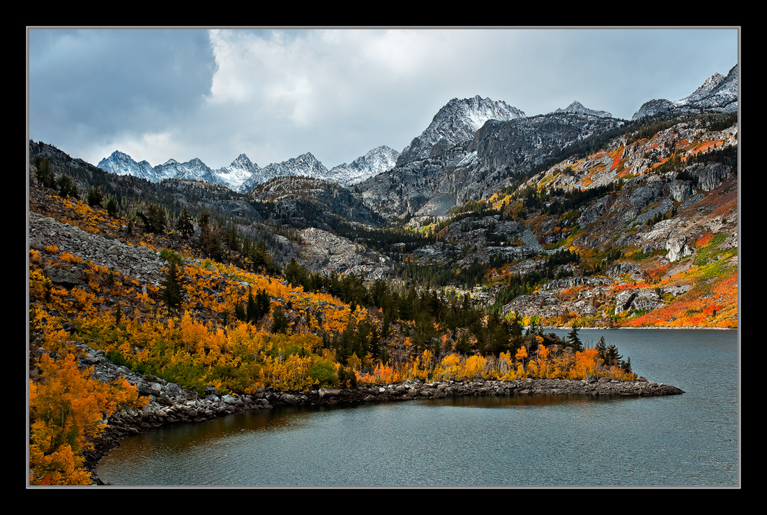
A revision of my image from lake Sabrina last fall. This is a different crop, and fresh processing. What I tried to do was, brighten it up a little, and make the ridgeline stand out a little more. Also the crop was intended to reduce the size of the empty space in the lower right corner. I didn't really want to sacrifice all the nice red/orange color at the bottom of the frame, but the tighter frame brings the high peaks into the comp more. What do you think, better overall, or no? The original is on the first page in my gallery, thanks. Larger version included, I'd love to hear your thoughts. I see the smaller version is a bit over sharpened, the larger version is better, I think. Shouldn't be a problem with the prints though. Thanks.

Chris

Comments

21 comments
Comment posted by Hamed Musharbak on September 17, 2011 at 4:03 PM
nice view from there Chris & very natural but i think the sharpness a bit over IMO :confused:

Hamed
Registered on June 1, 2009, 372 Posts, 2282 Comments
Comment posted by Joseph Balcken on September 17, 2011 at 4:06 PM
Chris, I think the processing looks a bit better in this version, but I prefer the comp of the first version. This version is still a killer in it's own right.
:toast:
Registered on November 29, 2009, 48 Posts, 249 Comments
Comment posted by SandyRichardsBrown on September 17, 2011 at 4:25 PM
Nice comp , scene, and colours, but the high degree of sharpening evident may be more than you intended, even in the larger version. :smile:
Sandy
Registered on November 24, 2003, 3937 Posts, 12909 Comments
Comment posted by Robert Dayton on September 17, 2011 at 4:37 PM
Lovely, Chris! Thanks for sharing the larger version. I have no suggestions for changes.
Registered on November 11, 2008, 281 Posts, 3958 Comments
Comment posted by Morris McClung on September 17, 2011 at 4:46 PM
Hey, they both work! Sell them to different buyers! :biggrin:
Registered on May 7, 2007, 670 Posts, 19650 Comments
Comment posted by Aaron Feinberg on September 17, 2011 at 5:04 PM
LOVE the comp here...great color on trees...the light isnt doing it for me at all. This shot is one I'd revisit til getting the masterpiece. Nice find

aF
Registered on October 26, 2009, 399 Posts, 2789 Comments
Comment posted by Paul Duval on September 17, 2011 at 5:50 PM
This is very nice, but does have a HDR feel to it. It might be compression, the larger image has less. I love this place and I have an emotional connection to this place and those days. The first has a slightly better composition, and flow even with the negative space in the RHLC. The first was a little dark. Maybe a reprocessing of the first? I think you were successful in the brightening and lightening. That's why I think you may want to try that on the first.

Paul
Registered on June 30, 2009, 508 Posts, 1907 Comments
Comment posted by Bruce King on September 17, 2011 at 5:54 PM
Nice Chris, I like the seriously warm tones. The smaller version does seem a bit over sharpened but the big brother is just right. :toast:
Registered on January 14, 2010, 276 Posts, 2212 Comments
Comment posted by Chris Chamberlain on September 17, 2011 at 6:22 PM
Aaron,

Thanks, you are right. The light is the weak link here. We were waiting for a long time before we could even see the peaks in the background. The scene was so nice, I was happy to get a shot with them visible. I will give it another chance this fall, I hope. After the spectacular morning we witnessed at North Lake the day before, the powers that be decided we must have had enough.

Chris
Registered on March 13, 2007, 500 Posts, 8365 Comments
Comment posted by Nick Bristol on September 17, 2011 at 6:45 PM
Yes, I could see this in different light Chris and I'm sure you will work that, but what a beautiful scene as it is here. The large version is much nicer to look at and really worth the click. Quite a view! Great comp and wonderful color.

Nick Bristol
Lone Rock, WI
Registered on February 1, 2004, 752 Posts, 14140 Comments
Comment posted by Russell Colletta on September 17, 2011 at 8:17 PM
Nicely balanced composition Chris. The larger version looks appropriately sharpened and the color is rich and vibrant. There is a lot of texture in those mountainsides.
Registered on October 31, 2009, 114 Posts, 1008 Comments
Comment posted by Mark Metternich on September 17, 2011 at 9:25 PM
Excellent shot Chris! Wish I could have been there to see it in person.

This smaller version is a bit crispy...
Registered on June 19, 2009, 276 Posts, 6240 Comments
Comment posted by Tony Kuyper on September 18, 2011 at 12:12 AM
This looks great, Chris. Comp, colors, and textures are outstanding.
Registered on November 1, 2003, 364 Posts, 22328 Comments
Comment posted by Gary Minish on September 18, 2011 at 3:36 AM
The combination of fresh snow and fall colors is one of my favorite things and this is an excellent example of it. A gorgeous scene and a very good exposure, Chris. The small version is way over sharpened but the larger one is just about right. The larger one has much more presence so thank you for including it.

Registered on February 4, 2006, 625 Posts, 3583 Comments
Comment posted by Peter Richter on September 18, 2011 at 7:10 AM
Chris, I enjoy your image with the balanced composition and variations of grey, green and the warm autumn tones. The curved lines add a kind of nice dynamic to the otherwise static scene in my opinion.

Peter
Registered on November 10, 2010, 218 Posts, 2723 Comments
Comment posted by Nancy Lea Sandy on September 18, 2011 at 11:18 AM
This crop really brings the peaks into play more but I'm not sure it makes enough of a difference to sacrifice that lovely rich color from the original crop. I do agree this version is much lighter. The color in both is spectacular. I would have a hard time choosing between them. Both are lovely
Registered on January 24, 2011, 576 Posts, 6942 Comments
Comment posted by Dietrich Gloger on September 18, 2011 at 12:36 PM
This is a very strong photograph Chris. It works on many levels. The composition is very simple and direct. There is some really interesting light going on. The dappled light on the ridge and the dramatic sky add a lot. And of course there are the fall colors which contrast nicely with the blues in the sky. Really good stuff man!
Registered on January 26, 2007, 360 Posts, 9876 Comments
Comment posted by Scott Smorra on September 18, 2011 at 12:39 PM
Beautiful image Chris. I really like all of the different fall colors you captured here. The comp definitely works for me.
Registered on November 2, 2009, 161 Posts, 2143 Comments
Comment posted by Lon Overacker on September 18, 2011 at 12:50 PM
Chris,

Wonderful autumn view of Sabrina and the Eastern Sierra. I think the processing is excellent, including color, contrast and saturation. I like what you did lightening some areas. However, sharpening is quite crispy as others have noted; the larger version not as much. I like the crop too.

Would be great to see some color like this again - not sure if I'll make it thought.

Lon
Registered on November 24, 2006, 521 Posts, 19147 Comments
Comment posted by Anil Rao on September 19, 2011 at 3:56 AM
What a gorgeous scene. I love your composition and the light is showing off the colors really well.
Registered on November 15, 2003, 234 Posts, 4923 Comments
Comment posted by Cliff Dodge on September 19, 2011 at 9:36 PM
Lets build a cabin at the point and never leave. :smile:
Registered on March 25, 2006, 125 Posts, 507 Comments