Nature Photographers Network
This is the preserved archive of the original Nature Photographers Network. The community continues at naturephotographers.network.
II
‹ PreviousLandscape GalleryNext ›

II

by Pavel Cakl

Gallery: LandscapePosted September 3, 2011126 views7 comments
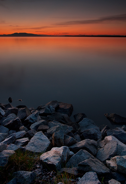
I would be very interested in your comments on this one. Took it back in 2007 so do not remember much details only that it was a really nice evening and sunset.

Blend of the 2 shots. FG f20/8s. BG f20/6s. Polarizer.
Nikkor 18-70 @ 18mm, Nikon D200

Anchorage, Alaska

Comments

7 comments
Comment posted by Raymond Klassen on September 3, 2011 at 4:21 PM
A nice simple scene, but with some nice color. I think the rocks might be a tad too bright for the conditions, but this looks good.
Registered on November 30, 2008, 114 Posts, 790 Comments
Comment posted by Pavel Cakl on September 3, 2011 at 4:44 PM
Slightly darker FG. I would even go for a darker version but I was worried that it might be too dark.
Registered on April 8, 2010, 7 Posts, 178 Comments
Comment posted by Yiming Hu on September 3, 2011 at 10:18 PM
Like the simplicity. To me the problem is the very obvious transition between dark and bright foreground. Maybe you can try to refine the blending a little bit.
Registered on April 28, 2011, 38 Posts, 733 Comments
Comment posted by Catherine Reilly on September 4, 2011 at 1:22 AM
I could gaze at this a l-o-o-o-o-n-g time. Thank you!
Registered on August 16, 2006, 603 Posts, 9192 Comments
Comment posted by Tony Kuyper on September 4, 2011 at 2:12 PM
The comp is nice and so are the colors. I feels a bit underexposed to me, but sometimes that can create drama. Wonder if it's my monitory as none of the other comments mention this :confused:
Registered on November 1, 2003, 364 Posts, 22328 Comments
Comment posted by Pavel Cakl on September 5, 2011 at 5:51 PM
Yep it is underexposed that is why I was wondering why everyone is saying it is too bright. Anyway the blending did not happen on the half-way around the rocks they were just much brighter but know what you mean. Many thanks for all comments.
Registered on April 8, 2010, 7 Posts, 178 Comments
Comment posted by Phil Pogledich on September 6, 2011 at 2:38 PM
This works pretty well for me. I like the placement of the distant line of hills in the frame and the exposure feels fine to me . . . perhaps just very slightly on the dark side. If it were mine I'd crop it from the bottom to a 4x5 format, as I feel the rocks take up a bit too much of the frame overall. Nice minimalistic shot all around.
Registered on August 24, 2009, 123 Posts, 3099 Comments