Nature Photographers Network
This is the preserved archive of the original Nature Photographers Network. The community continues at naturephotographers.network.
Fiery Gloriosa
‹ PreviousFlora GalleryNext ›

Fiery Gloriosa

by Gary Yeoh

Gallery: FloraPosted August 25, 2011147 views20 comments
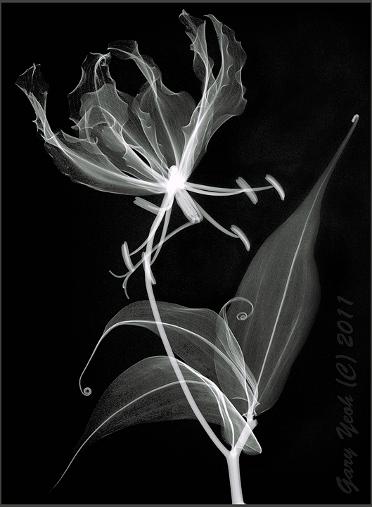
The exposure of this one is tricky. The leaves are very thin and easily overexposed but the center of the gloriosa is fairly radio-opaque and underexposed. I have burn this area but did not want to over-do it to avoid the posteriorized effect and hence the center of the flower is very bright. Anyway I kind of like the bright area radiating into the petals which look like white fire.

Positive image included for comparison. Do you have any preference?

GE mammogram machine 28kV 24 mAmp. CS5.

Comments

20 comments
Comment posted by Gary Yeoh on August 25, 2011 at 7:57 PM
Positive version
Registered on September 1, 2009, 588 Posts, 8184 Comments
Comment posted by Lorna Taylor on August 25, 2011 at 8:01 PM
O.K . Gary now you are starting to get on my nerves with these X ray images, this is just stunning. I am speechless as to how beautiful this image is! Truly great work!The first one does it for me ! :wavey:
Registered on November 12, 2010, 254 Posts, 3083 Comments
Comment posted by Philip Hodgkins on August 25, 2011 at 8:55 PM
I like both of these, but I think the negative is more powerful. Nice machine to play with...
Registered on July 24, 2006, 2741 Posts, 12349 Comments
Comment posted by Charlie Baugh on August 25, 2011 at 9:22 PM
You wouldn't need to post your name with these images. I knew in an instant "Gary". I have no understanding of this method of creating an image, but it is very, very beautiful and terrifically interesting. I like your Ikibana. I love you radiology images. Negative is my preference.
Registered on April 18, 2011, 329 Posts, 1985 Comments
Comment posted by Pat Sampson on August 25, 2011 at 9:22 PM
Gary,

I think I prefer the positive but it's really close. I like both of them.

Compositionally, i feel like there are two subjects (the top and bottom) in the image. For me the lower subject is more elegant. I particularly like those rolled tips. In the top there seems to be a sort of tangle with the stem and the anthers. That weakens the image for me a bit.

I'm still very impressed with the images and what I would really like to see, if you're taking requests, having seen this, is an X-Ray treatment of a fern.

These are really neat.

pat
Registered on May 19, 2007, 953 Posts, 15989 Comments
Comment posted by scott lanz on August 25, 2011 at 9:41 PM
Gary, I think Pat hit the nail on the head when he said this looks like images of two different flowers sort of tangled together. Both versions are striking, but my eye goes back and forth between the upper bloom and the lower. I really like the curled petals in the lower flower, and I slightly prefer the positive version.
Registered on November 14, 2003, 840 Posts, 12902 Comments
Comment posted by Craig Myers on August 25, 2011 at 10:25 PM
Gary,

Both are fascinating. I sort of lean toward the positive because of its apparent sharpness throughout. They would make a terrific diptych. Great stuff.
Registered on September 1, 2008, 85 Posts, 757 Comments
Comment posted by Ramamohan Pai on August 25, 2011 at 10:44 PM
Gloriosa Superba :cool: - another stunning capture. Truly confused between the two - may be one of each might say it all :toast:. Great work, Gary.
Registered on November 1, 2003, 550 Posts, 9037 Comments
Comment posted by Barbara Graham on August 26, 2011 at 1:04 AM
Both are absolutely stunning. I don't know if I've ever seen a B&W image I like as much as the positive version here.
Registered on July 27, 2010, 1310 Posts, 5035 Comments
Comment posted by David W. Kelly on August 26, 2011 at 1:08 AM
Beautiful work Gary. It is a hard call to say which one I like best but I think my vote goes to the first but that could change. :toast:
Registered on October 7, 2005, 883 Posts, 6590 Comments
Comment posted by Gary Yeoh on August 26, 2011 at 3:38 AM
Thanks everyone for your comments. I also find it difficult to decide which one I like better.

Pat & Scott:
I see what you are saying about the composition. Initially I was going to only image the flower but I also like the curled tips in the leaves so I ended up including them. They do indeed looked like two compositions but I am hoping the stem provides a bridge between them. The top part with its disorganized lines going everywhere like a flame is contrasted by elegant flow of lines ending the those curls in the lower portion.

I have in mind to do a few compositions with just leaves only and ferns would certainly be good candidates.
Registered on September 1, 2009, 588 Posts, 8184 Comments
Comment posted by Bob Duff on August 26, 2011 at 7:31 AM
Like Pat said there are two comps in the image. I think I prefer the positive version better as the stem unifys the two together better for my tastes.
Registered on April 21, 2010, 160 Posts, 1675 Comments
Comment posted by Nathan Buck on August 26, 2011 at 11:37 AM
They both work for me in different ways Gary. I don't know that I can explain it, but I like both of them a lot - especially the firey look to the petals.

Nathan
Registered on November 1, 2003, 1101 Posts, 13589 Comments
Comment posted by Mauro Pasquero on August 27, 2011 at 3:02 AM
Gary, great work ! Both images are awesome ! I'm really cofused between the two, perhaps the positve is more realistic, but the negative is more impressing ! Anyway every detail of these images is absolutely stunning :toast: :toast:
Mauro
Registered on January 21, 2010, 650 Posts, 2500 Comments
Comment posted by Craig Strand on August 27, 2011 at 9:05 AM
Well done Gary, I really like this and prefer with the darker BG. The delicate features are beautifully recorded and well presented.
Registered on March 30, 2008, 416 Posts, 2885 Comments
Comment posted by Rob Graham on August 27, 2011 at 11:16 AM
Well done, Gary. You are really getting the hang of this form of imaging :toast: . I can see where this could look appear as 2 subjects, but the stem does connect them. I vote for the first image. The positive image is still impressive, but I still prefer a traditional b/w look for radiographs :).
Registered on August 22, 2006, 842 Posts, 2824 Comments
Comment posted by Bill Fach on August 28, 2011 at 10:21 AM
Gary: Really cool presentations. I have a small preference for the positive image but both work great for me. Creative work. >=))>
Registered on November 1, 2003, 1805 Posts, 26981 Comments
Comment posted by Morris McClung on August 29, 2011 at 12:24 PM
Great contrast to make this one POP! The lighter version is more delicate to me and the darker one more dramatic. :toast:
Registered on May 7, 2007, 670 Posts, 19650 Comments
Comment posted by Anne K. Rusk on August 29, 2011 at 4:51 PM
Negative all the way for me. I like the white extending into the image and I notice the "flames" much more. For the bottom I do like the positive because it shows off the curls more, but as a complete image, I like the negative!
Registered on October 10, 2010, 65 Posts, 904 Comments
Comment posted by Lucy Aron on September 11, 2011 at 5:01 PM
Both are striking but my eye keeps going to the positive image. It's more subtle but.... Just a tad put off by that very bright center in the negative. Gorgeous work.


lucy
Registered on February 25, 2011, 189 Posts, 1160 Comments