Gallery: FloraPosted August 8, 201160 views13 comments
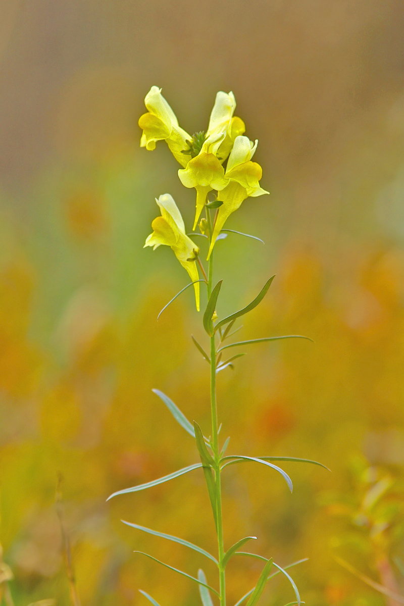
One of the reasons I'm enjoying photographing wildflowers is that they have such interesting names!
D200 300mm; f6.7@ 1/250th; ISO 200; HH; Full frame.
All comments and suggestions most welcome!
Comments
13 comments
Comment posted by Carolyn Derstine on August 8, 2011 at 10:12 PM
This is beautiful, Tom! That BG is so nicely colored and blurred; it works so well with the flower. IMHO I think a crop up from the bottom to just above where the 2 leaves are directly across from each other and below the right orange dot would work great. However, it is wonderful also as is. Nice job!
Registered on February 16, 2011, 610 Posts, 3684 Comments
Comment posted by Verdon on August 8, 2011 at 10:51 PM
Sweet shot, maybe for my taste to bright I would like to see little more creativity with composition.... Thank you for sharing!
Registered on June 10, 2011, 147 Posts, 1444 Comments
Comment posted by Barbara Graham on August 9, 2011 at 1:04 AM
Tom, I like the composition for this particular flower, and I love the colors. I would probably make the background a bit darker so the flower stands out more.
Registered on July 27, 2010, 1310 Posts, 5035 Comments
Comment posted by Tom Lusk on August 9, 2011 at 9:42 AM
Thanks for the input! The original shot was a lot darker, and I felt it looked a bit "gloomy". I've posted it here with the suggested crop.
I usually stick to birds and other wildlife, so have no idea on floral composition. Should I be looking at placing the blooms more off-center or use the rule of thirds, etc?
Lots to learn...
Registered on September 17, 2005, 312 Posts, 600 Comments
Comment posted by Barbara Graham on August 9, 2011 at 10:05 AM
Tom, the repost is great! In flora sometimes things are centered, and I think this one is fine centered, but I'll let Pat and/or Bill address that question more fully, because I don't want to say the wrong thing. ;)
Registered on July 27, 2010, 1310 Posts, 5035 Comments
Comment posted by Mark Seaver on August 9, 2011 at 12:14 PM
Tom, the repost is a big improvement in focusing on the flower. When you've got nothing else in the frame and the flower is well balanced right/left I suspect that moving it off center would be a distraction, of course the final answer is try it and see what YOU like.
Registered on January 23, 2011, 1103 Posts, 17270 Comments
Comment posted by Pat Sampson on August 9, 2011 at 6:58 PM
I think the repost is stronger Tom.
As regards composition for portraits, I'd agree with Mark. I think it's a matter of what you like. I think flora subjects are a lot like birds actually. I usually think of them as facing a certain direction and try to put extra space on that side. This one seems to be looking out at me and I'm fine with it centered but you could also put the bloom at a power point. I think part of it is the way the flower strikes you and part of it what you want to emphasize. Is it tall and thin with symmetry around a vertical axis, is it more circular with radial symmetry, is it a series of shapes that look more interesting on the diagonal. How much attention do you want the bloom to get versus the stem? Do you like the bg or do you need to keep it out of the image? How much dof do you want. With birds I'd pretty much always set my f stop at 5.6 unless the bird was pretty close then I might go up to f/8 to try and make sure he was all in focus.
Composition is the hardest part of photography for me. The nice thing is that the subject is usually still enough that you have time to think about it.
Registered on May 19, 2007, 953 Posts, 15989 Comments
Comment posted by Albert Darmo on August 9, 2011 at 7:09 PM
Hi Tom The repost is stronger, And the composition is fine for this shape of plant, You and your 300mmlens really make sublime backgrounds! The comp, color and light are all in harmony
Albert Darmo
abstractland, canada
Registered on November 25, 2008, 1386 Posts, 11978 Comments
Comment posted by Ramamohan Pai on August 9, 2011 at 8:07 PM
Textbook perfect, Tom. No suggestions from me, just beautiful as posted
Registered on November 1, 2003, 550 Posts, 9037 Comments
Comment posted by Morris McClung on August 9, 2011 at 11:02 PM
Lovely image.
Registered on May 7, 2007, 670 Posts, 19650 Comments
Comment posted by Gary Yeoh on August 10, 2011 at 8:40 PM
Tom:
Just beautiful. I actually prefer the original post with its dreamy brighter bg. Well done.
Registered on September 1, 2009, 588 Posts, 8184 Comments
Comment posted by Richard Ditch on August 13, 2011 at 4:16 PM
Another vote for the cropped darker repost.
Registered on November 1, 2003, 1031 Posts, 12705 Comments
Comment posted by Bill Fach on August 14, 2011 at 10:03 AM
Tom: The repost is just superb although I do like the original. I like your comp choices with this subject and pretty much ditto Pat's comments in that regard. Very nice work.>=))>
Registered on November 1, 2003, 1805 Posts, 26981 Comments

Comments
13 commentsI usually stick to birds and other wildlife, so have no idea on floral composition. Should I be looking at placing the blooms more off-center or use the rule of thirds, etc?
Lots to learn...
As regards composition for portraits, I'd agree with Mark. I think it's a matter of what you like. I think flora subjects are a lot like birds actually. I usually think of them as facing a certain direction and try to put extra space on that side. This one seems to be looking out at me and I'm fine with it centered but you could also put the bloom at a power point. I think part of it is the way the flower strikes you and part of it what you want to emphasize. Is it tall and thin with symmetry around a vertical axis, is it more circular with radial symmetry, is it a series of shapes that look more interesting on the diagonal. How much attention do you want the bloom to get versus the stem? Do you like the bg or do you need to keep it out of the image? How much dof do you want. With birds I'd pretty much always set my f stop at 5.6 unless the bird was pretty close then I might go up to f/8 to try and make sure he was all in focus.
Composition is the hardest part of photography for me. The nice thing is that the subject is usually still enough that you have time to think about it.
Albert Darmo
abstractland, canada
Just beautiful. I actually prefer the original post with its dreamy brighter bg. Well done.