Nature Photographers Network
This is the preserved archive of the original Nature Photographers Network. The community continues at naturephotographers.network.
Crested tit
‹ PreviousAvian GalleryNext ›

Crested tit

by Lennart Augustsson

Gallery: AvianPosted August 5, 2011138 views11 comments
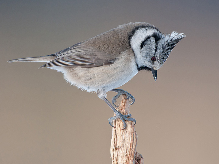
This is one of my favorite birds, the crested tit. The photo is taken from my club´s eagle hide where we aso feed the smaller birds like this one. Personally I think the background is too much out of focus. I like to see a little more of th environment where the bird lives. What do you think?

Nikon D300, 500mmx1,7, 1/400 at f/8, ISO 640

Comments

11 comments
Comment posted by Julia Flanagan on August 5, 2011 at 1:39 PM
I think the bg is fine. I like bgs with some variation but a lot of smooth coloring. I also like some environment if it is not too busy. But I consider those 2 different photos (one like you have here, and the other with more environment) each with it's own merit. Here, I like the definition of the bird and how well one can see the feet. My only nit would be that it seems a bit tight to me - otherwise - very lovely.

Julie
Registered on November 13, 2003, 59 Posts, 986 Comments
Comment posted by keith mitchell on August 5, 2011 at 2:29 PM
Sorry to disagree Lennart but i think that bg really complements this beautifully detailed bird if i was been really picky i think i would like to see the bird a little smaller in the frame if that where possible having said that it's a superb image.

Keith. :smile:
Registered on July 12, 2008, 127 Posts, 1735 Comments
Comment posted by SandyRichardsBrown on August 5, 2011 at 2:48 PM
Hi, Lennert - Nice pose, and it looks as if there is good detail - hard to tell in a small image. (You can also post a larger one if you wish - see the posting guidelines)
The BG is just fine for this type of shot. It doesn't draw attention from the bird. Other shots, as Julia says, will be interesting with a more defined habitat. It all depends on what YOUR goal and vision is.

This also seems tight in the frame to me, but it would be easy to add (if needed) some canvas on the top and sides.
Really nice image!

Sandy
Registered on November 24, 2003, 3937 Posts, 12909 Comments
Comment posted by Allen Brooks on August 5, 2011 at 5:28 PM
I suppose it depends on what you're after, but I think this is a superb shot. The background fits in nicely with the bird's color. Excellent detail. My only thought would be to add some canvas left and top.
Registered on July 27, 2011, 262 Posts, 2597 Comments
Comment posted by Dennis Plank on August 5, 2011 at 6:23 PM
Very nice, Lennart. I like the pose and the good look at the eye. The degree of detail in the background is a matter of continual debate here. I tend toward liking at least some texture in it indicative of the habitat, but some angles just don't provide it. Well done.
:toast:
Registered on January 28, 2008, 1767 Posts, 23192 Comments
Comment posted by Rajan Desai on August 5, 2011 at 8:27 PM
I like it as is (may be just a little bit of room around), Love the pose and raised crest. Nicely done.
Registered on March 25, 2005, 32 Posts, 395 Comments
Comment posted by John Robinson on August 5, 2011 at 8:38 PM
I aggree . Maybe a little smaller inthe frame with more indication of a basckground /habitat. Still a fine shot though. I could go to Scotland to get these on feeders but can't afford it !! :biggrin: :biggrin:
Cheers
JohnR
Registered on March 2, 2008, 535 Posts, 2453 Comments
Comment posted by Lennart Augustsson on August 6, 2011 at 4:33 AM
Thank you all of you for your comments.
It was not a good idea to crop this photo. Here is the full sensor.

Lennart
Registered on July 29, 2011, 21 Posts, 137 Comments
Comment posted by denise ippolito on August 6, 2011 at 8:39 AM
Awesome pose and the background is lovely. Your repost is great!
Registered on December 17, 2009, 202 Posts, 1529 Comments
Comment posted by Mia McPherson on August 6, 2011 at 9:13 PM
Lennart,

I like the repost the most, I like the added space. Great pose, love the head angle.

I think the background is fine as is. I think a well rounded portfolio is great, with habitat, with smooth backgrounds like this, with different poses, and all kinds of light.
Registered on June 25, 2007, 491 Posts, 12566 Comments
Comment posted by John Launstein on August 9, 2011 at 2:08 AM
Lennart: first off, this is a great image. Excellent pose and timing, great light and techs, strong comp (though perhaps a little tight?). In response to your question, yes, I too like a suggestion of environment in a OOF background, but I would NOT agree that this is too much out of focus in this case...it creates a wonderful soft background with a very pleasing graduation effect and outstandingly complementary colours and tones.

Thanks for sharing...this is a sweet shot!
Registered on April 5, 2011, 223 Posts, 1193 Comments