Marooned Columbine
by Brian Schrayer
I believe this is my first post in this gallery.
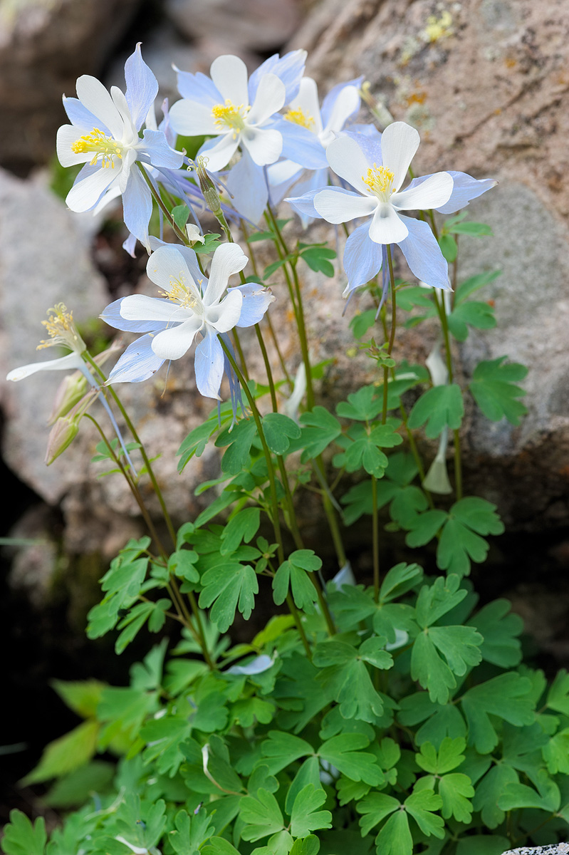
I found this group of Columbine along the trail to Crater Lake near the Maroon Bells. Compositionally, I was drawn to the contrast between the delicate flowers and the coarse rocks.
Image Capture & Processing:
Nikon D700
35mm @ f11, 1/100 sec, ISO 200
Processed using smart sharpening layer, Tony Kuyper's Smart Glow Action with opacity at 100% and default glaussian blur setting of 35. Also used selective saturation adjustment for the purple petals on the Columbine.
Honest critiques welcome. I am here to learn!!

Comments
13 commentsGood first post. The exposure for the white is spot on and the rocks do provide a nice backdrop. I have some suggestions for your consideration; I wish for a little more room along the left edge as the flowers are leaning in that direction. The petal of the partial bloom is almost touching that edge. Might even consider cropping some off the bottom too. I would also do some environmental tidying and remove the of the fallen white petals off the leaves as this looks a little distracting.
BTW, Welcome to Flora. You will find a bunch of great guys here who are always willing to help.
Bob
I also like Gary's suggestions for this. I think most of us tend to view flowers the same way we do birds or wildlife, so we tend to think of the blooms as facing a particular direction in the scene. In this case the blooms seem to face to the viewer's left. The convention is to put a little extra space in front of the blooms in the direction they're facing as you would something with eyes. (smile) So, the white petal nearly touching the frame seems particularly cramped. You can do whatever you want of course.
There's just not enough of the rock in the lower right corner to keep it there and it's a distraction for me. More of it would be fine I think or none.
I'm fine with the fallen petals but I also understand Gary's suggestion.
If you're intent was to emphasize the contrast between the rock and the blooms, you might consider shooting the rocks in sharp enough focus to highlight the detail and texture. There are conceptual contrasts here: soft/hard, light/heavy, animate/inanimate - but the textural contrast is missing.
These are all nits. It's a fine introduction to the gallery. I'm looking forward to seeing more of your images. I particularly like the mood of this one and that's really my first criterion in determining whether or not I like an image.
Again, welcome to the gallery.
pat
I can't tell because I'm using a new monitor, but the Columbines look over-exposed. It might be the Smart Glow action. No idea what's causing it. When I first looked at the image without reading your comments, I thought of using Tony Kuyper's Luminosity Painting and/or masks to darken the rock.
And, it may just be my monitor.
Nice capture.
Regards,
Carol
Albert Darmo
Canada