Nature Photographers Network
This is the preserved archive of the original Nature Photographers Network. The community continues at naturephotographers.network.
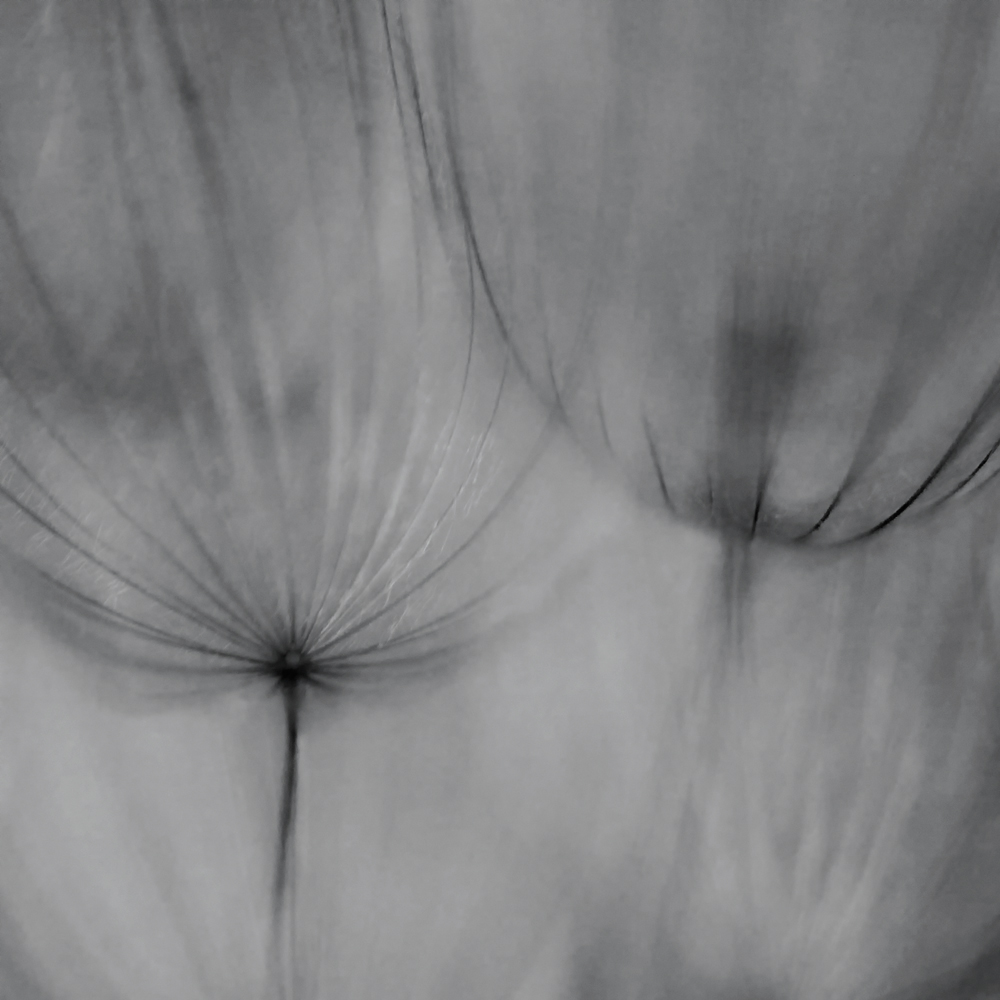
Seed Head B&W II + Repost
‹ PreviousFlora GalleryNext ›

Seed Head B&W II + Repost

by Peter Conway

Gallery: FloraPosted July 10, 201167 views14 comments
Mark III 1Ds, 180 macro, ISO 400, f/3.5, 1/64th, natural light

Processed using Nik filters fir B&w conversion plus Glamour Glow, Darken/Lighten center and Define. Selective burning also.

Of the number of these photos this is my favorite.

Comments/thoughts/suggestions appreciated.

Peter

Comments

14 comments
Comment posted by Bob&Charly Nelson on July 10, 2011 at 8:45 PM
Sweet and dreamy Peter. Well done.
Bob
Registered on October 27, 2005, 289 Posts, 4202 Comments
Comment posted by Pat Sampson on July 10, 2011 at 9:55 PM
Peter,

I like this. It reminds me of a charcoal or pencil drawing. It also reminds me some of Dain Tasker's X-Ray images, which I admire very much. If you think of Art as being comprised of the elements of line, shape, color, value, composition and mood, then this is mostly the use of line to create composition, suggest shape and convey mood. I think this is a very strong image in that respect.

I have two reservations about the image: Roughly the upper one third of the image is darker than the bottom and I don't know that, that accomplishes anything. I also wish the chalk marked looking area in the upper third on the viewer's left, was lighter or that the texturing there was a little finer.

I'm impressed with the image. I've repeatedly tried to use back lighting to create line drawing type images and this is certainly better than anything I've done. Very fine work.

pat
Registered on May 19, 2007, 953 Posts, 15989 Comments
Comment posted by scott lanz on July 10, 2011 at 10:03 PM
Really well done. Like Pat said, looks like a charcoal drawing. Very artistic vision to achieve this. :toast:
Registered on November 14, 2003, 840 Posts, 12902 Comments
Comment posted by Gary Yeoh on July 10, 2011 at 10:11 PM
Peter:
I can see why you like this. Certainly artsy and abstract looking. Also like the repeating pattern and softness. A suggestion to address Pat's comment about the darker upper third is to perhaps crop about 1/5 from the top and make this 4x5 rather a square crop. Overall a very engaging image.
Registered on September 1, 2009, 588 Posts, 8184 Comments
Comment posted by Philip Southard on July 10, 2011 at 10:15 PM
Nice one Peter. :cool:
Registered on July 15, 2007, 258 Posts, 3892 Comments
Comment posted by Peter Conway on July 10, 2011 at 10:23 PM
Pat, Your comments are spot on. You have a great eye. Thank you, more work to do.

Peter
Registered on June 25, 2007, 347 Posts, 3913 Comments
Comment posted by Morris McClung on July 10, 2011 at 10:57 PM
I agree with Pat that this is a strong image. You are showing how artistic photography can be. :toast:
Registered on May 7, 2007, 670 Posts, 19650 Comments
Comment posted by Ramamohan Pai on July 10, 2011 at 11:50 PM
Peter, My wife does charcoal paintings so this is exactly what it is and it appeals to me. I like the inclusion of dark tones in this photo and it looks like a very old charcoal painting (in a good way).
Registered on November 1, 2003, 550 Posts, 9037 Comments
Comment posted by Peter Conway on July 10, 2011 at 11:55 PM
Gary,

Thanks for the suggestion. Here is a reworked and cropped version. I appreciate the help with this as I now like it even more. :smile:

Peter
Registered on June 25, 2007, 347 Posts, 3913 Comments
Comment posted by Pat Sampson on July 11, 2011 at 12:22 AM
Peter,

The rework is a much stronger image for my tastes.

pat
Registered on May 19, 2007, 953 Posts, 15989 Comments
Comment posted by Gary Yeoh on July 11, 2011 at 1:59 AM
Peter:
I like the rework a lot more. :toast:
Registered on September 1, 2009, 588 Posts, 8184 Comments
Comment posted by Bill Fach on July 11, 2011 at 11:51 PM
Peter: Really nice work on the repost. I like how you're working these subjects. 2 thumbs up! >=))>
Registered on November 1, 2003, 1805 Posts, 26981 Comments
Comment posted by Ian Wolfenden on July 12, 2011 at 11:34 AM
Very imaginative image, Peter ! The sketchiness of it is truly appealing - like a line drawing indeed. I do prefer the repost - it gives more emphasis to the focal points. What I chiefly admire is that, despite being pretty abstract, you sense the seed heads perfectly.
Registered on May 18, 2007, 1108 Posts, 7647 Comments
Comment posted by Giuseppe Guadagno on July 13, 2011 at 5:42 PM
Two glasses for a toast. Peter, I love this ethereal, immaterial image.
Take care.
Registered on February 3, 2007, 827 Posts, 5052 Comments