Nature Photographers Network
This is the preserved archive of the original Nature Photographers Network. The community continues at naturephotographers.network.
Merced Texture
‹ PreviousLandscape GalleryNext ›

Merced Texture

by Lon Overacker

Gallery: LandscapePosted June 17, 2011384 views34 comments
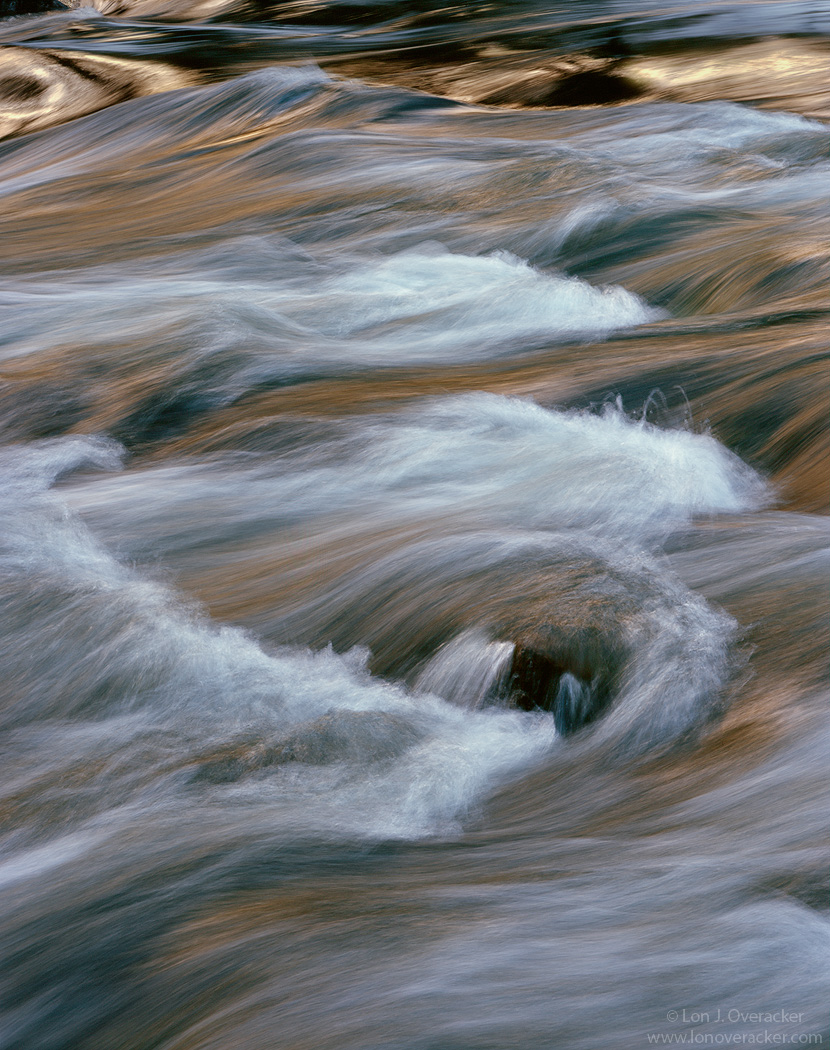
Here's an image I overlooked and just finished working up. This was from a quick overnight trip to Yosemite with Chris Chamberlain back in January. At this point, the Merced is at flood stage in Yosemite.

I'm curious to hear your preference between these two versions as well as any general comments or feedback. Also curious if the highlights up top are a distraction. Short of major cloning... I've got several layers trying to tone it down.

4x5, Nikkor 300mm, V100, F16 @1/4s (f32 @ 1s for image #2)
Tony's amazing masks and actions, including his new Triple Play.

Thanks!,
Lon

Comments

34 comments
Comment posted by Lon Overacker on June 17, 2011 at 2:26 AM
Here's another version with a longer shutter speed.
Registered on November 24, 2006, 521 Posts, 19147 Comments
Comment posted by Phil Pogledich on June 17, 2011 at 3:09 AM
Wow, tough choice between the two versions. Both are excellent and I don't mind the highlights up top. I think they add a bit of depth to the scene. If I had to choose, I'd probably go with the second version. Not because of the water texture--both are very good in that regard--but because the second version seems to have some cooler tones in the highlight areas that contrast well with the golden tones elsewhere in the scene. A hard choice though and I could probably go either way.
Registered on August 24, 2009, 123 Posts, 3099 Comments
Comment posted by Richard Hartmann on June 17, 2011 at 3:26 AM
Nice capture of this section of the river. The shapes make for an interesting abstract. The advanced processing makes this come to life.

I like the faster shutter speed of the first shot. The blown highlights don’t bother me.
Registered on January 15, 2009, 13 Posts, 772 Comments
Comment posted by Kent Mearig on June 17, 2011 at 3:38 AM
It's hard not to question the inclusion of the drastically different tonalities on the top edge. It fits much more harmoniously (though it still stands out) in the second version. I do appreciate the texture and added color of the lower portion of the top photo, but as a whole, I lean toward the second still.
Registered on September 4, 2006, 237 Posts, 4748 Comments
Comment posted by Peter Richter on June 17, 2011 at 5:03 AM
Lon, it is easy for me to decide, I clearly prefer the first version. The golden tones add at lot and make the image really comfortable to me, especially as they show a delightful interplay with the cooler tones. Futhermore, the faster shutter speed lets me experience the dynamics of the flow and offers some interesting texture. There is no distraction at all to my eye, the brighter parts at the top with their different character are just another point of interest to me.

Peter
Registered on November 10, 2010, 218 Posts, 2723 Comments
Comment posted by Scott Snyder on June 17, 2011 at 5:52 AM
Gorgeous Lon. I do prefer the first image with its more detailed water and tonal range
Registered on November 11, 2009, 45 Posts, 161 Comments
Comment posted by Andreas Resch on June 17, 2011 at 6:01 AM
Wonderful, Lon. I somehow prefer version 1 because of the better colors and more action in the water, but both are wall hangers for a water guy like me :)
Registered on November 14, 2007, 322 Posts, 6101 Comments
Comment posted by Neale Dyster on June 17, 2011 at 8:15 AM
number one , the extra textures swing it for me.
Registered on February 19, 2008, 94 Posts, 738 Comments
Comment posted by Bill Chambers on June 17, 2011 at 8:28 AM
I prefer the first version for my tastes. I love the water flow and texture, but I find the top part of the image to be somewhat distracting - I feel it might be a stronger image with the top cropped.
Registered on April 10, 2005, 753 Posts, 21216 Comments
Comment posted by Nick Bristol on June 17, 2011 at 8:41 AM
Lon, These are both very nice and it is a tough call deciding a favorite (for me anyways). After looking for awhile I do seem to prefer the second one, and the more I look the more I feel that.. I just seem to like the feel of the flow a bit better and also enjoy the color more too. I also think the brighter top works better in the second one. Both are awesome, but the second one for me! Wonderful work!

Nick Bristol
Lone Rock, WI
Registered on February 1, 2004, 752 Posts, 14140 Comments
Comment posted by Harley Goldman on June 17, 2011 at 9:55 AM
This kind of strikes me as two images, the top section and the bottom. I prefer the first rendition, as I like the colors, the glow and shutter speed. This one does not rate as one of my favorite Overackers.
Registered on November 19, 2003, 586 Posts, 11271 Comments
Comment posted by Daniel Ewert on June 17, 2011 at 10:06 AM
Lon, I like the second version much better. It seems smoother and has less contrasting and distracting elements. Both are very nice.
Registered on June 2, 2009, 103 Posts, 1500 Comments
Comment posted by Yiming Hu on June 17, 2011 at 10:29 AM
Both are lovely, so it's a tough choice. I might go with the 2nd version. I also think the top of the frame slightly distracting.

Registered on April 28, 2011, 38 Posts, 733 Comments
Comment posted by Paul Duval on June 17, 2011 at 10:48 AM
Lon,

You know you've kind of made it, when your work is branded and reduced to Overackers and I get the impression everyone knows what that means. I think your better copy wright that :biggrin: As to the images it's a tossup for me I like them both, the differences are to subtle for em to choose. May be I lack the proper sophistication.

Paul
Registered on June 30, 2009, 508 Posts, 1907 Comments
Comment posted by Preston Birdwell on June 17, 2011 at 11:09 AM
I prefer the first version, as well. The dark boulder draws my eye a tad too much because it lacks detail (I'm on my uncalibrated work monitor). I do like the more distinguishable detail.

It's a nice image, but I agree with Harley that it's not on my list of top Overackers.

--P
Registered on November 1, 2003, 471 Posts, 5188 Comments
Comment posted by Jesse Estes on June 17, 2011 at 12:53 PM
This is pretty sweet Lon, but I would crop the top out personally. Cheers! :toast:
Registered on April 13, 2011, 20 Posts, 174 Comments
Comment posted by Lon Overacker on June 17, 2011 at 12:56 PM
Thanks folks! Of course you're no help since it seems pretty split between the two. I guess that means they're both going to end up on my website. And really they're two different pieces of film and two different images.. I think I prefer the 1st image because of the texture in the water (hence the title.) I have yet another version that is much bluer that I almost posted. Lots of ways to go with the processing here.

I appreciate the feedback and comments.

Lon
Registered on November 24, 2006, 521 Posts, 19147 Comments
Comment posted by Stan Rose on June 17, 2011 at 1:00 PM
Top one, but i almost always prefer fast and i woud have probably gone faster. Nice shot--not a top image for you, but nice. :wink:
Registered on September 15, 2005, 836 Posts, 17099 Comments
Comment posted by Mark Seaver on June 17, 2011 at 1:55 PM
I definitely prefer #1. I like the details in the splashes especially the long curving one that touches the left frame. I also like that there's more color in the unstreaked regions of the water. Both are lovely captures of moving water.
Registered on January 23, 2011, 1103 Posts, 17270 Comments
Comment posted by R.Bill Moser on June 17, 2011 at 2:33 PM
Lon, both are excellent but I love the first version better just because of the color and the water action.
Registered on January 29, 2010, 285 Posts, 4281 Comments
Comment posted by Anthony Vincent on June 17, 2011 at 3:14 PM
Hey Lon,

You've been gone far too long :wink: I've always been a big fan of your river intimates and both are equally good. I think I prefer your second ver. as it seems cooler and more peaceful.
I'll have to get Tk's triple play, seems like a good one.

Nice work and looking forward to more
Registered on February 5, 2009, 199 Posts, 2775 Comments
Comment posted by Wayne Willison on June 17, 2011 at 4:56 PM
For me its the first one. The motion is so intense, due in great part to the fine lines, esp those at the upper end of the frame.
Crazy love it.
Registered on April 10, 2009, 292 Posts, 3967 Comments
Comment posted by John Williams on June 17, 2011 at 5:45 PM
Fascinating to me that there is that much variation in the vote, but add me to those for the first for the reasons mentioned. Nice Lon!
Registered on September 6, 2007, 221 Posts, 5985 Comments
Comment posted by Nancy Lea Sandy on June 17, 2011 at 8:04 PM
I like the shorter shutter speed because, IMO, it captures more of the rich color of the water and also more of the current. I find the highlights that you mention not at all distracting in that version as they add a sunshine/shadow dimension. In the second version, I do find them a bit distracting.
Registered on January 24, 2011, 576 Posts, 6942 Comments
Comment posted by Jared Atencio on June 17, 2011 at 9:36 PM
Nice Lon. During the days in Yosemite, I often sit along the banks of the Merced and just play with shots like this. I prefer the first one, as it seems to have better natural contrast and I like the tones. I could see just slightly brightening just a few of the brightest highlights in the bottom portion of the image to try and balance that upper portion, but I do like the upper part there for some reason? Hard for this to stand with the rest of your portfolio, but I like where this is headed.
Registered on June 23, 2009, 21 Posts, 422 Comments
Comment posted by Tony Kuyper on June 17, 2011 at 9:58 PM
Yes, keep them both. I like the first for the color contrast and the second for the water texture.

I also have to admit that I think the 4x5 really does water nice. The textures in these are simply amazing. It's just never seem to see this level of detail in digital images.
Registered on November 1, 2003, 364 Posts, 22328 Comments
Comment posted by Eva McDermott on June 17, 2011 at 9:59 PM
I am really enjoying the dappled and golden highlights here Lon. Water exposure in the repost works better for me. Magnificent!
Registered on January 4, 2009, 1015 Posts, 13229 Comments
Comment posted by Dietrich Gloger on June 18, 2011 at 3:26 AM
Very beautiful Lon! I like both versions, very hard to give a preference. The version with the longer shutter speed is a bit simplified, which of course does not harm. That version also looks as if it has a bit more of a blueish cast - which I like too. Both version have the same strong composition.. :wink: . The highlights at the top also work well, no distraction at all, quite the opposite - they add to the comp. Love that golden"liquid metal" look. I guess I stick to the second version - more friendly and harmonic on the eye.
Registered on January 26, 2007, 360 Posts, 9876 Comments
Comment posted by Chris Chamberlain on June 18, 2011 at 2:04 PM
Both are nice as most everyone agrees. I can't really fault one or the other. I guess I like the second better for the softer texture in the water, and the cooler colors. I think my mind must just naturally prefer those tones. Maybe why many of my images are cool/have a cool cast????

Chris
Registered on March 13, 2007, 500 Posts, 8365 Comments
Comment posted by Sarah Marino on June 18, 2011 at 3:04 PM
Hi Lon - I agree with many of the other comment that they are both wonderful. I personally prefer the first version because of the increased color and contrast. I think it still has enough of the beautiful water texture to slightly elevate it over the second version for me. I do not think that the top portion is a huge distraction, but I would likely crop out that area if it were my own image. I love each one of these intimate scenes that you present - always inspiring.
Registered on November 10, 2008, 23 Posts, 393 Comments
Comment posted by Craig Myers on June 19, 2011 at 12:22 AM
Both are beautiful images. I really like the first for its greater tonal depth. I think the sun on the water works better in that one, also.
Registered on September 1, 2008, 85 Posts, 757 Comments
Comment posted by Stuart Williams on June 19, 2011 at 5:39 AM
i prefer the first and might even consider a crop from the top ... that'd enhance the abstract nature of the image and keep all the bits i enjoy!
Registered on December 7, 2007, 247 Posts, 4792 Comments
Comment posted by Alister Benn on June 19, 2011 at 3:12 PM
very crisp and detailed study.. the glow from the cliffs adds some mystery...
Registered on June 9, 2011, 23 Posts, 258 Comments
Comment posted by Bill Maile on June 20, 2011 at 9:43 AM
Gorgeous Lon, I strongly prefer #1 over #2... there are some very interesting colors streaking through it. The light at the top doesn't bother me a bit. Love it, now onto Chris's! :wink:
Registered on March 2, 2009, 984 Posts, 2518 Comments