Nature Photographers Network
This is the preserved archive of the original Nature Photographers Network. The community continues at naturephotographers.network.
Wizard of the Hoh
‹ PreviousLandscape GalleryNext ›

Wizard of the Hoh

by Paul Marcellini

Gallery: LandscapePosted June 2, 2011761 views38 comments
My portfolio may not show it yet, but I love forests and trees. A sunset with reflections may garner more response but I definitely enjoy a well put together forest image more.

Saying that, I was very happy to get to explore the rainforests for 2 days while in the PNW. This was actually maybe my 3rd frame taken when I got there.

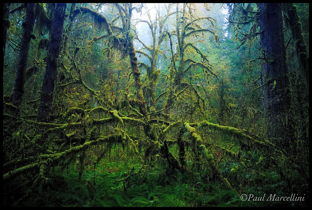
This combo of a big leaf maple and vine maple just commanded attention. There was so much beauty in the chaos of the rainforest, but hopefully this comes off a bit more composed.

Thanks for any cc,
Paul

Ps, the blues were pointed out by Jay on another forum, they are totally intentional for color contrast, but were there to begin with. I intended to frame the image both in tone and color, so cooler and darker around the warmer highlights really helped direct the eye to me.

Comments

38 comments
Comment posted by Eva McDermott on June 2, 2011 at 9:23 PM
I love the mood here Paul! Very different from most images from this area.... Fantastic vision. Almost foreboding in a way but very beautiful none the less. The center tree has a spider like quality to it. Superb work.
Registered on January 4, 2009, 1015 Posts, 13229 Comments
Comment posted by John Mumaw on June 2, 2011 at 9:38 PM
One of the best I've seen from here, Paul. It takes a talented individual to get exceptional compositions with any amount of depth from this place, and you've done just that. Thanks for posting the larger image for us to savor. The only place the blues bother me somewhat is on the tree trunks themselves. Other than that, I like the color contrast they provide in such an overwhelmingly emerald green place.
Registered on September 9, 2005, 62 Posts, 2289 Comments
Comment posted by Michael Anderson on June 2, 2011 at 9:40 PM
Wow, what a cool image Paul. The wetness is palpable. I feel like you nailed the colors and the composition. The blues do give a nice color contrast which is important in a thick forest scene like this. I find my eye drifts up a lot to the bright area in the top center of the image, pulling me out of the scene. It's a very minor point, but I wonder what you think of a crop of the top 1/8 of the image. I realize you lose some of the branches of the central tree, but I still think it works well. It's excellent as is though.
Registered on January 31, 2006, 228 Posts, 3072 Comments
Comment posted by Paul Marcellini on June 2, 2011 at 9:44 PM
Thanks guys,

Michael, I meant to mention that was also intentional. I wanted to draw the eyes up. Almost like the "wizard" was raising its arms to cast a spell. It may not translate as well to others, but as soon as I saw this scene, I had this image processed in my mind just like this. (a stop or so darker than actually shot)

Registered on November 27, 2007, 250 Posts, 2468 Comments
Comment posted by Taylor Reed on June 2, 2011 at 9:46 PM
It sure works for me. My initial gut reaction was to crop off the bright spot but after looking at it a while it didn't bother me. Great stuff.
Registered on February 18, 2010, 26 Posts, 556 Comments
Comment posted by Jared Atencio on June 2, 2011 at 10:18 PM
Seems like a lot of people have been trying to capture the Hoh lately, but this is one of the best I've seen. The blues on the trunks are just a tad strong as John points out, and I would maybe crop in just a tad from the left to eliminate the dark trunk in the ULC. Otherwise, I really like the darker mood here as it has a very natural look to my eye.
Registered on June 23, 2009, 21 Posts, 422 Comments
Comment posted by Chris Chamberlain on June 2, 2011 at 10:33 PM
That's a very strong comp from there! About as good as I've seen, really. I love the light fall off/ vignette, whatever, it really adds to the mood. Beautiful!

Chris
Registered on March 13, 2007, 500 Posts, 8365 Comments
Comment posted by James Fougère on June 2, 2011 at 10:38 PM
I also think you hit a "home run" with this image :eek: This is very unique with a deep dark mysterious feel to it!! Excellent vision and execution. I do see some ink blue color on the trees on the top of the image that could be adjusted, and the bright sky could be toned down, but again this is a matter of personal choice. Well done :toast:
Registered on October 25, 2010, 41 Posts, 831 Comments
Comment posted by Nicolaus Wegner on June 2, 2011 at 11:57 PM
This is awesome Paul. Sorry I don't have any critiques as I can't find anything wrong with this. Great find.
Registered on February 21, 2010, 133 Posts, 1509 Comments
Comment posted by Lon Overacker on June 3, 2011 at 1:22 AM
Paul,

I'll start by saying that I love the image and I think you've done a fantastic job just containing or making some sort cohesive image out of the Hoh. Actually any deep, busy forest like this is quite difficult to shoot.

You know there's a "but" coming though. I appreciate you letting us in on your vision and intention and you've succeeding in doing that with your image. And the great thing about this place and our craft is that we can all have different opinions. And my different opinion is that the blues, specifically in the upper adjacent trunks is a bit beyond "my" reality. The color is more purple to me than blue actually. For me, a more neutral dark shadow would work just as well in framing the scene. But that's just me.

I do really like the natural vignetting provided along the edges and the contrast with the bright top - kinda gives that "heavens are opening up" type of look.

That's my story and I'm sticking to it. Terrific image from the rain forest.

Lon
Registered on November 24, 2006, 521 Posts, 19147 Comments
Comment posted by Rick Lundh on June 3, 2011 at 1:47 AM
WOW! This is chaotically awesome! I love how dark you made/left this...
Registered on April 28, 2004, 774 Posts, 4351 Comments
Comment posted by Aaron Feinberg on June 3, 2011 at 2:11 AM
Still say to tone down the brightness of the top middle. Sick find.

aF
Registered on October 26, 2009, 399 Posts, 2789 Comments
Comment posted by Anand Narayanan on June 3, 2011 at 2:39 AM
Hauntingly beautiful :toast: :toast: :toast: :toast: :toast:
Registered on October 25, 2009, 110 Posts, 835 Comments
Comment posted by Bill Chambers on June 3, 2011 at 8:19 AM
This has a wonderfully spooky feel to it, like the tree is coming to life and reaching out for you. A great ciomposition in a situation where comps are difficult to come by.
Registered on April 10, 2005, 753 Posts, 21216 Comments
Comment posted by Paul Marcellini on June 3, 2011 at 9:29 AM
Thanks everyone. I went back and stared at the raw. This is actually a bit warmer than shot, and those blues are there. I did take down saturation on them a little bit though, since it was mentioned a lot.

Aaron, the brightness stays! Sorry, agree to disagree there. ;)
Registered on November 27, 2007, 250 Posts, 2468 Comments
Comment posted by R.Bill Moser on June 3, 2011 at 11:27 AM
Great mood here. Paul, I also like your comp. I like the color contrast. Awesome work :toast:
Registered on January 29, 2010, 285 Posts, 4281 Comments
Comment posted by Phil Pogledich on June 3, 2011 at 12:23 PM
Very compelling and well-executed image. Like some of the others I do find the brightness along the top of the frame to be a bit strong, but not necessarily objectionable. If it were mine I'd probably crop just a slight bit off the top, as Mike Anderson suggested, but I certainly understand your decision to leave it alone.
Registered on August 24, 2009, 123 Posts, 3099 Comments
Comment posted by Kyle L. Krause on June 3, 2011 at 2:01 PM
Fantastic Paul, a superbly intimate forest scene. Just beautiful!! Congratulation on your 2nd place for your panoramic photo from the Epson International awards. I had won a silver and four bronze when a saw your name in the winners category. Excellent work Paul.
Registered on June 15, 2010, 29 Posts, 605 Comments
Comment posted by Ben Horne on June 3, 2011 at 2:35 PM
The amount of depth that you've captured with this photo is truly impressive. On first glance, I would have said that it was shot on large format with print film. Although I certainly agree that the blue tone isn't "natural," it gives a very unique feel, and is the part of the photo that makes me think it was on film. This would make a fantastic print, especially on fujiflex where it will glow.
Registered on August 27, 2009, 51 Posts, 959 Comments
Comment posted by Lars Lentz on June 3, 2011 at 2:40 PM
I love the color, depth, and lighting. The contrast with light and dark is really nice. Great shot!
Registered on March 26, 2011, 42 Posts, 70 Comments
Comment posted by David Edwards on June 3, 2011 at 6:09 PM
Some pretty amazing processing, Paul. I like how you have isolated the main tree from the rest of the forest both in terms of light and color. The image actually looks quite sci-fi, like a big alien monster with large tentacles is coming towards me :eek: . The large version is even scarier! I do get the feeling the "tree" is raising it's arms (tentacles) right up in anticipation of a strike down, similar to your description of the wizard. Scary thoughts aside, this is a wonderful composition and your processing has brought your vision to life in spades imho. I do tend to agree with some of the others about the blue color, but for me, I like the color but it's just a little saturated on the left and right framing trees, and tends to pull my eye away from the main tree.
Registered on December 6, 2008, 142 Posts, 2623 Comments
Comment posted by Todd Bielby on June 3, 2011 at 7:38 PM
Wow this is really cool. :cool: It looks like a place I would not want to be in the dark. Thanks for sharing.
Registered on March 10, 2011, 169 Posts, 392 Comments
Comment posted by Paul Duval on June 3, 2011 at 7:58 PM
Paul,

The comp really grabs and pulls you right into the scene, very well composed. The blue cast is the strongest on the major trunk on teh right and is just slightly over the line for me. The other blues do really enrich the scene.


Paul
Registered on June 30, 2009, 508 Posts, 1907 Comments
Comment posted by Bret Edge on June 3, 2011 at 9:03 PM
This is very well done, Paul. Gorgeous colors and a perfect comp. Just awesome.
Registered on November 1, 2003, 711 Posts, 6363 Comments
Comment posted by Vance Gese on June 3, 2011 at 9:42 PM
Fantastic, Paul. Love your composition, wonderfully graphic, even eerie, with the moss covered branches almost alive, reaching out to the viewer. Great color as well. Although I try very hard to avoid bright highlights in a forest image (shooting film, those highlights just don't work), your inclusion of the misty sky really works well here and helps give the viewer a sense of height, and more dimension/depth to your image. Superb work. Sounds like you had a great time at the Hoh.
Registered on November 13, 2008, 298 Posts, 6629 Comments
Comment posted by Stan Rose on June 4, 2011 at 1:49 AM
Sweet! As ive told Floris and others, i know how tough it is to compose for the Hoh, and i think you came pretty close to nailing it here--i love the controlled chaos. Im with Mike and the others though--the bright spot is too much, its like someone driving at you with their high beams on--it pulls your attention there and then forces you to look to the side of the road (off frame). Id crop, though i do like the side portions up top. :wavey:
Registered on September 15, 2005, 836 Posts, 17099 Comments
Comment posted by Andreas Resch on June 4, 2011 at 4:51 AM
That tree is surreal and the conditions of the forest make it look even spookier. Great find and shot, Paul.
Registered on November 14, 2007, 322 Posts, 6101 Comments
Comment posted by Hamed Musharbak on June 4, 2011 at 9:47 AM
other wordly mood Paul,

is this from Avatar Movie :biggrin:
Registered on June 1, 2009, 372 Posts, 2282 Comments
Comment posted by Morris McClung on June 4, 2011 at 2:11 PM
So well seen, composed, and captured. This rocks for me, Paul!
Registered on May 7, 2007, 670 Posts, 19650 Comments
Comment posted by Mark Metternich on June 4, 2011 at 3:05 PM
:toast:
Registered on June 19, 2009, 276 Posts, 6240 Comments
Comment posted by Marc Adamus on June 4, 2011 at 11:40 PM
I totally love it, Paul. Wonderful in all regards.
Registered on September 17, 2005, 780 Posts, 8091 Comments
Comment posted by Matt Anderson on June 5, 2011 at 1:03 PM
Processing really makes this. I like the sprawling nature of this scary spider.
:toast:
Registered on September 6, 2007, 346 Posts, 2696 Comments
Comment posted by Floris van Breugel on June 5, 2011 at 1:46 PM
Love it, Paul. The vine maple / big leaf looks like a prehistoric spider trying to crawl out of the woods. I think the bright portion will be less distracting on a properly displayed print. The dark moodiness here is great. The blues on those spruces are a bit over saturated IMO.... and I was there.. :wink:
Registered on December 19, 2008, 306 Posts, 4840 Comments
Comment posted by Paul Marcellini on June 5, 2011 at 3:43 PM
Thanks again everyone. I did take down the blues a smidge in the master, but not much. I never saturated the blues once in the development of this image though.

Floris, you weren't here for this shot. :wink: Prolly 10 min before you showed up. I can see the progression of light in my shots and the blue goes away rapidly.
Registered on November 27, 2007, 250 Posts, 2468 Comments
Comment posted by INGOMA on June 5, 2011 at 10:03 PM
Oh my Paul, this leaves me speechless. Besides the obvious beauty it also reminds me of some gigantic alien creature. The composition could not be improved upon.
Registered on July 2, 2004, 231 Posts, 3110 Comments
Comment posted by Neale Dyster on June 6, 2011 at 5:11 AM
beautiful image Paul, I missed this one till now, glad I noticed it this time through!
I'm finding forests difficult to deal with compositionally, you certainly have no such problem here.
Registered on February 19, 2008, 94 Posts, 738 Comments
Comment posted by Boris Pophristov on June 8, 2011 at 3:24 PM
A masterpiece! Such a powerful composition! Love the mood and the cool tones. The large version is mind-blowing!
Registered on February 1, 2011, 15 Posts, 73 Comments
Comment posted by Kent Mearig on July 13, 2011 at 2:23 AM
I missed this last month. Absolutely incredible!
Registered on September 4, 2006, 237 Posts, 4748 Comments