Gallery: FloraPosted May 31, 2011100 views12 comments
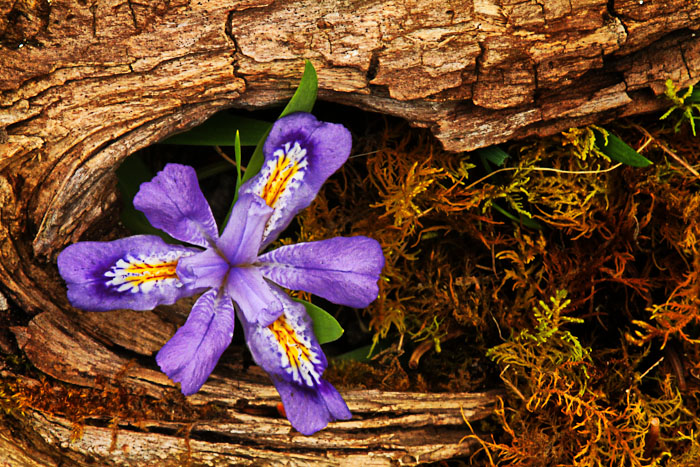
Took this in Mackinaw city this memorial weekend.
7D
f32
1/6 sec
iso 500
Comments
12 comments
Comment posted by Pat Sampson on May 31, 2011 at 8:28 AM
Love the composition Todd. I also like the wood and dried material a lot. They make the flower pop. I might clone out the stem and the small blade of grass in the V at the top of the flower. There's something odd in the textures or the light that I don't understand. The entire image seems a little contrasty? to me maybe. Or maybe you were dealing with harsh light? Or maybe it's the diffraction from F/32 or a touch of over sharpening. I wouldn't even mention it but I really like comp and the subject and the image is worth spending some time on - at least it would be to me. I think it needs to be softer and less contrasty/reflective throughout though. It may just be me. See what the others say.
pat
Registered on May 19, 2007, 953 Posts, 15989 Comments
Comment posted by Barbara Graham on May 31, 2011 at 10:41 AM
I agree with Pat in that the subject is wonderful and the comp really fits the subject, but the texture doesn't look realistic to me, and I think this subject would stand on its own really, really well without extra contrast, etc.
Registered on July 27, 2010, 1310 Posts, 5035 Comments
Comment posted by Todd Bielby on May 31, 2011 at 2:15 PM
Better?
Registered on March 10, 2011, 169 Posts, 392 Comments
Comment posted by Derek Yow on May 31, 2011 at 4:42 PM
I like this Todd for all the reasons Pat pointed out! I think the repost looks much more natural.
Registered on May 18, 2010, 26 Posts, 655 Comments
Comment posted by Barbara Graham on May 31, 2011 at 6:03 PM
Todd, I like the repost much better. You might try a tiny bit more sharpening or brightness on just the flower alone to make it stand out more, but the wood and all the supporting elements look wonderful in the repost.
Registered on July 27, 2010, 1310 Posts, 5035 Comments
Comment posted by Pat Sampson on May 31, 2011 at 7:06 PM
Todd,
I agree with Barbara's suggestion. I might selectively try to sharpen the bloom a bit more but the other image elements look better to me in the repost. You might try the textural contrast filter in the NIK Color Efex and/or also a little structural sharpening, if you have NIK's sharpening product or Viveza 2. You could do the same in PS although I have to figure out what I'm doing everytime I go onto the layers menu. PS will never seem intuitive to me.
Did you shoot this with a tripod? Am I seeing a little motion blur or is it the diffraction from the f/32. The flower does seem a bit soft to me.
pat
Registered on May 19, 2007, 953 Posts, 15989 Comments
Comment posted by Todd Bielby on May 31, 2011 at 7:48 PM
Hi pat, yeah I used a tripod. This was the last photo of my walk. Maybe I was ready to go, maybe diffraction, I have also heard that Tamron 180mm were not the sharpest lens as they could be. Oh I bet I know what it was. Earlier in my walk that day or the day before my stupid ring tripod adapter that came with the lens got stripped out and would hold the lens. The part that allows your lens to be vertical or horizontal not the part that hooks to the tripod. So I had to place the tripod plate on the camera and not the ring adapter. Which is not ideal. I had a lot of problems with lens creep when it was mounted this way. I bet that's why. Sorry for the long explanation.
Registered on March 10, 2011, 169 Posts, 392 Comments
Comment posted by Gary Yeoh on May 31, 2011 at 8:42 PM
Todd:
A pleasing composition and nice framing by the wood and plant in the bg.
Registered on September 1, 2009, 588 Posts, 8184 Comments
Comment posted by Pat Sampson on May 31, 2011 at 10:13 PM
Thanks for the explanation Todd.
Nothing I hate more than having gear fail and I don't baby mine much either. You might still play with some selective contrast/sharpening on the flower. I like the image.
pat
Registered on May 19, 2007, 953 Posts, 15989 Comments
Comment posted by Bill Fach on June 2, 2011 at 9:04 PM
Todd: I like the repost a lot. The comp attracted me even with the thumbnail. Nice adjustment.>=))>
Registered on November 1, 2003, 1805 Posts, 26981 Comments
Comment posted by Paul Duval on June 3, 2011 at 11:09 AM
While the original post is very fine, the repost based on comments is superior. It's just a personal preference I do like the warm tones in the original which contrast well with the cool blue of the Iris. But again that's just a personal preference, the first has a hardness and edginess that almost HDR like while the second has a softer natural appearance.
Paul
Registered on June 30, 2009, 508 Posts, 1907 Comments
Comment posted by Morris McClung on June 4, 2011 at 1:31 PM
I like the comp, and the color and texture contrast. Nice lighting, too. The repost is more natural, my taste would be somewhere in between the 2, but that's just me. Nice work.
Registered on May 7, 2007, 670 Posts, 19650 Comments

Comments
12 commentspat
I agree with Barbara's suggestion. I might selectively try to sharpen the bloom a bit more but the other image elements look better to me in the repost. You might try the textural contrast filter in the NIK Color Efex and/or also a little structural sharpening, if you have NIK's sharpening product or Viveza 2. You could do the same in PS although I have to figure out what I'm doing everytime I go onto the layers menu. PS will never seem intuitive to me.
Did you shoot this with a tripod? Am I seeing a little motion blur or is it the diffraction from the f/32. The flower does seem a bit soft to me.
pat
A pleasing composition and nice framing by the wood and plant in the bg.
Nothing I hate more than having gear fail and I don't baby mine much either. You might still play with some selective contrast/sharpening on the flower. I like the image.
pat
Paul