Thanks so much for the comments on my previous image. Feels great to be back and having some images to post again.
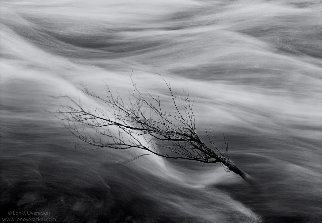
This one here is a slight departure from my norm and may not be everyone's cup of tea. I haven't done many black and whites, but more and more and especially on this trip, I am "seeing" more b&w. I always try and I prefer to visualize a b&w scene before the capture. But I'd be lyin' if I said I've never converted to b&w just to see what it looks like...

The scene here called out for the higher contrast, simple tones, motion and just said b&w. I'm wondering if that holds true for the viewer though. Oh, and also it's pretty obvious that most of the branches are blurred from movement as you get away from the core of the tree. I knew this and was hoping it adds to the overall impact rather than detracts.
Any help with a title for this would be appreciated. I just can't seem to find anything that really nails this scene.
All honest comments and critiques welcome!
4x5, 210mm, V100, f/22 @1s
TK's Luminosity masks and new Triple Play
Thanks!
Lon

Comments
23 commentsAnd Sean, good idea - that could be tough, but I might try and do that. Thanks all for the comments.
Oh, here's a larger version too.
Thanks!
Paul
Funny, after writing the above, I almost deleted it and just said awesome work. Because it really is, as it 99 percent of the photography I see on this page. Perhaps as photographers were are getting too nit picky about details those who actually buy prints will probably never even see. On the flip side though, hard critiques push us all to improve our game even more. I definitely feel like I must work harder when someone critiques my images or points out something I completely missed.
Any way Lon, one small thing that I REALLY do like about this image is the movement of the top branches. It almost adds a sense of the branch flowing in the same manner as the water. On the flip side one could say that the movement of the branches takes away from the detail. Hahah...just kidding.
Great work as usual.
I think this is a very artistic interpretation of this scene. The b&w is definately right for the situation as well. I can see the benefits of some dodge/burn and contrast tweaks, but my initial reaction was that this was "good"!
Chris
lucy
So, like i said--cool, but not a showcase shot for you.