Nature Photographers Network
This is the preserved archive of the original Nature Photographers Network. The community continues at naturephotographers.network.
Branching Out
‹ PreviousLandscape GalleryNext ›

Branching Out

by Justin Reznick

Gallery: LandscapePosted May 25, 2011181 views20 comments
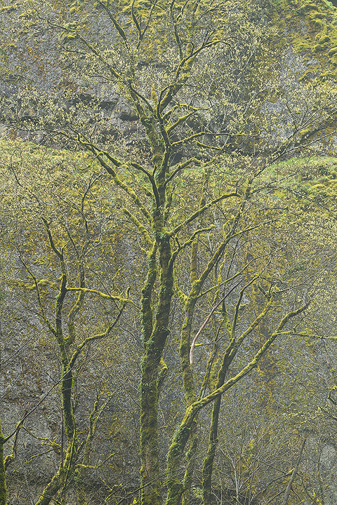
This was taken in the Columbia River Gorge.

The image may appear to need more contrast, but after spending some time with the multiple versions, I opted for the more subtle approach. Thoughts?

Thanks in advance for any C&Cs!

Comments

20 comments
Comment posted by Marc Adamus on May 25, 2011 at 2:02 PM
I've looked at these trees over Elowah many, many times. I was never thrilled enough with the images I took to keep them, but this is quite nice. Very delicate. I think the contrast works well.
Registered on September 17, 2005, 780 Posts, 8091 Comments
Comment posted by Justin Reznick on May 25, 2011 at 2:12 PM
Thanks for the feedback Marc. I love that you knew exactly where I took this right away, goes to show your knowledge of the Gorge!
Registered on November 24, 2009, 79 Posts, 515 Comments
Comment posted by Bill Chambers on May 25, 2011 at 2:14 PM
WOW. This is top notch work Justin. So delicate and subtle - works beautifully. I love the contrast as is. The only suggestion I can offer is that I might crop 2-4% off the right side to remove the dark spot in the URC and to remove the extraneous limb coming in on the right, near the bottom. You could clone them as well, but I think a crop would help balance the shot a little better. Excellent work!!!
:toast: :toast: :toast:
Registered on April 10, 2005, 753 Posts, 21216 Comments
Comment posted by Art Escobado on May 25, 2011 at 2:41 PM
I really liked the thumbnail and larger image... :toast:
Registered on January 7, 2007, 0 Posts, 775 Comments
Comment posted by Paul Marcellini on May 25, 2011 at 4:12 PM
I like the softer contrast but might give it a hint more saturation.
Registered on November 27, 2007, 250 Posts, 2468 Comments
Comment posted by Justin Reznick on May 25, 2011 at 5:30 PM
Thanks for the suggestions!

I took some off the right and upped the saturation for the repost.
Registered on November 24, 2009, 79 Posts, 515 Comments
Comment posted by Phil Pogledich on May 25, 2011 at 7:52 PM
Both the original and repost work well for me. I noticed that little dark triangle in the upper RHC before reading Bill's comment and was going to suggest a slight crop off the top, but a crop from the right works well too.

Personally, I'd be interested to see this with a bit more contrast, particularly in the bottom 1/3 or so, and even more saturation for the sake of comparison. It all looks very good as-is but it doesn't have the same vibrancy as so much of your other work.
Registered on August 24, 2009, 123 Posts, 3099 Comments
Comment posted by Lon Overacker on May 25, 2011 at 9:13 PM
Justin,

I've come back to this a number of times and I'm honestly undecided about the contrast. I'm not sure this was effect you were after from capture, or just something that came along in processing. But for whatever reason, my very first impression is an image that's just not processed for nice contrast. I understand of course that that is simply a reaction to what most consider normal or within "the box." So to step out of the box I have to give you kudos for stepping out of that expectation.

In the end though, it doesn't quite look like a mist atmosphere, so I keep going back to processing. In fact an impression I'm getting now is, a lithograph; take the processing a little further and you'd get there.

I love the scene and am very fond of trees and intimate captures like this so that does weigh nicely for me. I too like the narrower crop, but the original is fine too.

I'm inclined to think along the lines of Phil's comment. Perhaps even bringing back a shade of contrast, but not so much you lose this effect would bring me back.

Lon
Registered on November 24, 2006, 521 Posts, 19147 Comments
Comment posted by Eva McDermott on May 25, 2011 at 9:25 PM
I like the repost Justin. I like the delicate details and color.
Registered on January 4, 2009, 1015 Posts, 13229 Comments
Comment posted by Justin Reznick on May 25, 2011 at 9:47 PM
Here's a version with more contrast

Thanks for the continued input!
Registered on November 24, 2009, 79 Posts, 515 Comments
Comment posted by Lon Overacker on May 25, 2011 at 10:10 PM
Justin,

Excellent. I thought that might do the trick for me. A subtle change, but I think world of difference. Thanks for taking the time.

Lon
Registered on November 24, 2006, 521 Posts, 19147 Comments
Comment posted by Justin Reznick on May 25, 2011 at 10:12 PM
Thank you Lon! I've definitely missed your critiques, thrilled to see you back on the forum!
Registered on November 24, 2009, 79 Posts, 515 Comments
Comment posted by Chris Chamberlain on May 25, 2011 at 10:15 PM
Yeah, that's nice. Very clean and crisp. I'm for the contrast increase too.

Chris
Registered on March 13, 2007, 500 Posts, 8365 Comments
Comment posted by Floris van Breugel on May 26, 2011 at 12:18 AM
The repost works much, much better. I like how the trees seem to blend into the walls. I've noticed you really hit your images with some super fine web sharpening, usually it looks good, sometimes a little over the top. Whenever I try that for high detail scenes it seems to wreak havoc on my overall contrasts. I wonder, perhaps this would work better (here on the web) if you held back on that web sharpening a little?
Registered on December 19, 2008, 306 Posts, 4840 Comments
Comment posted by Matt Anderson on May 26, 2011 at 8:59 AM
The thumbnail doesn't do this one justice.
Part of me wants a slight crop off the bottom, but
none-the-less, you were surely adroit in framing this masterpiece!
:toast:
Registered on September 6, 2007, 346 Posts, 2696 Comments
Comment posted by Stuart Williams on May 26, 2011 at 10:12 AM
i love the trees and the contrast. what i would like to see are these in different conditions such that there is a good degree of separation between them and the cliffs behind (find a foggy day!).
Registered on December 7, 2007, 247 Posts, 4792 Comments
Comment posted by Justin Reznick on May 26, 2011 at 11:43 AM
Floris - thanks for the observation, here's a version with less sharpening. Let me know if this is more along the lines of what you're thinking...
Registered on November 24, 2009, 79 Posts, 515 Comments
Comment posted by Phil Pogledich on May 26, 2011 at 12:25 PM
I like the repost that followed Lon's comment. Just about what I was thinking. Very nice work!
Registered on August 24, 2009, 123 Posts, 3099 Comments
Comment posted by Harley Goldman on May 26, 2011 at 1:42 PM
Count me in for the version with more contrast, right after Lon's input. Excellent trunk lines against the greens and wall. Very nicely done!!
Registered on November 19, 2003, 586 Posts, 11271 Comments
Comment posted by Rick Lundh on May 26, 2011 at 4:18 PM
I second what Marc said... At first when I looked at this, I wanted more contrast...but think you chose the best level to display the spring starts.
Registered on April 28, 2004, 774 Posts, 4351 Comments