Gallery: LandscapePosted May 22, 2011356 views15 comments
I did post this image, but B&W version,
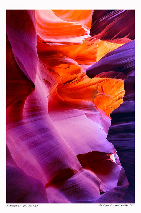
This is the color version
CC Welcomes!!!
Enrique Vizcarra
Comments
15 comments
Comment posted by Nicolaus Wegner on May 22, 2011 at 2:19 AM
Wow, this is absolutely crazy to look at. How saturated is this compared to the original?
Really like the blue to red going on here. Probably the most colorful canyon shot I have seen posted on this site.
Registered on February 21, 2010, 133 Posts, 1509 Comments
Comment posted by Dietrich Gloger on May 22, 2011 at 3:27 AM
Hi Enrique,
interesting to see the comparison. The composition is very strong and the color version works very well. But I must admit that the color intensity is borderline for me in this one. The colors are appealing, and the different tones work well for the scene. On the other hand it is the saturation and the colors that seem "unreal". I have been to slot canyons and of course I have not seen them in all kinds of different light, but I wonder whether it can ever get that blue and purple. However these are just my honest thoughts. I don't want to imply that tuning an image into a direction that feels good for the artist is not legitimate. But personally, I prefer the more understated look of the bw version.
Registered on January 26, 2007, 360 Posts, 9876 Comments
Comment posted by Kah Kit Yoong on May 22, 2011 at 3:41 AM
Love the colours here. I prefer this to the BW but like Dietrich, I find the saturation borderline over-the-top. Wonderful shot.
Registered on September 27, 2006, 636 Posts, 10682 Comments
Comment posted by Julian Barkway on May 22, 2011 at 4:29 AM
I have to say that the colours aren't really working for me, either. Having been to Antelope myself and having seen a great many pictures from there, I have to say that the intensity of colour (esp. magenta) just seems wrong to my eyes. Of course, without the weight of expectation generated from all those other pictures, I might see this entirely differently...
If you pull back the magenta, I think you might just be able to get away with the saturated reds and oranges...
Registered on January 18, 2007, 344 Posts, 1961 Comments
Comment posted by Ron Pullen on May 22, 2011 at 8:13 AM
Plenty of color going on in this one, absolutely beautiful. Ron
Registered on December 18, 2005, 74 Posts, 1413 Comments
Comment posted by Harley Goldman on May 22, 2011 at 9:13 AM
I like the comp and light. I am finding the colors a little over the top for my tastes, though.
Registered on November 19, 2003, 586 Posts, 11271 Comments
Comment posted by Bruce King on May 22, 2011 at 11:07 AM
The colors ARE incredible and as a straight forward landscape they are a little over the top as others have mentioned, although quite beautiful. As a work of art however, I think it's fantastic. The tones, lines and overall compositon are very appealing to my eye and I want to stay and wander through the image. My only nit is the white area at LR. I might turn that another shade of magenta. I think your interpretation of the scene is bold and exciting.
Registered on January 14, 2010, 276 Posts, 2212 Comments
Comment posted by Steve Sieren on May 22, 2011 at 11:31 AM
I'd prefert to see less magenta and more warm earth tones Enrique. Nice comp though.
Registered on January 2, 2008, 360 Posts, 5321 Comments
Comment posted by Doug Koepsel on May 22, 2011 at 12:33 PM
I like the composition, but the magenta is too much for me. You might burn down the small brighter spot in lower right.
Registered on April 1, 2010, 196 Posts, 1592 Comments
Comment posted by R.Bill Moser on May 22, 2011 at 3:44 PM
I love the comp...but the saturation is also for me over the top. Beautiful light
Registered on January 29, 2010, 285 Posts, 4281 Comments
Comment posted by Richard Teller on May 22, 2011 at 4:29 PM
Beautiful image and a wonderful color pallet. I am envious. I came through Page, AZ and had one morning to go to Antelope Canyon and there was no sun, just clouds. Great picture.
Registered on August 23, 2010, 1162 Posts, 6692 Comments
Comment posted by Lars Lentz on May 23, 2011 at 8:33 AM
I love the saturation of the colors! This is a great shot. In lower right area between middle and bottom, there is a lighter spot of some natural feature or light, that draws my eye there immediately. Its under the overhang, but behind it somewhere. Its not a bad thing because it is naturally there, but if it weren't there, I wouldn't be focused on it so much and I may look more up and down in the photo instead of focusing there. Love the shot as-is though! Great work!
Registered on March 26, 2011, 42 Posts, 70 Comments
Comment posted by Mark Metternich on May 23, 2011 at 12:22 PM
I think the comp is good.
The colors are way too strong for me though
Registered on June 19, 2009, 276 Posts, 6240 Comments
Comment posted by Floris van Breugel on May 23, 2011 at 3:30 PM
Lovely composition, Enrique. The color doesn't for me though... way to saturated.
Registered on December 19, 2008, 306 Posts, 4840 Comments
Comment posted by Enrique Vizcarra on May 24, 2011 at 10:54 AM
Try turning down the saturation of colors, but on the other hand, I think they are strong and give it a hint ..... perhaps more photo art
I read all your valuable comments and understand that by uploading this photo as a landscape with such bright colors clash with the real image of a landscape
I think this photo should have rather gone to the Photo Art forum, And I will do
Thank everyone for your valuable comments
Registered on September 10, 2009, 223 Posts, 393 Comments

Comments
15 commentsReally like the blue to red going on here. Probably the most colorful canyon shot I have seen posted on this site.
interesting to see the comparison. The composition is very strong and the color version works very well. But I must admit that the color intensity is borderline for me in this one. The colors are appealing, and the different tones work well for the scene. On the other hand it is the saturation and the colors that seem "unreal". I have been to slot canyons and of course I have not seen them in all kinds of different light, but I wonder whether it can ever get that blue and purple. However these are just my honest thoughts. I don't want to imply that tuning an image into a direction that feels good for the artist is not legitimate. But personally, I prefer the more understated look of the bw version.
If you pull back the magenta, I think you might just be able to get away with the saturated reds and oranges...
The colors are way too strong for me though
I read all your valuable comments and understand that by uploading this photo as a landscape with such bright colors clash with the real image of a landscape
I think this photo should have rather gone to the Photo Art forum, And I will do
Thank everyone for your valuable comments