osprey 2
by Ron Huff
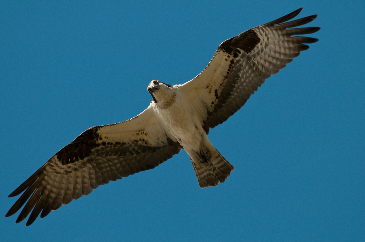
Second post of a bird in flight, and it is again an osprey. Took what I learn from the first post (4-20-11) and went out again. I feel there is improvement here, sut still a aways to go.
Please let me know what is not so good and what may be good?
All your help and comments are really apperciated. I feel this is better detail, exposure and sharper, than first post.
D300
Nikon 80-400m lens @ 400mm
Exposure- manual exposure
Center weight metering
Single focus point- but forgot to set to AF-C
F7.1
1/1250'a
ISO 320,
DOES THIS SEEM DARK ON YOUR COMPUTER? LOOKED GOOD ON MIND AT HOME BUT LOOKS BAD ON MY COMPUTER AT WORK- HOME IS A HD SCREEN???
Shoot in hight speed burst- Full Frame
Ron Huff
Culdesac

Comments
5 commentsVery lucky really, as if it had been looking straight ahead you probably wouldn't have been able to see either of it's eyes.
If this were mine I would add more canvas to each edge, though more to the upper ad LH edges than the lower and RH side.
The sharpness looks quite a bit better. It looks a little dark to me as well. I agree with Ashley about including some more room around the bird if you have it in the original or adding some canvas if you don't.
Thanks
Ron
The detail/DOF looks good, always room for improvement of course. I think there's a lot you could do in PS to bring up the under-wings, they don't need much. And with the right feathering of a selection, you could also bring up the sky, looks a bit too blue/dark..And of course more space around the bird, fairly easy to do with a BG like this.
Of course, I don't know if you've already done any of this - you don't say. You would get better feedback from the experts around here if you included specific info about what corrections you make to an image post.