Nature Photographers Network
This is the preserved archive of the original Nature Photographers Network. The community continues at naturephotographers.network.
Rock and Leaf
‹ PreviousLandscape GalleryNext ›

Rock and Leaf

by Neil Paskin

Gallery: LandscapePosted April 8, 2011106 views7 comments
I made this photo at the same time as the image in my last post at Kondalilla Falls.
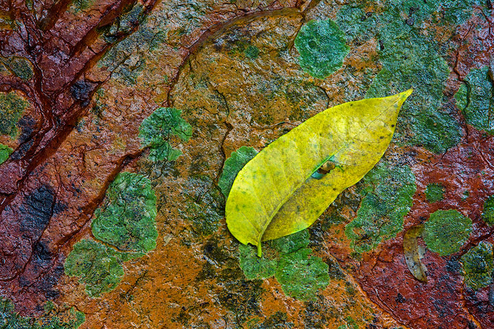
It was a little unoriginal (a bit like the title - I was struggling there) but I placed the leaf on the rock. I felt it was needed, even though I find the rock interesting as is this just added another element and gave the rock some sort of scale.

I opened this file in Photoshop to resize it for this post when I thought I'd try TK's latest Triple Play action, and even though I was already happy with the image it brought out more detail in the darks. Even better. :smile: I woudn't normally change the contrast in an image at this stage but it was just a small and improved adjustment.

Comments

7 comments
Comment posted by Shane McDermott on April 8, 2011 at 10:05 PM
Wow, this looks like a painters palette! I would consider de-saturating it a bit, and adding a vignette to add more emphasis to the leaf.

Cool shot! :toast:
Registered on November 12, 2007, 49 Posts, 1074 Comments
Comment posted by Steve Kennedy on April 8, 2011 at 10:12 PM
This is a very cool shot Neil! I love the color palette and you handled the light very well. Good details and I like the comp. Nice job!
Registered on March 9, 2009, 79 Posts, 676 Comments
Comment posted by Tony Kuyper on April 8, 2011 at 11:02 PM
I love these colors, Neil, and the subtle diagonals in the frame keep the eye engaged. The only thing I might suggest would be to burn down the highlights a bit, sort of like adding a polarizer to cut some of the glare. It sort lets more of the colors show through.
Registered on November 1, 2003, 364 Posts, 22328 Comments
Comment posted by Morris McClung on April 8, 2011 at 11:12 PM
I really like your comp and the colors here. I would agree with Tony's suggestion of taking the highlight shine down just a little. Well done.
Registered on May 7, 2007, 670 Posts, 19650 Comments
Comment posted by Andreas Resch on April 9, 2011 at 1:59 AM
These are some crazy colors - unusual but nice. I somewhat öike the hint of specular light on the rocks and the wet feeling this creates.
Registered on November 14, 2007, 322 Posts, 6101 Comments
Comment posted by Andreas Resch on April 9, 2011 at 1:59 AM
Registered on November 14, 2007, 322 Posts, 6101 Comments
Comment posted by Ian Cameron on April 9, 2011 at 6:06 PM
Nice Neil I love the shine on the rock glad you didn't lose that it helps with that touch of reality.
Registered on August 6, 2004, 1125 Posts, 3318 Comments