Nature Photographers Network
This is the preserved archive of the original Nature Photographers Network. The community continues at naturephotographers.network.
The Female
‹ PreviousAvian GalleryNext ›

The Female

by Ashley Vincent

Gallery: AvianPosted April 1, 201180 views9 comments
Canon EOS 7D, EF 500mm f/4L IS USM, Shutter Priority @ f/4 (1/400 sec), ISO 1250, Exposure Compensation: 2/3, Tripod, JPG from RAW, Cropped About 50% From Full Frame

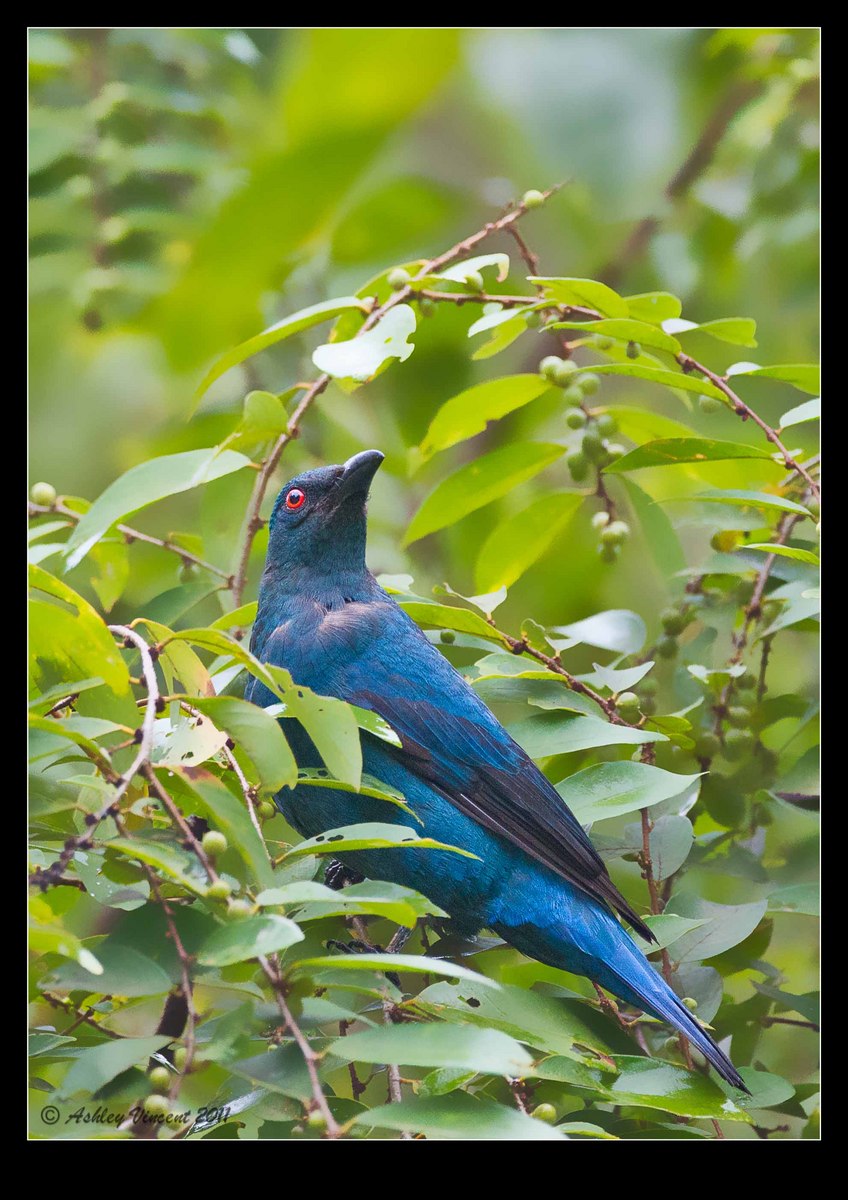
Following one from my previous post of a male Asian Fairy Bluebird, this here's the female, taken about 10 minutes before I scored that shot of the male.

Although there's a lot of foliage around, part of which obstructs her from view, I like this image as it reminds me how much patience was required in waiting until any of the several species of birds that came to this tree finally hopped into a position whereby I could actually squeeze off a frame. The pose and diagonals also appeal to me; I'm pretty fond of diagonal lines BTW ;^)

That said, thoughts, comments, suggestions and/or advice always welcome :^)

Kind regards,

Ashley

Comments

9 comments
Comment posted by Harry Harris on April 1, 2011 at 12:07 PM
Ashley, I like habitat in images and you captured it without distracting from the bird. I like the room you left on the top which is where I feel the bird is looking to. Thanks for sharing.
Registered on August 2, 2010, 169 Posts, 741 Comments
Comment posted by Jim DeWitt on April 1, 2011 at 12:13 PM
She appears to have given you some challenges. If it were mine, I'd try to tone down the leaf immediately above the bill; I'm not sure if it is blown, but it's bright enough to be distracting. And I'd crop out some of the that bright empty space at the top. In the larger version, I think I see some noise (which is surprising for your camera at ISO1250), especially in the dark colors on the bird, but I could be mistaken. But I'd still be happy to have this species in my portfolio.
Registered on August 28, 2006, 1240 Posts, 8506 Comments
Comment posted by S Govindarajan on April 1, 2011 at 2:50 PM
Another beauty, Ashley. A wonderful look at the eye. The inclusion of the foliage provides a nice habitat shot, not to mention a great contrast to the bluebird. The entire bird is sharp and the details in the larger version are very good.

I tend to agree with Jim in toning down the leaf on top. I would also move the bird a little more up the frame. Right now, it looks a little cramped at the bottom and losing a part of the blurred background will not decrease the impact.

Congrats on getting this beauty! Your patience has been well rewarded. :toast:
Registered on April 19, 2008, 115 Posts, 1921 Comments
Comment posted by Jim Hackley on April 1, 2011 at 3:32 PM
What a beautiful looking bird and I do not mind see the foliage, it really adds to an image. I also think toning down the bright leaf above the bird would help and a maybe a slight crop from the top. Nice job in getting this shot, way to go.
Registered on September 17, 2009, 302 Posts, 5535 Comments
Comment posted by Rick Cloran on April 1, 2011 at 3:56 PM
These are beautiful birds. Thanks for sharing them. I'd agree with the others on toning the bright leaf above the head and slight crop form the top.
Registered on April 6, 2004, 119 Posts, 1989 Comments
Comment posted by Rob Drummond on April 1, 2011 at 7:22 PM
Foliage doesn't bother me at all Ashley; in fact I think it adds to the overall setting and feel of the image. I'd be tempted to add a little to the bottom.

cheers
Rob
Registered on November 8, 2003, 617 Posts, 8267 Comments
Comment posted by Ashley Vincent on April 2, 2011 at 5:31 AM
Many thanks for your kind words and suggestions Harry, Jim, Govind, Jim H, Rick, and Rob :^)

In line with your recommendations I've reworked the image some again, reducing the brighter areas in some of the leaves (particularly the one you alerted my attention to directly above the subject) and, killing two birds with one stone - if such a phrase is permissible in this forum ;^) - I kept the same dimensions and size of the crop but shifted it down some; reducing the amount of empty space at the top of the frame, while adding a little more to the bottom.

Thanks again for the pointers guys :^)
Registered on March 1, 2011, 154 Posts, 2083 Comments
Comment posted by S Govindarajan on April 2, 2011 at 12:50 PM
Ashley: The repost looks much more balanced.
Registered on April 19, 2008, 115 Posts, 1921 Comments
Comment posted by Ashley Vincent on April 2, 2011 at 10:43 PM
Thanks again for the original suggestion Govind, and for coming back with approval of the repost :^)
Registered on March 1, 2011, 154 Posts, 2083 Comments