Nature Photographers Network
This is the preserved archive of the original Nature Photographers Network. The community continues at naturephotographers.network.
Dunes and Wind 2+Reposts
‹ PreviousLandscape GalleryNext ›

Dunes and Wind 2+Reposts

by Eva McDermott

Gallery: LandscapePosted February 27, 2011761 views32 comments
Thanks for your comments and critiques on my last post.

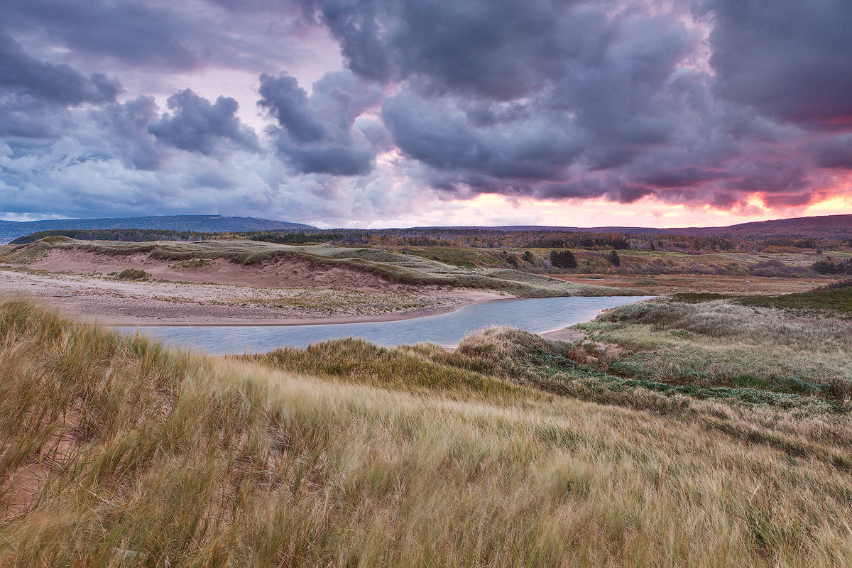
This image was taken at the same loction but one year earlier in Oct 2009. I would be interested in your thoughts on this version as the sky is more ominous, light very different, but the wind just as ferocious. There is some motion of the grass in the foreground. A little less motion blurred than my previous post captured at 4sec.

Canon 5DM2
Canon EF 24-70mm f/2.8L at 24mm
ISO200 2sec f/11
SR +2-Stop Reverse ND Gradient

Also this is the first image I processed with my new Lenovo W701ds laptop which has a built in color calibrator. How do the colors and brightness appear?

Comments

32 comments
Comment posted by Robert Stough on February 27, 2011 at 3:01 PM
I like this very much Eva. The foreground dunes and curve of slate-blue water lead the eye nicely towards that dramatic sky. My only suggestion would be to try and pull a bit more detail out of that bright horizon. Also luminosity and color fidelity look good to me.
Registered on November 20, 2010, 26 Posts, 273 Comments
Comment posted by David W. Kelly on February 27, 2011 at 3:34 PM
Beautiful comp and color Eva. I like the way the water runs through the middle of the image.
Registered on October 7, 2005, 883 Posts, 6590 Comments
Comment posted by Andrew Morrill on February 27, 2011 at 4:19 PM
Really like the color scheme. The composition really makes you feel like you're there. Color and brightness seem fine to me. Only nit, and might be compression, but some of the grass/river seem a tad over sharpened.
Registered on June 10, 2010, 51 Posts, 216 Comments
Comment posted by Basil Greber on February 27, 2011 at 4:34 PM
Colors and brightness look great, as does the composition. The more distant grass looks a bit like this is an HDR. Is this an effect of the ND grad you used? A great looking image in any case.
Registered on November 8, 2005, 219 Posts, 1340 Comments
Comment posted by Richard Teller on February 27, 2011 at 4:39 PM
I get a great sense of openness and depth in this image. I also like the color. The clouds give a real feeling of how fast and hard storms can roll across the open country.
Registered on August 23, 2010, 1162 Posts, 6692 Comments
Comment posted by Eva McDermott on February 27, 2011 at 5:01 PM
Hi Basil - This is not an HDR processed image. LR3 for initial adjustments, CS5 with TK luminosity layers and reduction of grad line that dipped below the horizon in a few spots.

Thanks everyone for your comments and critiques.

Here is a darker version for comparison. I think I like this better. Used TK Layers to darken the expanded midtones and TK Burn/Dodge layer to darken horizon above the hills.
Registered on January 4, 2009, 1015 Posts, 13229 Comments
Comment posted by Mark Seaver on February 27, 2011 at 5:25 PM
For me, this one is all about the drama in the sky...it's spectacular. I'd crop much of the foreground grass for a panorama look. I prefer version 2, feels much more menacing.
Registered on January 23, 2011, 1103 Posts, 17270 Comments
Comment posted by Tony Kuyper on February 27, 2011 at 5:36 PM
You've already addressed my thoughts in the second version. That one looks very natural and beautiful.
Registered on November 1, 2003, 364 Posts, 22328 Comments
Comment posted by Ian Cameron on February 27, 2011 at 5:38 PM
Hi Eva

A very nice shot with a ribbon of turquoise running between the dunes. You asked about colour and contrast and brightness, without really knowing the colour of the sand in the dunes and between the foreground grasses I do see what I consider to be a slight excess of red which is also (I feel) a little too dominant in the sky I also see a slight excess of cyan over and above what I would think should be there. It seems to me on my monitor at least that the cyan and red sat should be backed off a few percentage points. Brightness and contrast in the initial shot seems fine. For myself the second version seems a little too dark and menacing over and above what I'd expect to occur naturally.
Registered on August 6, 2004, 1125 Posts, 3318 Comments
Comment posted by Rick Goldwasser on February 27, 2011 at 5:46 PM
Very nice shot Eva, great drama! Nothing new to add so I'll just echo a couple of things: the darker version is a definite improvement and I do see just a litle too much red overall - very nice work.
Registered on May 10, 2009, 127 Posts, 970 Comments
Comment posted by Dan Baumbach on February 27, 2011 at 6:06 PM
I find the second version too dark. I think something in between would work better.

- Dan
Registered on November 1, 2003, 473 Posts, 7980 Comments
Comment posted by David Chauvin on February 27, 2011 at 6:53 PM
I love the way you have composed this truly grand scene, Eva. The sky in the second version looks a bit dark to me. Maybe something in between the two?
Registered on August 5, 2004, 1007 Posts, 5595 Comments
Comment posted by Eva McDermott on February 27, 2011 at 7:12 PM
Thanks Ian. Your feed back is the kind I am looking for. New computer and monitor so I am trying to make sure I am on the mark with color and brightness. While I calibrate, I did here with a built in calibrator on my new laptop - Xrite Huey Pro. I can always disable and recalibrate using my Xrite i1Display 2 if I have too but same supplier so not sure it will make much of a difference. I may experiment though.

Invreness sand on my side of the pond is reddish in nature. The sky, hard to tell if it may be due to the grad I used. I did back off on the reds and blues on the repost here. The new laptop monitor is so much brighter than my last (backlit RGB full gamaut 100% Adobe). Cyan back off did not seem to make a difference but blues did a little.

Thanks Dan and David. I see that now.
Registered on January 4, 2009, 1015 Posts, 13229 Comments
Comment posted by Dottie Short on February 27, 2011 at 7:55 PM
Oooh! This is yummy! The river just sweeps my eyes from left to right and the clouds are spectacular. I like the movement in the grass as it testifies to the wind that you describe. What does the SR refer to in the comps?
Registered on April 12, 2010, 61 Posts, 375 Comments
Comment posted by Eva McDermott on February 27, 2011 at 8:14 PM
SR refers to Singh Ray filters Dottie. Thanks for asking.
Registered on January 4, 2009, 1015 Posts, 13229 Comments
Comment posted by Vance Gese on February 27, 2011 at 8:37 PM
This is really a gorgeous image, Eva, and your composition really makes this phenomenal. How the dunes roll back like swells of the ocean,and the curve of the river carries the eye further back to that glorious color and clouds. Your third post nails it. Fantastic.
Registered on November 13, 2008, 298 Posts, 6629 Comments
Comment posted by Chris Chamberlain on February 27, 2011 at 9:49 PM
Looks great, Eva! Congrats on the new machine. I like that this doesn't really look like it has to be at the coast. Nice texture to the grasses.

Chris
Registered on March 13, 2007, 500 Posts, 8365 Comments
Comment posted by Mohsen Al-Dajani on February 27, 2011 at 10:14 PM
Really beautiful, your cloud is always very special, broken, low, and dramatic.
Registered on August 23, 2007, 160 Posts, 432 Comments
Comment posted by Lon Overacker on February 27, 2011 at 10:50 PM
Eva,

Third time is a charm for me! Thanks for working this as I think the progress worked and the final result is excellent. Although I would echo the over-sharpening comments at midground.

What I like here is the visual contrast between the threatening sky and the pastoral look and feel of the grasses. I know you said the wind was howling, but it's hard to get that sense here other than I see that the water surface isn't very still.... ;-) Overall, I think this is a great capture and wonderfully captures the essence of this place.

Lon
Registered on November 24, 2006, 521 Posts, 19147 Comments
Comment posted by Bob Miller on February 28, 2011 at 1:09 AM
I like the orig. A couple swipes with a large burn brush along the bottom at maybe 10 and it is done. Super comp.
Registered on January 24, 2005, 152 Posts, 405 Comments
Comment posted by SandyRichardsBrown on February 28, 2011 at 2:52 AM
Wow, another beauty!
Wonderful sky, and the lines and varying levels of the grass/dunes are very compelling.
Colors look great to me -

This would also be a nice entry for this week's WC -
Sandy
Registered on November 24, 2003, 3937 Posts, 12909 Comments
Comment posted by Peter Richter on February 28, 2011 at 4:12 AM
Eva, the third version is an overwhelming experience. I especially like the tangible texture of the grasses in the foreground, that makes me feel like standing in the middle of the scene.

Peter
Registered on November 10, 2010, 218 Posts, 2723 Comments
Comment posted by Nick Bristol on February 28, 2011 at 8:37 AM
This is really nice, Eva. I think you have captured the feel of this place very well. The 3rd post really does it for me too. I think you have fixed what it needed and it looks great. I love scenes like this. :toast:

Nick Bristol
Lone Rock, WI
Registered on February 1, 2004, 752 Posts, 14140 Comments
Comment posted by Bill Chambers on February 28, 2011 at 8:59 AM
Another beauty Eva. After looking at all three, I still prefer the first post. Looks very natural to me, Colors and brightness look very good to me.
Registered on April 10, 2005, 753 Posts, 21216 Comments
Comment posted by Abdullaziz Bin Ali on February 28, 2011 at 9:07 AM
Looks awesome
I like the first and the third post

Well done
Registered on May 31, 2009, 112 Posts, 1590 Comments
Comment posted by Steve Sieren on February 28, 2011 at 10:58 AM
Mesmerizing Eva! I can see every little detail here! :toast:
Registered on January 2, 2008, 360 Posts, 5321 Comments
Comment posted by Jason Kim on February 28, 2011 at 3:53 PM
Very nice, Eva. I'll throw a vote in for the 3rd post as well. I love the way the river snakes through the frame, this is a very elegant composition.
Registered on July 1, 2006, 60 Posts, 1233 Comments
Comment posted by Arild Heitmann on March 1, 2011 at 6:34 AM
The third one looks best, and the second one looks great too.... Awesome work!
Registered on October 13, 2010, 27 Posts, 378 Comments
Comment posted by Basil Greber on March 1, 2011 at 2:43 PM
I think the second re-post (third image) is spot-on. Not too bright, not too dark, most natural looking. :toast:
Registered on November 8, 2005, 219 Posts, 1340 Comments
Comment posted by Gary McGhee on March 1, 2011 at 3:01 PM
It's your third upload that works best for me too Eva with regards to the lighting. The comp is good with the river splitting the rolling hills giving good depth and topped off with some terrific clouds.

Gary.
Registered on April 15, 2010, 142 Posts, 2416 Comments
Comment posted by Lizzie Shepherd on March 3, 2011 at 6:16 PM
Stunning image Eva - I love the grasses and the threatening sky. I'm with the various comments regarding colour and balance between original and 2nd posts. Perhaps I miss a little of the lightness of the grass in the first - but not if that doesn't reflect what was there! Either way, this is one I'd be very keen to find a space for on my wall, were it mine :-)
Registered on March 2, 2011, 18 Posts, 120 Comments
Comment posted by Jared Ropelato on March 4, 2011 at 12:11 AM
I liked the first one, then the second, now the third! Way to work out the little nits. Such beautiful color, rich drama, and brilliant shades and tones throughout the grasses. Great work, just great.
Registered on March 1, 2011, 25 Posts, 204 Comments