Gallery: LandscapePosted February 25, 2011113 views7 comments
hi everyone,
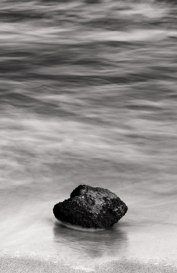
from 2008 taken by Nikon D300 & it was my first shot with it. i have used the multi purpose lens 18-200mm nikkor @ 200mm
all the comments are welcome
thanks
Comments
7 comments
Comment posted by Preston Birdwell on February 25, 2011 at 1:24 PM
I really like minimalist images, Hamed. The B&W treatment works nicely for this one. The rock looks a tad soft, but the image still works.
--P
Registered on November 1, 2003, 471 Posts, 5188 Comments
Comment posted by Andreas Resch on February 25, 2011 at 2:04 PM
Simple and effective. Often less is more. Well done, Hamed.
Registered on November 14, 2007, 322 Posts, 6101 Comments
Comment posted by Richard Teller on February 25, 2011 at 2:37 PM
This an artistic image, but it doesn't really work for me. Probably just personal preference.
Registered on August 23, 2010, 1162 Posts, 6692 Comments
Comment posted by Nancy Lea Sandy on February 25, 2011 at 2:58 PM
I like this. The contrast between the rock and softer waves works well for me but I'm not wild about the vertical crop. Theres a sense of flow here I feel the vertical treatment inhibits. A very peaceful image
Registered on January 24, 2011, 576 Posts, 6942 Comments
Comment posted by Luis Argerich on February 25, 2011 at 2:58 PM
Hi Hamed,
I'd have liked more negative space on the sides to make this more minimalistic.
I like how you rendered the water.
The rock does look quite soft on my screen too.
Registered on December 22, 2009, 91 Posts, 1349 Comments
Comment posted by Brad Kargus on February 25, 2011 at 7:07 PM
Hamed,
I often don't consider the title when considering an image but, in this case, I think the title carries a lot of meaning with the composition. If feels right that "the one" is centered, at least in the horizontal. The contrast of the rock's dark, heavy tones against the lighter water also feels right. I also like how there is enough of a sense of movement in the water texture to balance the stillness of "the one".
I wrote the above before reading the comments and Nancy's comment regarding the crop made me think further on why I like it. I think it's because a wider view would make the flow seem to surround the rock. IMHO, the crop seems to separate "the one" partially from its surroundings and so it is consistent with the effect of the light-dark contrast and movement-stillness effect. In other words, the choices made in processing the image feel consistent with how I perceive it.
To anyone reading, please note I am not debating Nancy's comment at all. It just made me think a little more about my own response.
Brad
Registered on January 19, 2007, 47 Posts, 1051 Comments
Comment posted by R.Bill Moser on February 26, 2011 at 8:38 AM
This is well done, Hammed.
Registered on January 29, 2010, 285 Posts, 4281 Comments

Comments
7 comments--P
I'd have liked more negative space on the sides to make this more minimalistic.
I like how you rendered the water.
The rock does look quite soft on my screen too.
I often don't consider the title when considering an image but, in this case, I think the title carries a lot of meaning with the composition. If feels right that "the one" is centered, at least in the horizontal. The contrast of the rock's dark, heavy tones against the lighter water also feels right. I also like how there is enough of a sense of movement in the water texture to balance the stillness of "the one".
I wrote the above before reading the comments and Nancy's comment regarding the crop made me think further on why I like it. I think it's because a wider view would make the flow seem to surround the rock. IMHO, the crop seems to separate "the one" partially from its surroundings and so it is consistent with the effect of the light-dark contrast and movement-stillness effect. In other words, the choices made in processing the image feel consistent with how I perceive it.
To anyone reading, please note I am not debating Nancy's comment at all. It just made me think a little more about my own response.
Brad