Nature Photographers Network
This is the preserved archive of the original Nature Photographers Network. The community continues at naturephotographers.network.
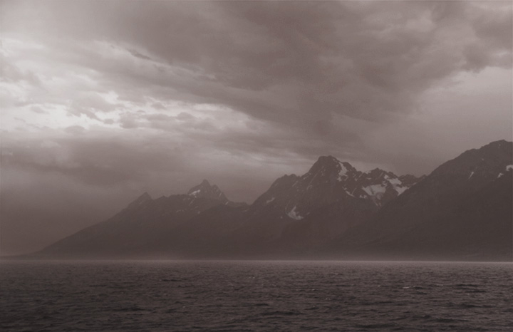
Storm over Jackson Lake + repost
‹ PreviousLandscape GalleryNext ›

Storm over Jackson Lake + repost

by Cristina Strudthof

Gallery: LandscapePosted February 18, 201188 views8 comments
This photo was taken in August and is a storm rolling through Teton NP. It was rainy and windy so I took the shot from inside my car. The original image had a bluish cast to it but I felt a B&W would make for more interesting viewing. I adjusted the curves and increased the contrast to make the sky more ominous. The fuzzy white line between the lake and the mountains occurred naturally, I guess because of the shutter speed and the crashing waves in the distance. Let me know what you think.

Nikon D300s, f/4.5, 1/40, ISO 200, 44mm

Comments

8 comments
Comment posted by Nancy Lea Sandy on February 18, 2011 at 9:29 AM
The image certainly carries the feel of a storm. I think B&W was a good choice for this, but
there seems to be a mauve tint to the image that detracts a bit from it. IMO the compostitional elements are well handled
Registered on January 24, 2011, 576 Posts, 6942 Comments
Comment posted by Cristina Strudthof on February 18, 2011 at 9:39 AM
Thanks for your comment Nancy, I made an adjustment and this is the result.
Registered on January 14, 2011, 53 Posts, 363 Comments
Comment posted by Peter Richter on February 18, 2011 at 1:39 PM
Christina, the low contrast stresses the threatening atmosphere well. An interesting view!

Peter
Registered on November 10, 2010, 218 Posts, 2723 Comments
Comment posted by Richard Teller on February 18, 2011 at 2:10 PM
I like the second image better. It gives you the feel of the approaching storm for sure.
Registered on August 23, 2010, 1162 Posts, 6692 Comments
Comment posted by Raymond D Smith on February 18, 2011 at 4:33 PM
The second image is very nice Cristina. Great conditions to be shooting in or out of your car. I could even see blacking with the black point and the white point a bit. Well done Cheers
Registered on January 22, 2009, 12 Posts, 479 Comments
Comment posted by Rodrigo Sandoval on February 18, 2011 at 4:39 PM
Cristina,
Wonderful B&W image. I agree, for this case it was the best choice. I also like the second version much better. I still miss just a bit of extra contrast, but probably that will play against the mood of the weather that day. I just feel the clouds could benefit from that extra contrast.
Anyway, a nice shot anyway.
Registered on April 4, 2009, 13 Posts, 254 Comments
Comment posted by Steve Sieren on February 18, 2011 at 9:47 PM
If you wanted the tone I do not think there is anything wrong with adding a tone to the image.
Registered on January 2, 2008, 360 Posts, 5321 Comments
Comment posted by Jason Kim on February 18, 2011 at 10:41 PM
Very moody, I like it. The tone in the first image is pretty bold, and I like it. I think the B&W might work better with a bit more contrast added, maybe play around in the channel mixer to darken the darks and help capture the same mood as in the first post.
Registered on July 1, 2006, 60 Posts, 1233 Comments