Gallery: LandscapePosted February 8, 2011707 views41 comments
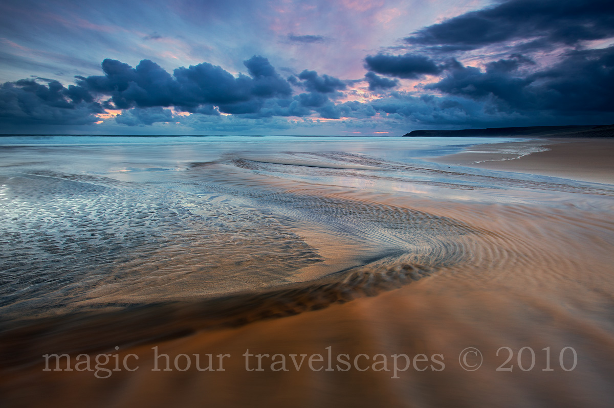
Isle of Lewis, Scotland
Some cool patterns at Traigh Mor beach. I tried to find the same composition the next morning but everything had changed.
Canon 5DMkII, 16-35mm 2.8L, ISO 100, f11, 4s, GND filter.
Comments
41 comments
Comment posted by Alex Mody on February 9, 2011 at 12:22 AM
This is too good. The lines, clouds, and light all come together to form a spectacular scene, which you have captured wonderfully.
Registered on December 25, 2007, 163 Posts, 1896 Comments
Comment posted by Daniel Cartamil on February 9, 2011 at 12:27 AM
One of the most beautiful coastal scenes I have seen in a while. If I had to really nitpick, I would say that maybe the top right corner is a bit dark, esp. at the horizon line. The colors and symmetry are stunning.
Registered on November 15, 2007, 50 Posts, 601 Comments
Comment posted by Koveh Tavakkol on February 9, 2011 at 12:36 AM
The wide array of colors throughout the scene are excellent here.
Registered on September 1, 2009, 41 Posts, 608 Comments
Comment posted by dean hebert on February 9, 2011 at 1:03 AM
Cool! I love the line and sense of motion. The colours are pretty intense.
Registered on August 4, 2010, 70 Posts, 1132 Comments
Comment posted by Aaron Feinberg on February 9, 2011 at 1:24 AM
Awesome lines and colors. Woah. And yea...beaches are never the same 2 days in a row ;)
aF
Registered on October 26, 2009, 399 Posts, 2789 Comments
Comment posted by Barry Ashenhurst on February 9, 2011 at 2:45 AM
Lovely shot old mate. Yeah, I like this a lot.
Registered on August 4, 2009, 253 Posts, 455 Comments
Comment posted by Rick Lundh on February 9, 2011 at 3:17 AM
Man...what is wrong with this group and lack of comments! This is one AMAZINGLY beautiful image! The detail is really extrordinary here
Registered on April 28, 2004, 774 Posts, 4351 Comments
Comment posted by Stan Rose on February 9, 2011 at 3:27 AM
Very nice! Beautiful comp and some great detail/color in the water especially. The urhc is a tiny bit dark. Im also wondering--if its even possible or practical--about the clouds up top, they are quite blue/cyan. I am wondering if they were neutralized a bit, it might be a better color balance, since the distant ocean would stand out better (blue against gray rather than blue against blue) and it would also help the beautiful reds in the sky stand out better--those low clouds dont really deserve to be colorful here, but the pink cirrus and sea definitely do.
I think this could be accomplished with a sat/vibrance mask and selective warming of the sky. Just a thought.
Registered on September 15, 2005, 836 Posts, 17099 Comments
Comment posted by Balakumar Kaushik on February 9, 2011 at 7:09 AM
Very very beautiful scene Kah Kit. Loved the overall colours and especially the colours reflected off the low waters in the middle. The stripe-like patterns in the FG adds a lot to the image.
Registered on January 4, 2008, 98 Posts, 1403 Comments
Comment posted by Guy Tal on February 9, 2011 at 7:17 AM
Excellent composition and processing. Really not much to add. Your attention to detail and excellent skill are very evident here.
Guy
Registered on November 1, 2003, 566 Posts, 15507 Comments
Comment posted by Nick Bristol on February 9, 2011 at 9:59 AM
This is beautiful. Great comp and wonderful colors. The combination of sand and water here is fantastic.
Nick Bristol
Lone Rock, WI
Registered on February 1, 2004, 752 Posts, 14140 Comments
Comment posted by Raymond D Smith on February 9, 2011 at 10:03 AM
This is a tremendous seascape Kah. I can't image that this one is from Scotland looks like it should be from New Zealand. The foreground textures lines and patterns are a photographers dream, they create an awesome lead in. I second Stan's critique of taking down the blues in the clouds and there looks to be some CA around some of them in the larger version. An Awesome capture and is up there with some of your best seascapes. Cheers
Registered on January 22, 2009, 12 Posts, 479 Comments
Comment posted by Ian Cameron on February 9, 2011 at 10:07 AM
Excellent Kah Kit great shot and very beautiful light.
Registered on August 6, 2004, 1125 Posts, 3318 Comments
Comment posted by Lorna Taylor on February 9, 2011 at 10:52 AM
Stunning work, just perfect!
Registered on November 12, 2010, 254 Posts, 3083 Comments
Comment posted by Eva McDermott on February 9, 2011 at 11:03 AM
Amazing view Kah Kit! The textures and color are stunning. Beautiful work.
Registered on January 4, 2009, 1015 Posts, 13229 Comments
Comment posted by Mark Metternich on February 9, 2011 at 11:59 AM
As with all your work, beautiful.
I too would be inclined to balance the tones a tad more in the right/upper area.
Registered on June 19, 2009, 276 Posts, 6240 Comments
Comment posted by Jimmy Gekas on February 9, 2011 at 12:12 PM
This is great! Love the curves and water patterns. The colors of the sand and water are sweet, as are the colors in the sky. I really like the simplicity of the foreground, too. Well done, Kah Kit.
Registered on July 26, 2007, 244 Posts, 2807 Comments
Comment posted by Andreas Resch on February 9, 2011 at 12:50 PM
Great composition and lines, Kah. You've captured some awesome drama here.
Registered on November 14, 2007, 322 Posts, 6101 Comments
Comment posted by Gary Crabbe on February 9, 2011 at 1:00 PM
That is one beautiful seascape! I really like the visual line that carries me through photo.
Registered on November 1, 2003, 182 Posts, 1840 Comments
Comment posted by Jason Kim on February 9, 2011 at 1:07 PM
Wonderful lines and shapes, the foreground is spectacular considering the fact that it's essentially flat sand. Really nice seascape.
Registered on July 1, 2006, 60 Posts, 1233 Comments
Comment posted by Paul Breitkreuz on February 9, 2011 at 1:20 PM
Larger version is gorgeous, Kah. As always excellent work throughout.
Registered on February 25, 2006, 525 Posts, 8448 Comments
Comment posted by Michael J Greene, on February 9, 2011 at 2:22 PM
Lovely composition and killer conditions Kah. While the satuation levels overall seem a bit high, I still find the color of the sand palatable.However, I find the cyan levels in the clouds and surf to transcend what I would consider to be "reality" or aesthetically pleasing for that matter. Obviously, I am in the minority though....
Michael
Registered on June 18, 2009, 86 Posts, 2317 Comments
Comment posted by R.Bill Moser on February 9, 2011 at 3:42 PM
This is awesome. Intense colors and good use of lines to compose this image. Well done
Registered on January 29, 2010, 285 Posts, 4281 Comments
Comment posted by Lon Sharp on February 9, 2011 at 4:15 PM
Terrific. The colors make this one special.
Registered on December 9, 2007, 258 Posts, 9892 Comments
Comment posted by Dietrich Gloger on February 9, 2011 at 4:33 PM
Very impressive image Kah Kit! The color combo here is very unorthodox and weird, but I don't find it to look unatural or processed, for some reason. The composition is very strong, the water looks amazing and the curved line works great.
Registered on January 26, 2007, 360 Posts, 9876 Comments
Comment posted by Daniel & Loana on February 9, 2011 at 4:52 PM
Wonderful!
D&L
Registered on October 7, 2008, 166 Posts, 3044 Comments
Comment posted by Jim Lou on February 9, 2011 at 5:10 PM
I like different motifs formed by the sand, water and clouds. Also, excellent s curve to lead eyes into the frame.
Registered on August 3, 2010, 86 Posts, 273 Comments
Comment posted by Scott Bycroft on February 9, 2011 at 6:16 PM
The composition and mood of the image are really effective. Nice movement makes it come alive.
You have obviously pushed the colours a way, and the image is quite contrasty, and whilst I don't find it entirely natural, it works well together.
Nice one.
Registered on September 24, 2008, 14 Posts, 13 Comments
Comment posted by Anne K. Rusk on February 9, 2011 at 9:21 PM
Excellent lines, beach, sky. All awesome!!!
Registered on October 10, 2010, 65 Posts, 904 Comments
Comment posted by Vance Gese on February 10, 2011 at 1:12 AM
Phenomenal. The motion, color, and tones in the water are amazing; so unusual, fascinating, and beautiful.
Registered on November 13, 2008, 298 Posts, 6629 Comments
Comment posted by Gary Yeoh on February 10, 2011 at 4:01 AM
Kah Kit:
Really beautiful.
Registered on September 1, 2009, 588 Posts, 8184 Comments
Comment posted by Darren Huski on February 10, 2011 at 8:30 AM
Fantasitc!
Registered on August 17, 2008, 61 Posts, 340 Comments
Comment posted by Pramod Viswanath on February 10, 2011 at 9:30 AM
Simply Fabulous image Kah Kit!
Registered on December 4, 2008, 60 Posts, 697 Comments
Comment posted by Gabi Lach on February 10, 2011 at 9:42 AM
Great capture! Dramatic, dynamic and beautifully composed.
Registered on May 1, 2007, 101 Posts, 3187 Comments
Comment posted by Mark Metternich on February 10, 2011 at 1:06 PM
Yo Kah Kit, I came back to this because it rocks and because I was not on a calibrated monitor at the time. Still think it rocks and still feel the upper right is heavy, but now I notice your blue intensity in the clouds may be eligible for toning town. Otherwise, I'd certainly sell it, and hang it on my wall!
Registered on June 19, 2009, 276 Posts, 6240 Comments
Comment posted by Roman Kurywczak on February 10, 2011 at 2:49 PM
Very, very, nice!!! This just has an almost surreal look to it.....outstanding!
Registered on November 20, 2009, 56 Posts, 748 Comments
Comment posted by Anthony Vincent on February 10, 2011 at 5:28 PM
Fantastic image man.
Registered on February 5, 2009, 199 Posts, 2775 Comments
Comment posted by Matthew Goldsmith on February 10, 2011 at 9:29 PM
Beautiful image. I love the S-curve leading into that amazing blue water. Very unusual color.
Registered on June 29, 2010, 37 Posts, 286 Comments
Comment posted by Tony Kuyper on February 10, 2011 at 11:26 PM
Sweet. Wouldn't've guessed Scotland.
Registered on November 1, 2003, 364 Posts, 22328 Comments
Comment posted by Morris McClung on February 11, 2011 at 10:15 AM
Fascinating patterns in the water, and gorgeous color. Outstanding image!
Registered on May 7, 2007, 670 Posts, 19650 Comments
Comment posted by Chris Chamberlain on February 13, 2011 at 7:21 PM
It's a fine composition, and gorgeous scene. Excellent conditions for this. Nice colors through out as well. My honest opinion about the blues in the clouds, and the cyan in the surf line is that it's too much. Maybe some neutralizing in thise areas and this is a stunner!
Chris
Registered on March 13, 2007, 500 Posts, 8365 Comments

Comments
41 commentsaF
Lovely shot old mate. Yeah, I like this a lot.
I think this could be accomplished with a sat/vibrance mask and selective warming of the sky. Just a thought.
Guy
Nick Bristol
Lone Rock, WI
I too would be inclined to balance the tones a tad more in the right/upper area.
Michael
D&L
You have obviously pushed the colours a way, and the image is quite contrasty, and whilst I don't find it entirely natural, it works well together.
Nice one.
Really beautiful.
Chris