Gallery: LandscapePosted February 7, 2011361 views27 comments
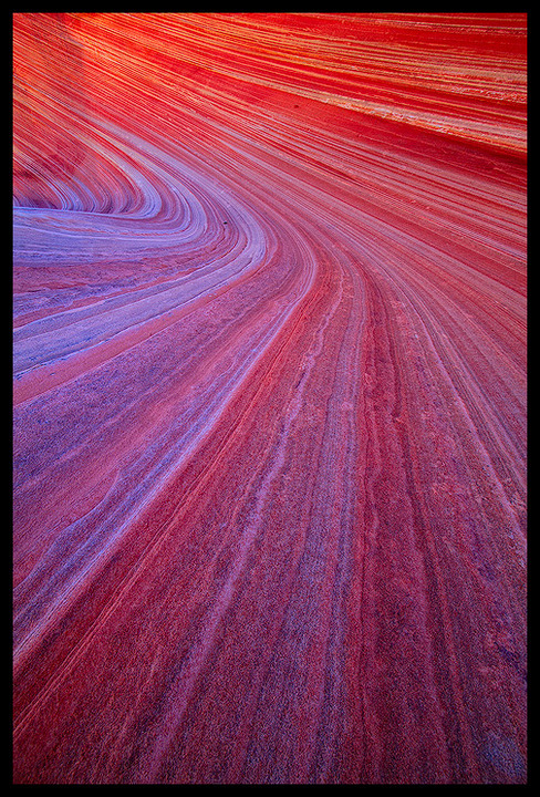
Another image from my recent trip to the Wave. What a fantastic location to photograph!
Thanks in advance for any C&C's!
Comments
27 comments
Comment posted by Michael J Greene, on February 7, 2011 at 1:49 PM
Great depth of field and color Justin. I wonder if it wouldn't work even better as a horizontal....
Michael
Registered on June 18, 2009, 86 Posts, 2317 Comments
Comment posted by Bill Chambers on February 7, 2011 at 2:07 PM
Love the comp, and the color is quite intense, but not overly so. Well done.
Registered on April 10, 2005, 753 Posts, 21216 Comments
Comment posted by Floris van Breugel on February 7, 2011 at 2:29 PM
Now that sure is some color.. maybe a bit too much for me. I'm going to do my best to resist joining the Colombia River School in its quest for arguably over intensified colors Love the composition, lots of motion here.
Registered on December 19, 2008, 306 Posts, 4840 Comments
Comment posted by R.Bill Moser on February 7, 2011 at 2:30 PM
Great colors....beautiful lines. I love the comp.
Registered on January 29, 2010, 285 Posts, 4281 Comments
Comment posted by Jason Kim on February 7, 2011 at 2:51 PM
Nice one. Another reminder that I simply must visit this place.
Registered on July 1, 2006, 60 Posts, 1233 Comments
Comment posted by Marc Adamus on February 7, 2011 at 3:16 PM
Light speed ahead! Awesome!
Registered on September 17, 2005, 780 Posts, 8091 Comments
Comment posted by Aaron Feinberg on February 7, 2011 at 4:08 PM
My kind of comp. Killer
aF
Registered on October 26, 2009, 399 Posts, 2789 Comments
Comment posted by Mark Metternich on February 7, 2011 at 4:10 PM
Very nice classic comp Justin. The colors are too saturated (especially orange/red) for my taste on my monitor, but once fine tuned this is a striking image.
Registered on June 19, 2009, 276 Posts, 6240 Comments
Comment posted by Joel Hazelton on February 7, 2011 at 4:15 PM
Very nice, I love the simple curve and color gradient.
Registered on August 6, 2008, 194 Posts, 1315 Comments
Comment posted by dean hebert on February 7, 2011 at 5:11 PM
Love it!
Registered on August 4, 2010, 70 Posts, 1132 Comments
Comment posted by Dietrich Gloger on February 7, 2011 at 5:25 PM
Great dynamics in this comp. Not much more to say. Oh yes, some great glow too.
High impact work Justin!
Registered on January 26, 2007, 360 Posts, 9876 Comments
Comment posted by Gary McGhee on February 7, 2011 at 6:08 PM
Cracking shot Justin, the lines really draw me in and the colour is fantastic.
Gary.
Registered on April 15, 2010, 142 Posts, 2416 Comments
Comment posted by Eva McDermott on February 7, 2011 at 8:35 PM
Fantastic color and lines Justin!
Registered on January 4, 2009, 1015 Posts, 13229 Comments
Comment posted by Vance Gese on February 7, 2011 at 10:42 PM
Incredible lines and color, Justin. Amazing, amazing work.
Registered on November 13, 2008, 298 Posts, 6629 Comments
Comment posted by Chris Chamberlain on February 7, 2011 at 10:59 PM
I never looked at the title, but that's what I was thinking this looked like too! Impressive neon color, and great perspective.
Chris
Registered on March 13, 2007, 500 Posts, 8365 Comments
Comment posted by Kory Lidstrom on February 7, 2011 at 11:21 PM
Awesome, this is a rare image where the title is crucial. The one you choose works perfectly!
Registered on November 19, 2008, 49 Posts, 1035 Comments
Comment posted by Tony Kuyper on February 7, 2011 at 11:31 PM
This is nice, Justin. I've tried to get something similar to this, but it never worked out this well. Wondering if the seasonal light might be the deciding factor.
Registered on November 1, 2003, 364 Posts, 22328 Comments
Comment posted by Harley Goldman on February 7, 2011 at 11:35 PM
Cool perspective with the lines and colors. Very well done.
Registered on November 19, 2003, 586 Posts, 11271 Comments
Comment posted by Stuart Williams on February 8, 2011 at 1:25 AM
my preferred image from you visit to this location. superb.
Registered on December 7, 2007, 247 Posts, 4792 Comments
Comment posted by James Fougère on February 8, 2011 at 2:12 AM
I need my seatbelt on for this ride
Registered on October 25, 2010, 41 Posts, 831 Comments
Comment posted by Harry Lichtman on February 8, 2011 at 9:59 AM
Loks like a slingshot to me! Great texture and color - not sure about the saturation having never been there. I'm sure the lighting could make it drab or electric. Definately electric here!
Registered on September 17, 2010, 304 Posts, 3507 Comments
Comment posted by Luis Argerich on February 8, 2011 at 11:03 AM
Wow Justin!
Totally uber-beautiful, fantastic.
Registered on December 22, 2009, 91 Posts, 1349 Comments
Comment posted by Dorin Bofan on February 8, 2011 at 4:11 PM
Simply awesome, Justin! The dynamic and the colors are a feast for the eyes.
Registered on April 30, 2007, 122 Posts, 3086 Comments
Comment posted by Alex Mody on February 8, 2011 at 5:46 PM
This is very intelligently composed, and I like it a lot! I might suggest toning down the colors, but that would just be my personal preference. It seems like you did really well out there!
Registered on December 25, 2007, 163 Posts, 1896 Comments
Comment posted by Morris McClung on February 8, 2011 at 9:07 PM
Excellent use of lines and yes, it does look like the bank at Daytona! The colors are a bit strong, but I like 'em.
Registered on May 7, 2007, 670 Posts, 19650 Comments
Comment posted by Jimmy Gekas on February 9, 2011 at 12:17 PM
Sweet colors and lines.
Registered on July 26, 2007, 244 Posts, 2807 Comments
Comment posted by Matthew Goldsmith on February 10, 2011 at 9:48 PM
Fantastic lines.
Registered on June 29, 2010, 37 Posts, 286 Comments

Comments
27 commentsMichael
aF
High impact work Justin!
Gary.
Chris
Totally uber-beautiful, fantastic.