Nature Photographers Network
This is the preserved archive of the original Nature Photographers Network. The community continues at naturephotographers.network.
Heavenly World + RP
‹ PreviousLandscape GalleryNext ›

Heavenly World + RP

by Michael J Greene,

Gallery: LandscapePosted January 6, 2011430 views16 comments
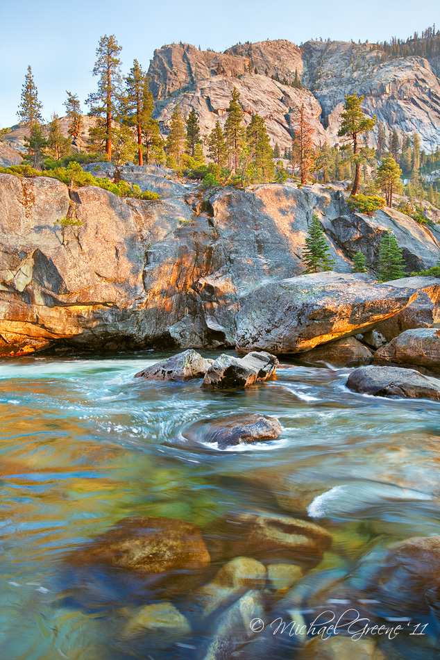
Summer inspiration here. Taken a couple of years back during a 6 day backpacking trip referred to in guidebooks as the Northern Yosemite Loop. This was taken during our last night in the wilderness while traveling up the Grand Canyon of the Tuolumne. It was a hot, grueling day and I was physically spent...

I am very interested in reading your feedback here as I just finished reprocessing this image. Larger version included too.

5DMK2
16-35
F/14
1/4 sec

Comments

16 comments
Comment posted by Bill Chambers on January 6, 2011 at 12:59 PM
I really like this Michael - beautiful light and very nice comp. Perfect shutter speed for the water motion too.
Registered on April 10, 2005, 753 Posts, 21216 Comments
Comment posted by Mat Malone on January 6, 2011 at 1:07 PM
Despite the your exhaustion it looks like a beautiful spot to rest, it makes me want to see this part of the park for myself. Comp and light work very well for me. I am not so sure about the processing. It looks HDR-ish to me. Maybe pull back on the contrast and saturation?
Registered on December 15, 2008, 91 Posts, 882 Comments
Comment posted by Kartik Venkatarama on January 6, 2011 at 1:10 PM
My idea of paradise! Lovely. I do think it's a tad on the bright side though, would darken it a bit and bump up contrast - essentially playing with Curves in PS.
Registered on July 27, 2007, 197 Posts, 830 Comments
Comment posted by Larry Reitz on January 6, 2011 at 2:11 PM
Beautiful image, well worth the effort. No nits here.
Registered on September 7, 2007, 32 Posts, 335 Comments
Comment posted by Robert Stough on January 6, 2011 at 3:53 PM
A lovely scene very well composed. I generally like the processing here, my only nit being I think the foreground pool might be a little darker.
Registered on November 20, 2010, 26 Posts, 273 Comments
Comment posted by Gary Crabbe on January 6, 2011 at 4:17 PM
Despite the slightly opened up (HDR) appearance, I especially love the glimpse into that water. It looks so inviting.
Registered on November 1, 2003, 182 Posts, 1840 Comments
Comment posted by Nick Bristol on January 6, 2011 at 4:37 PM
This is really nice, Michael. The light and color are wonderful. The water is very cool, and I like the rocks under it in the foreground. The comp works very well. On my monitor it does seem to be just a little bright overall, but still beautiful.

Nick Bristol
Lone Rock, WI
Registered on February 1, 2004, 752 Posts, 14140 Comments
Comment posted by Michael J Greene, on January 6, 2011 at 5:52 PM
Thanks everyone. I am finding that opening the shadows is a must when printing as is increasing the brightness. My prints have been coming dark and the shadows slightly blocked up. Unless you are viewing with a direct light source or in natural light the colors just don't look good. While the result for web viewing may be more synthetic or HDRish, it does translate to a better looking finished product.

I guess I could edit for the web and print; I just don't feel like it right now. On the repost, I've reduced the brightness about 10 points increased the blacks and slightly darkened the image with a curves adjustment.
Registered on June 18, 2009, 86 Posts, 2317 Comments
Comment posted by Morris McClung on January 6, 2011 at 8:25 PM
Excellent comp! I would like to see a print of this, but for the purposes of viewing here, it does looks like it lacks contrast and a richness to the color.
Registered on May 7, 2007, 670 Posts, 19650 Comments
Comment posted by Tony Kuyper on January 6, 2011 at 10:20 PM
I like the comp and the light. Foreground maybe looks a bit over-engineered relative to the background. Looks like a lovely place to rest.
Registered on November 1, 2003, 364 Posts, 22328 Comments
Comment posted by Vance Gese on January 6, 2011 at 11:57 PM
Beautiful light, color, and composition, Michael. Love the warm quality of the light and the wonderful color in the water. This must make a stunning print.
Registered on November 13, 2008, 298 Posts, 6629 Comments
Comment posted by Shane McDermott on January 7, 2011 at 12:27 AM
this is totally cool! Great depth and color, as well the comp is superb!

Shane
Registered on November 12, 2007, 49 Posts, 1074 Comments
Comment posted by Catherine Reilly on January 7, 2011 at 1:47 AM
Glorious light and great action in the water's flow. Looks beautiful to me. Definitely conveys a feeling of summer. Quite artistic, too.
Registered on August 16, 2006, 603 Posts, 9192 Comments
Comment posted by Kent Mearig on January 7, 2011 at 1:49 AM
Personally, I'm wondering what you might think about cropping the submerged boulders at the bottom. As interesting as they are in their own right, the don't mesh very well with the rest of the scene for me (particularly their colors and those of the surrounding water). The trees are what I really love about the photo - they are really beautiful - but I lose my connection with them down at the bottom. The exposed rocks and the surface of the water are enough to complete the story for me - those are two other really nice components.
Registered on September 4, 2006, 237 Posts, 4748 Comments
Comment posted by Chris Chamberlain on January 7, 2011 at 9:37 PM
I think it looks good, Michael! Slightly hdr-ish, but not hdr to me. Nice bright rich colors to my eye. I would have been in that river at the end of a long hike on a hot day!

Chris
Registered on March 13, 2007, 500 Posts, 8365 Comments
Comment posted by Roger Kirchen on January 31, 2012 at 9:38 PM
When I saw the thumbnail, I though of an impressionist painting. Love the composition and colors. Good shutter speed for the water.
Registered on March 6, 2011, 95 Posts, 847 Comments