Nature Photographers Network
This is the preserved archive of the original Nature Photographers Network. The community continues at naturephotographers.network.
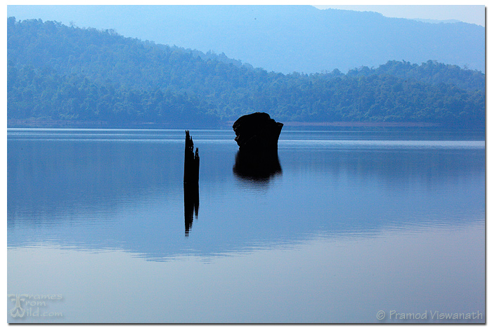
Reflections of dead
‹ PreviousLandscape GalleryNext ›

Reflections of dead

by Pramod Viswanath

Gallery: LandscapePosted January 4, 201188 views8 comments
Been a long time since I have posted images here, however I have been active member by commenting, admiring and learning from some of the best landscape photographers in the world.

Made this image in the Western Ghats of the Indian subcontinent.

Thanks in advance for looking. Appreciate your thoughts and views on this image.

Comments

8 comments
Comment posted by Bill Chambers on January 4, 2011 at 10:10 AM
Very peaceful and soothing, and I like the bluish haze. A couple of small nits - I do wish the shadows were opened up a little to allow some detail to show in the FG elements, and there's a tiny dust spot in the upper center. I love the varied hues of blue in the water, that really attracts my eye.
Registered on April 10, 2005, 753 Posts, 21216 Comments
Comment posted by Pramod Viswanath on January 4, 2011 at 10:42 AM
Thanks bill for your views. Missed the dust spot though it was blatant! :(

Attached is slightly opened up version of the image
Registered on December 4, 2008, 60 Posts, 697 Comments
Comment posted by Pramod Viswanath on January 4, 2011 at 10:43 AM
And here is the B&W version of the same.
Registered on December 4, 2008, 60 Posts, 697 Comments
Comment posted by Raymond D Smith on January 4, 2011 at 11:15 AM
Pramod the repost looks good,you have opened up the shadows nicely. I do now see a touch of a halo around the rock and stump though. I think you are getting closer. Nice picture. Cheers
Registered on January 22, 2009, 12 Posts, 479 Comments
Comment posted by Luis Argerich on January 4, 2011 at 12:20 PM
Very simple, very blue and very nice.
Registered on December 22, 2009, 91 Posts, 1349 Comments
Comment posted by Richard Teller on January 4, 2011 at 12:27 PM
Nice simple image. The only thing is I am left wishing the two main elements were more prominent in the pic.
Registered on August 23, 2010, 1162 Posts, 6692 Comments
Comment posted by Barry Vangrov on January 4, 2011 at 4:05 PM
I have to disagree with Bill. I like the original much better than the repost. It's the fact the the stumps are in silhouette that I like. Opening up the shadows to include the details takes that away. I also like the blue haze. I might crop the top to leave out the small portion of sky in upper right.
Registered on September 1, 2009, 148 Posts, 749 Comments
Comment posted by Lon Overacker on January 4, 2011 at 9:27 PM
Pramod,

Thanks for posting. I'm with Barry on the original. I think the jet-black silhouette has more of an impact, especially in communicating the title you have chosen. And I think the sharp contrast with the hazy blue background is effective as well.

My only suggestion, at least opinion, is that this appears to have a slight tilt; it's very slight, but the lines in the water seem to be rotated slightly CW. Also, I would agree a slight crop of the top to remove the sky; it would simplify this even more.

Lon
Registered on November 24, 2006, 521 Posts, 19147 Comments