Nature Photographers Network
This is the preserved archive of the original Nature Photographers Network. The community continues at naturephotographers.network.
Global Warming
‹ PreviousLandscape GalleryNext ›

Global Warming

by Bill Maile

Gallery: LandscapePosted December 29, 2010225 views12 comments
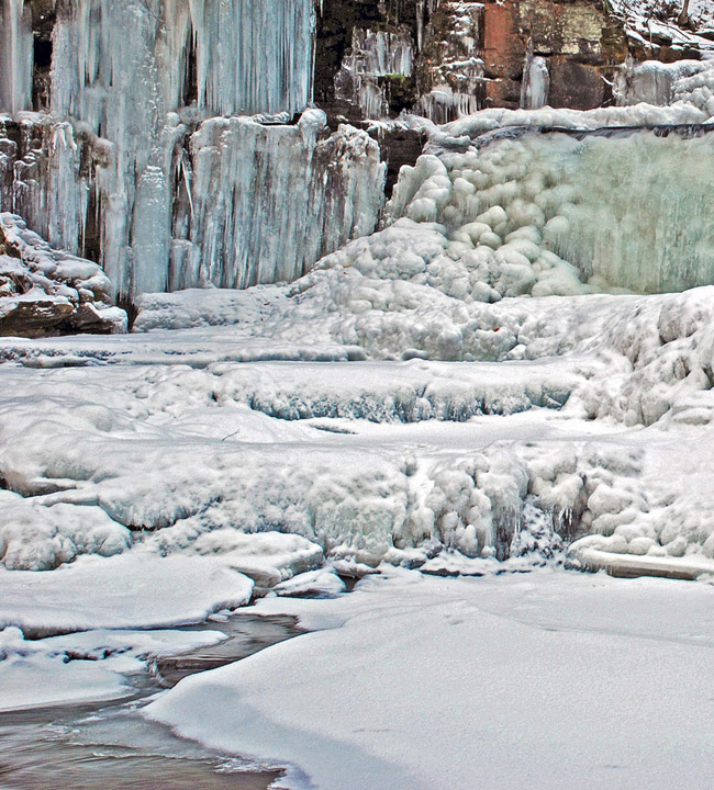
Not here in PA! A small section of my favorite local waterfall during my first winter visit last weekend. Normally fast flowing, and not abnormally dry here, the main section of it is almost completely frozen over already. I found all of the shapes, colors and textures of the ice and snow in this side section interesting.

D80, ISO-160, 1/2 second, f-22, no CPL. Thank you for any C&C.

Comments

12 comments
Comment posted by Doug Roane on December 29, 2010 at 11:45 AM
The comp works pretty well here, Bill, though I prefer the comp in M&N. Like the other, it looks 'overprocessed' for my tastes.
Registered on December 12, 2008, 213 Posts, 2226 Comments
Comment posted by Bill Maile on December 29, 2010 at 12:06 PM
Thanks again Doug for your input, certainly the comp is better in M&N. All I can say is I am still trying to find a happy medium I guess between the "too flat" and the "overprocessed" look. And it's testing my patience. :wink: But I'll keep plugging, no doubt. :toast:
Registered on March 2, 2009, 984 Posts, 2518 Comments
Comment posted by Peter Richter on December 29, 2010 at 12:40 PM
The different shapes of ice, snow and water are really fascinating. When I compare the two versions, I would prefer the one on M&N; yet both of them seem rather busy to me, although I understand the intention to compile all these forms. Perhaps I would try to concentrate to a still closer detail and work out the unique forms, maybe like an abstraction.

Peter
Registered on November 10, 2010, 218 Posts, 2723 Comments
Comment posted by Bill Maile on December 29, 2010 at 2:43 PM
Thank you Peter, just an FYI I didn't just clip this off of the M&N post. Totally different image, with separate processing--thanks!
Registered on March 2, 2009, 984 Posts, 2518 Comments
Comment posted by Lon Overacker on December 29, 2010 at 2:46 PM
Bill,

A lot going on here, but I will say that I think all the elements have their place and I think they all fit together well and I like the setting quite a bit.

You're real close on the processing, but still just a little strong. See my email. I do like the colors a lot.

Lon
Registered on November 24, 2006, 521 Posts, 19147 Comments
Comment posted by Barbara Graham on December 29, 2010 at 3:17 PM
I agree that all the elements have a place. To me they seem to flow from both upper corners down through the middle. I don't know at all about the overprocessing/underprocessing issue, but if you try anything Lon suggested I look forward to seeing whatever the differently processed image would look like. Then maybe I'd understand better, too. :wink:
Registered on July 27, 2010, 1310 Posts, 5035 Comments
Comment posted by Kent Mearig on December 29, 2010 at 7:14 PM
I liked your more focused previous ESS composition/photo much much more. You could spend all day tweaking the processing on this without ever getting to the point where it will appeal to a much larger audience. I should have given lots of positive feedback on that last post, sorry.
Registered on September 4, 2006, 237 Posts, 4748 Comments
Comment posted by Tony Kuyper on December 29, 2010 at 9:28 PM
The shapes and textures are sure sweet. The details feel a bit "clumpy" and I'm guessing that's a processing thing.
Registered on November 1, 2003, 364 Posts, 22328 Comments
Comment posted by Chris Chamberlain on December 29, 2010 at 11:18 PM
Ice shots are often tough because the tones all meld together. You've done a nice job with the tonal separation, making all the details and shapes easy to see. I like it!

Chris
Registered on March 13, 2007, 500 Posts, 8365 Comments
Comment posted by Bill Maile on December 30, 2010 at 8:24 AM
Thank you folks. Personally I just found all of the odd shapes and colors interesting, if not just plain old strange! And it all kind of has a downward flow to it as Barbara said. But "clumpy" is a good word too! Going to revisit it once I get going here.
Registered on March 2, 2009, 984 Posts, 2518 Comments
Comment posted by Guy Tal on December 30, 2010 at 9:16 AM
Very interesting patterns in the ice. I also like the subtle variations of light cyan and blue in the thicker ice. Looks like there's some chromatic aberrations that need to be corrected and I would also recommend a slight crop to eliminate the bottom of the tree visible in the upper right corner.

Guy
Registered on November 1, 2003, 566 Posts, 15507 Comments
Comment posted by Genny K. on December 30, 2010 at 1:54 PM
Yeah, I know what you mean about things freezing over. :smile: I like all the shapes in this. You could spend days just focusing in on all the individual shapes here. I also like it with the rocks in the upper right corner cropped off, just because they really stick out versus all that nice ice. That's not a nit, just another crop idea, honest. :biggrin:
Registered on June 5, 2006, 132 Posts, 2001 Comments