Gallery: LandscapePosted December 28, 2010206 views12 comments
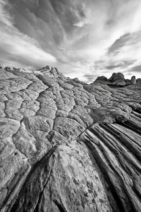
I was fascinated by the formations of rock thrown together at this location in northern Arizona. I processed this image in B&W to hopefully better display the 'brain rock' pattern of this strange landscape.
Comments
12 comments
Comment posted by Ben Horne on December 29, 2010 at 1:22 AM
White Pocket is truly a photographer's dreamland. It's neat how the cloud texture in the upper left corner mimics the brainrock texture.
Registered on August 27, 2009, 51 Posts, 959 Comments
Comment posted by Lon Overacker on December 29, 2010 at 1:24 AM
Mike,
This is excellent. I like the vertical lines leading the eye in to the scene and to the "brain-like" patterns that you're showcasing here. The sky is fantastic and a great compliment to the scene. Not sure how the color looked, but the b&w version works very well as you intended.
Processing wise, I think you could add some tweaks here. Nothing major as this looks very good as presented. But I'm thinking of a bit more mid-tone contrast - mostly for the brain part of the image. Even some more dramatic contrast for the sky and in general a slight darkening of the image overall. None of those suggestions in major doses, but some things to perhaps play around with.
Excellent comp and a fine take-away from here.
Lon
Registered on November 24, 2006, 521 Posts, 19147 Comments
Comment posted by Guy Tal on December 29, 2010 at 8:18 AM
Fascinating patterns and great near-far composition. My only suggestion is to increase the contrast a bit.
Guy
Registered on November 1, 2003, 566 Posts, 15507 Comments
Comment posted by Harry Lichtman on December 29, 2010 at 9:02 AM
Really like this rendition. We've seen a few color shots from this area recently, the BW showcases the textures. i might suggest slight increase in contrast in the rock, maybe darken the blues and cyan during the conversion if using PS. Looks like a fascinating place to photograph.
Registered on September 17, 2010, 304 Posts, 3507 Comments
Comment posted by Doug Roane on December 29, 2010 at 12:41 PM
Excellent comp with great lines and great tones
Registered on December 12, 2008, 213 Posts, 2226 Comments
Comment posted by David Edwards on December 29, 2010 at 2:18 PM
An excellent comp, Mike. I like the distinction between left and right fg rock patters, which adds a lot of interest to the image. Nice leading lines and textures throughout. I agree that it seems a bit bright, and perhaps a little soft as well.
Registered on December 6, 2008, 142 Posts, 2623 Comments
Comment posted by Bill Chambers on December 29, 2010 at 4:23 PM
Love the low perspective and the dynamic sky. Looks a bit soft to me though.
Registered on April 10, 2005, 753 Posts, 21216 Comments
Comment posted by Miles Morgan on December 29, 2010 at 4:23 PM
One of my favorite places on earth. I really like the idea of this comp, with the separation between the two types of patterns in the FG. Agreed that perhaps a little darker and higher contrast might make it pop a bit more. Terrific show of this cool place
Registered on November 23, 2009, 6 Posts, 185 Comments
Comment posted by Kent Mearig on December 29, 2010 at 6:53 PM
I get the idea to eliminate color for the sake of emphasizing pattern in the rock. For me, the photo remains too busy to achieve the desired effect, and then I'm wondering about how the colors would look.
Registered on September 4, 2006, 237 Posts, 4748 Comments
Comment posted by Tony Kuyper on December 29, 2010 at 9:21 PM
Fascinating place for sure. B&W gives it even more of a surreal quality. Sky looks good for the monotone treatment, but could see adding more contrast.
Registered on November 1, 2003, 364 Posts, 22328 Comments
Comment posted by Andreas Resch on December 30, 2010 at 7:10 AM
A bit soft in terms of web sharpening (check my signature for a nice script) but well composed with a great scene and awesome clouds. All the best for 2011, Mike.
Registered on November 14, 2007, 322 Posts, 6101 Comments
Comment posted by Paul Wegemann on January 1, 2011 at 5:48 PM
This is wonderful, Mike. Great comp, and I love that sky. I'll echo the comments about contrast and sharpening, but those are easy fixes. Well seen.
Registered on December 14, 2006, 58 Posts, 1888 Comments

Comments
12 commentsThis is excellent. I like the vertical lines leading the eye in to the scene and to the "brain-like" patterns that you're showcasing here. The sky is fantastic and a great compliment to the scene. Not sure how the color looked, but the b&w version works very well as you intended.
Processing wise, I think you could add some tweaks here. Nothing major as this looks very good as presented. But I'm thinking of a bit more mid-tone contrast - mostly for the brain part of the image. Even some more dramatic contrast for the sky and in general a slight darkening of the image overall. None of those suggestions in major doses, but some things to perhaps play around with.
Excellent comp and a fine take-away from here.
Lon
Guy