Nature Photographers Network
This is the preserved archive of the original Nature Photographers Network. The community continues at naturephotographers.network.
Primordial Sea +repost
‹ PreviousLandscape GalleryNext ›

Primordial Sea +repost

by Doug Roane

Gallery: LandscapePosted December 23, 2010477 views22 comments
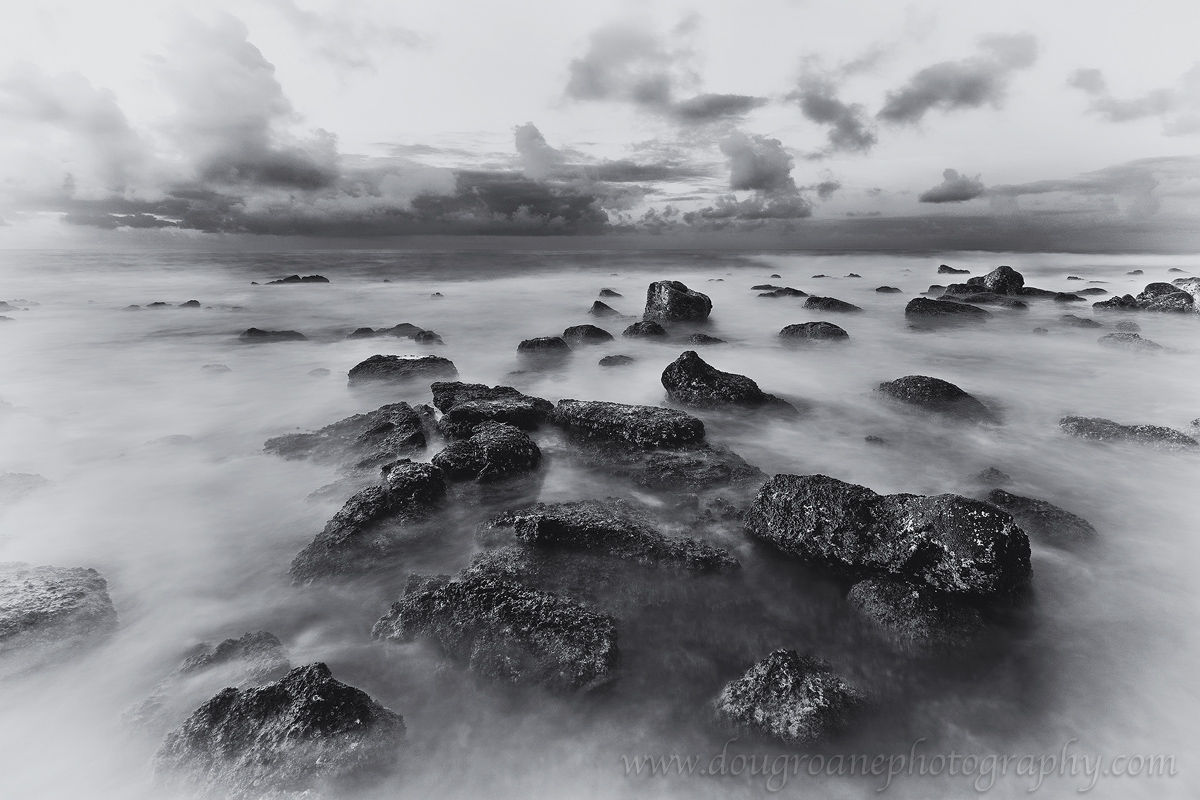
Poipu, Kaua'i.
I added some vignetting, which will not be to everyone's taste - so I will also post it with only a slight vignette, as well as the color version.

Canon 5DII. 16-35 @ 16mm. ISO 200. f/16. 2 exposures manually blended, 10 sec exposure on the water. Please see LARGER VERSION for best detail. C&C appreciated.

**edit: please see the repost below based on Guy's suggestion**

Comments

22 comments
Comment posted by Doug Roane on December 23, 2010 at 9:28 AM
Here is with only slight vignette
Registered on December 12, 2008, 213 Posts, 2226 Comments
Comment posted by Doug Roane on December 23, 2010 at 9:29 AM
color version
Registered on December 12, 2008, 213 Posts, 2226 Comments
Comment posted by Guy Tal on December 23, 2010 at 9:46 AM
I like this, Doug. It's especially interesting to me since your processing approach is very different from what I may have used and it works! I wouldn't mind pushing the white point even farther for more of a high key look.

Guy
Registered on November 1, 2003, 566 Posts, 15507 Comments
Comment posted by Gino Cortez on December 23, 2010 at 9:54 AM
Very nice. I like both versions very much.
Registered on November 23, 2010, 57 Posts, 396 Comments
Comment posted by Doug Roane on December 23, 2010 at 10:24 AM
Excellent suggestion, Guy - thanks!
Registered on December 12, 2008, 213 Posts, 2226 Comments
Comment posted by Nick Bristol on December 23, 2010 at 10:28 AM
Wow, these are great Doug. I like what you did here. The vignetting works well for me on the first one. I also like the color version very much. Really nice work.

Nick Bristol
Lone Rock, WI
Registered on February 1, 2004, 752 Posts, 14140 Comments
Comment posted by Joseph Rossbach on December 23, 2010 at 10:39 AM
This is really nice Doug. I also like the processing and the heavy white vignette. The high key look is really great!! :toast:
Registered on November 25, 2005, 484 Posts, 1377 Comments
Comment posted by Bill Chambers on December 23, 2010 at 10:55 AM
ooooh, I like this a lot. After looking at each version I prefer the repost via Guy's suggestion by far. The reverse vignetting works to perfection IMO and your perspective is wonderful. Really nice image!!
Registered on April 10, 2005, 753 Posts, 21216 Comments
Comment posted by Harley Goldman on December 23, 2010 at 10:59 AM
Real fine image, Doug. Very mysterious and other-worldly. I favor the high-key version, but the first two also work. I definitely prefer the B&Ws.

Registered on November 19, 2003, 586 Posts, 11271 Comments
Comment posted by Jorne de Bruin on December 23, 2010 at 12:47 PM
Very cool! Especially the high key version! Strong composition and original processing really makes this one shine! :toast:
Registered on June 26, 2008, 178 Posts, 2136 Comments
Comment posted by dean hebert on December 23, 2010 at 1:15 PM
NIcely seen and processed. I know the dark area in the water on the horizon is acurate but I think if it was lightened it would make for a smoother transition.I'm pulled towards the subtle tones in the colour version. :toast:
Registered on August 4, 2010, 70 Posts, 1132 Comments
Comment posted by Emmanuel Coupe on December 23, 2010 at 1:43 PM
I like you unusual take with the bright vignette, the composition is great. They higher key version works as well, you can easily select either one.
Registered on March 17, 2007, 83 Posts, 341 Comments
Comment posted by David Edwards on December 23, 2010 at 2:18 PM
Very nice image, Doug. I like the lighter vignetting in your original post as it enhances the appearance of the rocks 'floating' in the image and adds a softer, dreamier quality that contrasts the rocks so well. The enhanced high-key version kills this quality somewhat, but that's just my taste. Nice one!
Registered on December 6, 2008, 142 Posts, 2623 Comments
Comment posted by Dorin Bofan on December 23, 2010 at 2:20 PM
Great vision into creating this one, Doug! The last version is simply stunning!
Registered on April 30, 2007, 122 Posts, 3086 Comments
Comment posted by Kyle L. Krause on December 23, 2010 at 2:53 PM
Hey Doug, I love the color verion. b&w is powerful but i really like the composition, detail and colors. Nicely done. :toast:
Registered on June 15, 2010, 29 Posts, 605 Comments
Comment posted by Jason Kim on December 23, 2010 at 3:01 PM
I like the way the dark rocks emerge from the misty, white sea. I think I prefer the first version without the vignette, which seems to draw my eye towards the middle of the scene in a stronger way.
Registered on July 1, 2006, 60 Posts, 1233 Comments
Comment posted by Hamed Musharbak on December 23, 2010 at 3:07 PM
wonderful seascape

i like it :wavey:
Registered on June 1, 2009, 372 Posts, 2282 Comments
Comment posted by Lon Overacker on December 23, 2010 at 3:29 PM
Doug,

First of all, kudos for being creative here. I'm curious though what made you decide to alter the original color version? If I had that image I would be very happy and honestly probably wouldn't have considered anything but tweaking color, contrast and saturation.

Having said that, the b&w works wonderfully, especially the final repost and more high-key approach. Your very first however has a very nostalgic look for me, 19th century like. Hey, you could even add some sepia treatment for the full effect?

Excellent work all the way around.

Lon
Registered on November 24, 2006, 521 Posts, 19147 Comments
Comment posted by Richard Wong on December 23, 2010 at 8:02 PM
All three versions are great and look different from one another. As for personal preference, I prefer the color version.
Registered on February 2, 2006, 79 Posts, 2629 Comments
Comment posted by Tony Kuyper on December 23, 2010 at 8:08 PM
This is a really interesting take on processing. The sky being almost a negative of what would normally be expected. Repost even better. The Photo Art quality to this is outstanding, especially since it still look s very real.
Registered on November 1, 2003, 364 Posts, 22328 Comments
Comment posted by Anne K. Rusk on December 23, 2010 at 11:05 PM
What a creative take, Doug! I like the high key image best, but the llc seems to have gone too far with the vignette for my taste.
Happy holidays! :smile:
Registered on October 10, 2010, 65 Posts, 904 Comments
Comment posted by Raymond D Smith on December 24, 2010 at 8:14 AM
What a great idea Doug, very creative. I like the colour version and the last repost the best. You have some great detail in the foreground rocks. Cheers
Registered on January 22, 2009, 12 Posts, 479 Comments