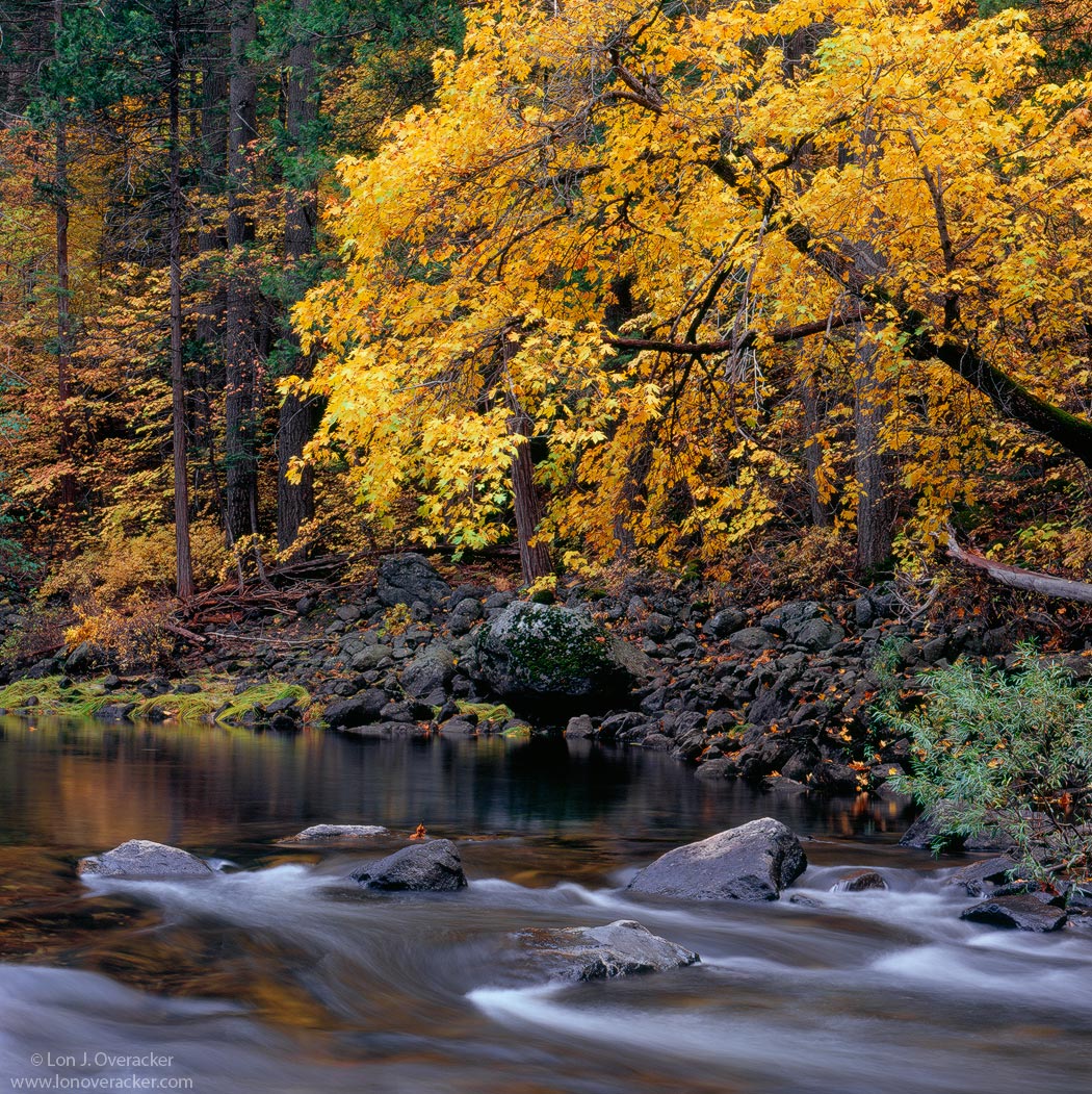
Tranquil Merced Autumn
by Lon Overacker
Thanks very much for the comments on the last image. I'm glad it got a better response than I thought it might. I suppose we're all like that, we have favorites from an outing and then others that we don't like as much. That's one of the great reasons for sharing work here on NPN is simply to see how others see things that we can't always see in our own work.
Here's another autumn scene from Yosemite captured downstream a bit from the Pahono bridge. I love this stretch of river and have come to name it "Cramer Alley" in honor of one of my favorites, Charles Cramer.
It's always tranquil along the Merced, especially in the fall and winter.
All comments and critiques welcome.
4x5, Nikkor 210mm, V100, f/32 @2s.
Thanks!
Lon

Comments
31 commentsGuy
Happy Holidays to you, Lon.
Nick Bristol
Lone Rock, WI
Didn't Maggie find this composition for you?? I knew she was helping you quite a bit with your photography on that trip. That might explain your high success rate.
This is an image that may look "simple" but I think the composition is really terrific and I wonder just for curiosity how long it took you to find it.
I like how the colors in the background are in sync with the motion of the water, everything flows right to left. This must be a hit in Japan!
There is not much to say, rarely is there anything that needs to be said about your work other than to just stare. I too love "Cramer Alley" as you call it. Its one of the best places in the park.
This image has a classic feel, beautifully composed, well done.
Excellent image! So tranquil... love the composition and fall colors. Makes me wanna be there!
Happy holidays!! Aloha - Bruce
- Dan.
Merry Christmas!
Chris
Hey Chris - if you check back, please, please feel free to pass along any nits you find! That's what this forum is for. Vlad pointing out that thing sticking up out of the water next to one of the rocks is a great example. I never noticed it the entire time I was processing the image. Many times it's those little nits that really help us fine tune an image.
Lon
Okay, The upper right corner in the larger version is open to the background(pretty minor). The smaller framed version solves that issue with the inclusion of the frame/crop, whatever. I like the foliage completely covering the frame into the corner. I also thought while not at all necessary, you could bump the color just a bit more. If not global, maybe in the greens to make the grasses on the background shore pop a tiny bit more. And also the yellow orange reflections. It looks like the light was pretty subdued here, so maybe a departure from what it looke like to do those adjustments?
Chris
Dang, I posted the wrong larger version and you're the only one to call me on it! So thank you, I'm really glad you spoke up. Not that I can do anything about it now... but the posted crop is the intended one. Actually, the original is a vertical, but it's too late to post that now.
Also, thanks for the other suggestions. I like your idea about punching up the grasses along the shore. I wasn't sure if it would be too much.
Thanks again everyone!
Lon