Devadatta
by Aaron Burdick
I'm back! I haven't posted in WAY TOO LONG! I've been busy with other projects and grad school applications.
I had the pleasure of going on one of Jay + Varina Patel's workshops in November to Southern Utah. It was my first time shooting this area and I can't wait to go back. (I highly recommend their workshops to anyone interested. They are both great teachers and people.)
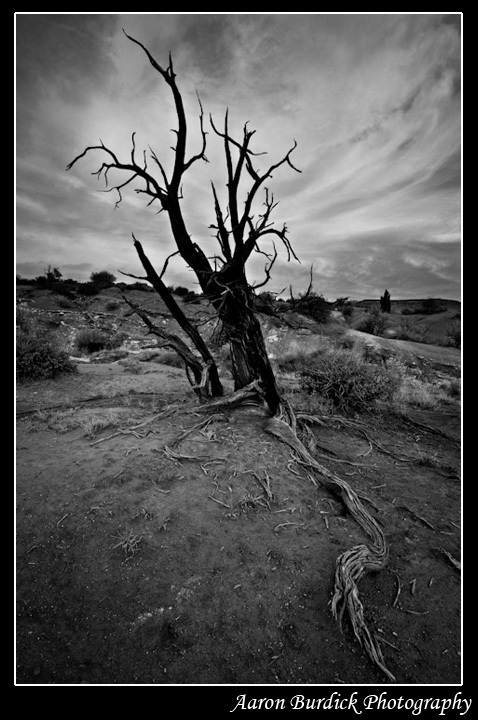
So, Devadatta! I've been studying the Devadatta chapter of the Lotus Sutra, which explains the enlightenment of Devadatta, an "evil" person who betrayed the Buddha, tried to destroy the Buddhist order, and to assassinate Shakyimuni Buddha many times. The main point of this chapter is that we are all Buddhas and can attain enlightenment and happiness in this lifetime, even if we have done evil acts. The Buddha even called Devadatta "a good friend" because he helped to illuminate this principal and to represent the oneness of good and evil.
I'll be posting the color version too, although I prefer this B+W version. I should mention that this shot was inspired by Marc Adamus's B+W bristlecone pine shot that most you have probably seen ("The Tree God").
All C+C welcome! (The level of work on this forum is so consistently stunning. Kudos to everyone who's been posting!)
Nikon D300
Nikon 12-24mm
f/11 (at hyperfocal distance)
Blend of two images (1/15 and 1/4)
B+W conversion done in LR3
Aaron

Comments
8 commentsOn the b&w I like how the branch on the ground becomes a strong visual element as it contrasts the black tree by being somewhat white, on the color photo it gets eaten up by the color of the ground and gives me less visual impact.
Glad to see you are able to post an image - welcome back!
I pretty much agree with Tony's comments exactly. For me the starkness of the b&w works well to showcase the tree, but the sky lacks any real drama that I think is missing. Perhaps too much contrast and drama in the sky would compete with the tree/silhouette, but still I think the sky needs some work. Also, it looks pretty soft to me overall, but that's usually a "getting to the web" thing.
While I think the b&w version has the best potential, I like the color version as presented. The tree is still showcased well and I like the sky much better here and how the colors in the sky compliment the colors of the earth.
This is also one of those images if "only the trees could talk." Thanks also for the explanation!
Lon
Thanks.
-Jay