Nature Photographers Network
This is the preserved archive of the original Nature Photographers Network. The community continues at naturephotographers.network.
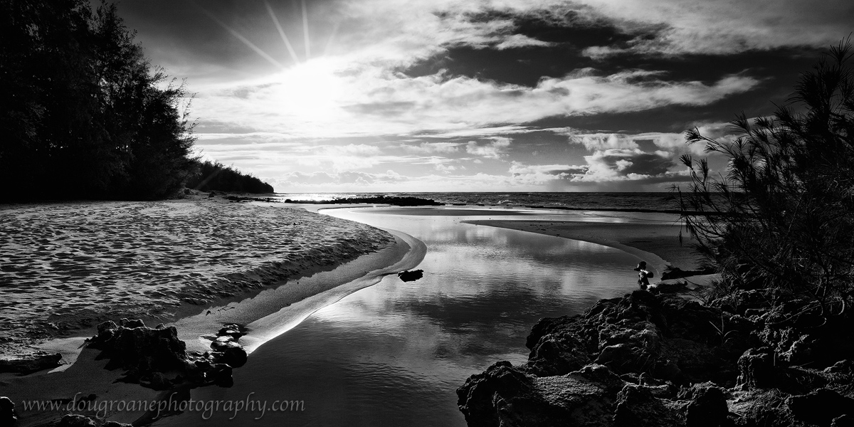
Gillin's Beach in BW +repost
‹ PreviousLandscape GalleryNext ›

Gillin's Beach in BW +repost

by Doug Roane

Gallery: LandscapePosted December 19, 2010271 views9 comments
Kaua'i, 4/2010. A different comp of the same scene as my last post. In contrast, this is a manual blend of 2 exposures. I feel the BW works much better than the color, because of the sun in the frame, with a pretty lame sunstar effect which I think ruins the color version. In fact, I wish the sun weren't in the frame at all. However, I had only one chance to get to this area while on vacation, so this is it. Color version posted for comparison. C&C appreciated - tell me what you think.

Canon 5DII. Canon 16-35. ISO 100. f/22. 1/10 and 1/45 sec. See LARGER VERSION for best detail

Comments

9 comments
Comment posted by Marc Adamus on December 19, 2010 at 4:48 PM
Very strong, Doug. If anything, maybe a touch bright around the sun......but it is the sun after all. B&W was a good choice and the blend looks fine.
Registered on September 17, 2005, 780 Posts, 8091 Comments
Comment posted by Anthony Vincent on December 19, 2010 at 5:34 PM
Very strong contrasts which make this ideal for bw.
Nice drama Doug
Registered on February 5, 2009, 199 Posts, 2775 Comments
Comment posted by Ben Horne on December 19, 2010 at 9:35 PM
the winding foreground shoreline leads me right into the scene. Your B&W treatment is very good here -- contrasty and rich with good mid-tones. Although the left and right sides balance each other, and the elongated aspect ratio is pleasing to the eye, I feel like most of the potential is within the winding shoreline and the reflection.
Registered on August 27, 2009, 51 Posts, 959 Comments
Comment posted by David Edwards on December 20, 2010 at 4:38 AM
This is wonderful, Doug. I very much like your comp with the curving waterline leading into the shot, and the b/w conversion is excellent. Yes, the sun is quite large in the frame and blown, but the strength of the comp holds it together. The only thing I perhaps wish for is a little bit more detail in the blacked out area in the upper left.
:smile:
Registered on December 6, 2008, 142 Posts, 2623 Comments
Comment posted by Guy Tal on December 20, 2010 at 7:33 AM
I like the composition and the narrow crop. The concentrations of blacks in the upper left and lower right corners do feel a bit "heavy" to me. I wonder if some selective contrast adjustment can be used to keep contrast high in the mid tones while still including some detail in the deep shadows.

Guy
Registered on November 1, 2003, 566 Posts, 15507 Comments
Comment posted by Lon Overacker on December 20, 2010 at 5:36 PM
Doug,

I really like the scene and the semi-pano format. I also like the high contrast, but I feel it's a blessing and a curse to some extent. I'm wishing there was more detail in shadows both on the left and the right. I didn't see the original color version, but I'm guessing you have the data in the files, cause it's certainly a scene worth working.

Lon
Registered on November 24, 2006, 521 Posts, 19147 Comments
Comment posted by Barry Vangrov on December 21, 2010 at 8:14 PM
I agree with Lon and Guy: tone down the contrast in upper left and lower right corners to bring out some detail. I definitely like it as a BW
Registered on September 1, 2009, 148 Posts, 749 Comments
Comment posted by Doug Roane on December 22, 2010 at 12:14 AM
Thank you everyone. Sorry, I forgot to post the color version. Here it is
Registered on December 12, 2008, 213 Posts, 2226 Comments
Comment posted by Doug Roane on December 22, 2010 at 12:24 AM
Here's a repost based on suggestions. thank you very much. unfortunately, some of the detail I brought out is lost in the compression.
Registered on December 12, 2008, 213 Posts, 2226 Comments