Solitary Pine
by Barbara Lee
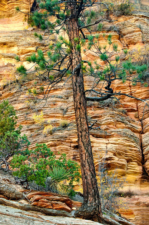
I took this image the first week of November in the Zion High Country. I was struck by the textures and color in the scene, particularly the striations in the sandstone and the tenacious root growing out of the rock. I am interesting in knowing if you think that this image works or not. Some have said that it lacks depth, appears too flat, others say that the "illustrative" quality of the work is very appealing. What do you think? And if you think that it needs more depth, what would you do in CS5 to accomplish this? Thanks for your feedback, I value each and every comment!

Comments
6 commentsThis image absolutely works for me. The color, texture and detail are all excellent. I really like that you've pretty much filled the frame here and used the cliffs as a backdrop for this tree and foreground.
Interestingly, I also think this doesn't have very much depth to it. but in this case I don't think it's a detriment what so ever. In fact it almost seems like this is a composite of the tree/foreground and the background - but in an appealing way. at least for me. But regarding the comment what would you do in PS to accomplish more depth? Personally, I don't think you can do anything after the fact. Depth, selective focus and all those things are captured and created in the field with choices in aperture, viewpoints, focal lengths, etc. etc. What is captured either has depth, or it doesn't, IMHO.
I think this is an excellent image and you did very well to see, capture and process this one.
lon