Gallery: LandscapePosted November 21, 2010150 views6 comments
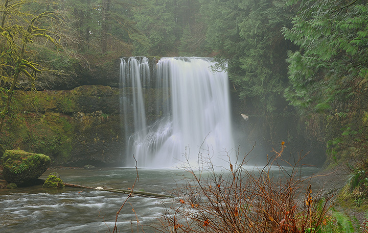
D700, Nikon 24-70 @70mm f11
First try at taking a pic of a waterfall. Had to process the raw file twice, once for shadows and the other for highlights and then blended the exposures.
Comments
6 comments
Comment posted by Randy Bacon on November 21, 2010 at 6:56 PM
Nice first attempt Glenn, the scene has a lot of potential as it looks like a lovely spot. The image looks a little flat so try pumping up the contrast somewhat. From a composition standpoint, I might have moved to the left and lowered my shooting position in order to remove the foreground bush and increasing the impact of the moving water in the river. I do like the shutter speed selection as the waterfall looks very nice.
Registered on November 24, 2008, 56 Posts, 492 Comments
Comment posted by Bruce Painter on November 21, 2010 at 8:01 PM
Agree this is a good first attempt. It is a nice waterfall and the shutterspeed looks just right. I also agree that the foreground bush is a little to dominant. Without knowing the scene I don't know what your best option might be to get around it. Randy's suggestion of left would be good if that was available. If not it looks in this shot like you might be able to go around it to the right and up stream. Looks like a little fog and that is part of what is making it a little flat but it also adds a wonderful mood.
Bruce
Registered on May 11, 2006, 50 Posts, 207 Comments
Comment posted by Glenn Starr on November 21, 2010 at 8:53 PM
Thanks Randy and Bruce for the feedback. I did try to get closer when I first got to the fall but the spray was so bad I couldn't keep my lens dry. I did pla with the photo a bid and added quite of bot of contrast so does look better. I think I'm stuck with the bush though.
Registered on April 26, 2009, 16 Posts, 16 Comments
Comment posted by Bruce Painter on November 21, 2010 at 9:52 PM
My personal preference would be for something in between, but especailly less contrast adjustment in the waterfall itself as the second version has part of the falls "washed out" at least on my laptop. Also, this may just be my views but giving this much adjustment took out to much of the misty look which in IMO gave the photo a great mood. Others may have differing views on this as it could be more a personal taste.
Instead of using contrast adj. you might try using levels and using only the black and the white setpoints.
Bruce
Registered on May 11, 2006, 50 Posts, 207 Comments
Comment posted by Lon Overacker on November 22, 2010 at 1:46 AM
Glenn,
I think I'm with Bruce in his comments. I think processing this somewhere in between or slightly different could work. I like the misty look of the first and the falls have some nice lines and texture in them. But in your second version, I like how the colors really popped - especially in the bush at the bottom, which with the added color I think becomes less of a distraction. And thanks for the explanation of not being able to get closer to the falls - makes perfect sense.
Lon
Registered on November 24, 2006, 521 Posts, 19147 Comments
Comment posted by Glenn Starr on November 22, 2010 at 6:25 AM
Thanks again for the feedback. You're right did overdo it a bit by setting a black point that wasn't really black. So for my last attempt...IS this better???
Registered on April 26, 2009, 16 Posts, 16 Comments

Comments
6 commentsBruce
Instead of using contrast adj. you might try using levels and using only the black and the white setpoints.
Bruce
I think I'm with Bruce in his comments. I think processing this somewhere in between or slightly different could work. I like the misty look of the first and the falls have some nice lines and texture in them. But in your second version, I like how the colors really popped - especially in the bush at the bottom, which with the added color I think becomes less of a distraction. And thanks for the explanation of not being able to get closer to the falls - makes perfect sense.
Lon