Nature Photographers Network
This is the preserved archive of the original Nature Photographers Network. The community continues at naturephotographers.network.
Away From The Chaos (+ repost)
‹ PreviousLandscape GalleryNext ›

Away From The Chaos (+ repost)

by Rick Gomez

Gallery: LandscapePosted November 7, 2010248 views12 comments
It's been a little too long since I have posted anything on NPN (or anywhere for that matter). Mostly because of a terrible creative rut that I can't seem to break... I have to remember to keep coming back to this gallery, as it it my biggest source of inspiration.

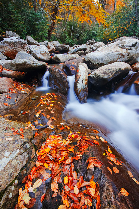
I shot this a couple weeks ago. This was a short hike upstream from the trailhead to the Chimney Tops in the GSMNP. Traffic was as I expected... CHAOS!

A few things I'd like your opinions on...
#1- Is this comp a little off?
Normally I keep the flow of water in the frame, but it was the shape of the rock and the FG leaves on it that attracted me.

#2- Is the color too much? I'm working on my new (uncalibrated) monitor. It looks good on my old monitor, but oversaturated on this one.

#3- How much do the branches coming from the top left bug you? They bug me, but it's not exactly like I could move them (or myself) and I can't realistically clone them.

Canon 40D
Sigma 10-20mm
polarizer
ISO 100
15 sec. @ F/11
Early morning before traffic rolled in.

Thanks for looking! :biggrin:

Comments

12 comments
Comment posted by Paul Horsley on November 7, 2010 at 2:05 PM
Hi Rick, This a nice shot, I like the detail and colour of the leaves in the foreground and the silkiness of the water. I know it can be hard on locations like this but I think that if you could have gotten a bit more to the right the image would be stronger by showing more water. The left side of the shot is not doing a lot for me, you could crop where the leaves start on the lower left but then I would like to see the water leave on the lower right corner. Just my thought.

Paul
Registered on May 9, 2010, 5 Posts, 10 Comments
Comment posted by Jeffrey Sipress on November 7, 2010 at 2:39 PM
Nice image, Rick. Looks like your getting the feeling back....

#1, the comp is dramatic, but a bit unsettling up front. Looks like the leaves won the fight for the dominant foreground. I'd like more water, but the shutterspeed is too long to have the water look right (to me).

2, Color is about as hot as can be and still be right (to me).

3, Not a bother.
Registered on February 17, 2004, 236 Posts, 1197 Comments
Comment posted by Doug Koepsel on November 7, 2010 at 2:48 PM
Nicely seen. I would think that adding 10-15% to the right side would add some balance to the image. The white edged vertical rock above the leaves is what centers the image left2right to me.
The branches are not a bother. SS and exposure look good.
Registered on April 1, 2010, 196 Posts, 1592 Comments
Comment posted by Wayne Jones on November 7, 2010 at 2:55 PM
Rick,
I like the low perspective and all the elements here. Here are the answers to your questions:
#1 -- Comp: I agree that the rock and leaves are the main attraction here. Yes, it might look better with more of the water in the frame, but I don't know if that was possible, without diminishing the impact of the leaves, so this is nice, even if a bit unusual.
#2 -- Color: The reds do look oversaturated on my monitor, too.
#3 -- Branches: They don't bother me at all.

Now a question for you: I rarely visit national parks, and most of my visits were in the "off" season. Your remarks about the "traffic" and chaos, as well as other descriptions from beautiful locations make me want to avoid national parks. Just wondering how many people you call a crowd, and if they interfere with your photography and ability to enjoy areas like this. Thanks.
Registered on April 18, 2007, 953 Posts, 6435 Comments
Comment posted by Phil Pogledich on November 7, 2010 at 3:06 PM
I really like this shot and find your questions interesting. I do think that the color is a bit strong and the composition is slightly foreground heavy, but both are really quite minor issues. This shot is quite strong nonetheless and is a definite keeper.
Registered on August 24, 2009, 123 Posts, 3099 Comments
Comment posted by Rick Gomez on November 7, 2010 at 3:15 PM
Thanks for the comments and the insight guys. Here is a repost. I cropped mostly from the left and a bit from the top and bottom keeping a 2x3 ratio. I also desaturated about 10% and did a bit of dodging and burning.
Thanks for the pointers!

Wayne, the great thing about national parks, as opposed to most other types of protected areas, is that it is public land and you are free to go anywhere you wish (hiking), unless a sign specifically states that you are not allowed beyond a certain point (these signs are rare). I pretty much hike away from people and avoid the hot spots during busy seasons... The traffic still sucked though.
When I'm out in nature, I like to feel like I'm the only one out there. I am probably the most anti social photographer that exists :wink: . The only reason I was even in the Smokys is that a client was paying me for a private lesson/workshop.
Registered on March 3, 2007, 206 Posts, 1853 Comments
Comment posted by Adam Gibbs on November 7, 2010 at 5:12 PM
Hey Rick, I find the composition to be engaging and full of energy. Everything leads me into the scene. The colour is very saturated and a little too much for my taste. The branches at the top don't bother me but if they bother you then take them out. 4x5 crop works as well, if you eliminate everything at the top to just above the boulders?
Registered on November 1, 2003, 168 Posts, 870 Comments
Comment posted by Dan Baumbach on November 7, 2010 at 5:22 PM
Rick, the composition works well but I find the image a bit too saturated, especially the foreground leaves. I like the original comp as much or more than the cropped verision.

- Dan.
Registered on November 1, 2003, 473 Posts, 7980 Comments
Comment posted by Robert Dayton on November 7, 2010 at 8:04 PM
Beautiful, Rick! For my taste the image is well composed.
To me it's strong from FG to BG. The colors look OK on
my monitor as does the saturation. The overhanging branch
doesn't bother me. The brightness level in the background
seems to me to be right on. However, I personally would
like to see the FG and middle area just a little darker.
That's just my opinion. Nevertheless, it's a strikingly
gorgeous image.

With this image I think that you've come along way of
getting out of your rut. Keep up the good work, and
keep posting/sharing.
Registered on November 11, 2008, 281 Posts, 3958 Comments
Comment posted by John Williams on November 7, 2010 at 11:42 PM
I prefer the original comp. The branches don't bug me, but the reds are a bit oversaturated in the original. In the repost, the reds look good, but I preferred the original saturation at the top of the photo.
Registered on September 6, 2007, 221 Posts, 5985 Comments
Comment posted by Ed Lowe on November 9, 2010 at 7:25 AM
I think your repost addresses the three concerns you had with the original version, Rick. You still have enough of the colorful autumn leaves to showcase the season and the water flowing out of the scene is closer to the LRC. A very beautiful image.

Ed
Registered on February 7, 2004, 414 Posts, 7115 Comments
Comment posted by Ed Cooley on November 13, 2010 at 4:25 PM
Great composition and wonderful colors Rick. Color might be a touch cool but that is the way I prefer it. Not bothered by the branches, it is the smokies after all. Maybe a slight turn to the right to have the tree covered rocks and branches a little farther left would improve a nice image.

Didn't see the repost until I commented. Vastly improved.
Registered on August 22, 2007, 45 Posts, 547 Comments