Nature Photographers Network
This is the preserved archive of the original Nature Photographers Network. The community continues at naturephotographers.network.
Sierra Waves
‹ PreviousLandscape GalleryNext ›

Sierra Waves

by Chris Chamberlain

Gallery: LandscapePosted November 4, 2010458 views30 comments
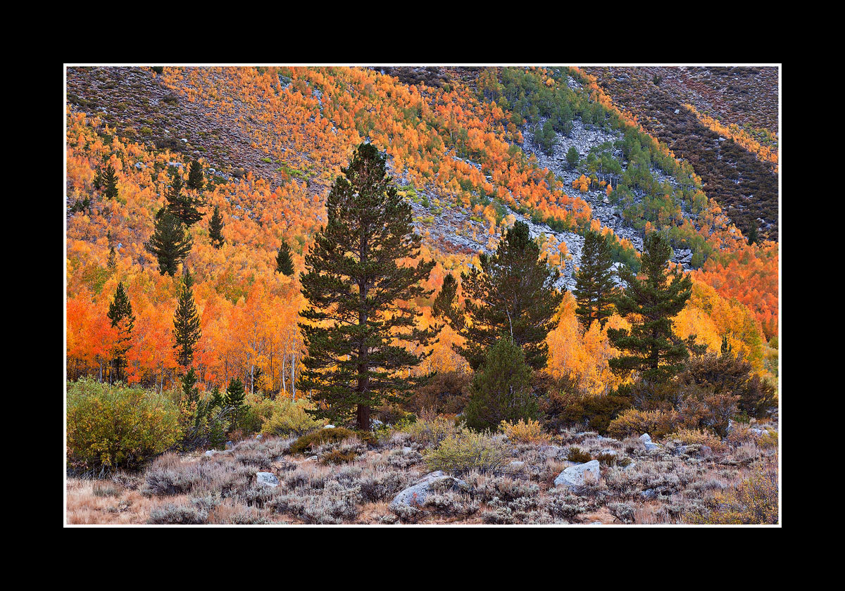
Of autumn color! I really liked the layers of color sweeping across the slopes in the background. I hope I arranged the evergreens in a way that makes a nice complete comp. I remember this being almost sensory overload with the color intensity. So it's processed with that in mind. Backing off the saturation at all just seems to take the life out of it. Larger version included as well. I hope you enjoy it, and thank you for your thoughts.

Oh yeah, this is somewhere in the South Fork of Bishop Canyon!

D200,
18-70mm,
1/3sec, F/11

Thanks,
Chris

Comments

30 comments
Comment posted by Dean Sauskojus on November 5, 2010 at 12:03 AM
Wow Chris. You've been batting them out of the park lately. Beautiful color all around. Lovely image.
Registered on September 29, 2009, 137 Posts, 2659 Comments
Comment posted by Morris McClung on November 5, 2010 at 12:07 AM
I like the comp and the color and the progression into the distance with the different layers of colors on the hillsides. And I'm loving that sage in the foreground. :biggrin:
Registered on May 7, 2007, 670 Posts, 19650 Comments
Comment posted by Zack Clothier on November 5, 2010 at 12:15 AM
Beautifully crafted image here Chris, I love it.. no nits from me. :toast:
Registered on January 28, 2010, 343 Posts, 2257 Comments
Comment posted by Mark Zemmin on November 5, 2010 at 12:17 AM
Very nice colors and comp. I bet it was breathtaking to be there.
Registered on November 4, 2010, 8 Posts, 170 Comments
Comment posted by Daniel Ewert on November 5, 2010 at 12:22 AM
The larger version is definitely worth it. Beautiful display of colors here, Chris.
Registered on June 2, 2009, 103 Posts, 1500 Comments
Comment posted by Youssef Ismail on November 5, 2010 at 12:26 AM
Real amazing color Chris. I am on the fence with the pines. They kind of block my view but at the same time add a element of contrast that helps the colors pop. Either way, you were fortunate to have seen this.
Registered on November 1, 2003, 474 Posts, 5555 Comments
Comment posted by Bret Edge on November 5, 2010 at 1:01 AM
Love it, Chris. Vibrant color and the few evergreens are like stoic soldiers standing out from the crowd. Great composition and details. Make a big print and enjoy.
Registered on November 1, 2003, 711 Posts, 6363 Comments
Comment posted by Dietrich Gloger on November 5, 2010 at 2:22 AM
Oh yes, a very appealing scene Chris! Not as dramatic as your previous post of course, but a very subtle beauty here. Very well composed. As a small detail I really like the white trunks of the aspens in the bg left from the big pine. fg and the lines in the slope in the bg also work great. Well made my friend!
Registered on January 26, 2007, 360 Posts, 9876 Comments
Comment posted by Mat Malone on November 5, 2010 at 2:26 AM
Wow those colors are awesome. Definitely don't touch the sat. I like the evergreens but they do seem very front-and-center. But without them you would lose some depth. Anyway it's a wonderful image showing the diversity of Bishop Canyon.
Registered on December 15, 2008, 91 Posts, 882 Comments
Comment posted by Brian Gallagher on November 5, 2010 at 7:41 AM
I like the layers and for me, the foreground pines add to the success of the photo. I would not reduce the saturation.
Registered on April 21, 2007, 7 Posts, 54 Comments
Comment posted by Mark Pelton on November 5, 2010 at 8:03 AM
Nice arrangement of evergreens to contrast with the orange. Beautiful scene.
Registered on November 25, 2003, 380 Posts, 4647 Comments
Comment posted by Bill Chambers on November 5, 2010 at 8:47 AM
Very nice Chris. I like the comp a lot - you included just the right amount of FG with it's muted colors. Looks like you're having wonderful autumn colors - glad to see you're taking full advanatge of them.
Registered on April 10, 2005, 753 Posts, 21216 Comments
Comment posted by Robert Dayton on November 5, 2010 at 9:40 AM
I like this composition. The colors are beautiful, and I do like the way
that you've placed the evergreens. I also like the diagonal lines in the
background on the hillside. The foreground leaves enough space that
the trees aren't cramped. Well thought out, and thanks for sharing, Chris.
Registered on November 11, 2008, 281 Posts, 3958 Comments
Comment posted by Bill Maile on November 5, 2010 at 10:07 AM
Like it a lot Chris, almost fades into a miniature scene in the BG. Sweet!
Registered on March 2, 2009, 984 Posts, 2518 Comments
Comment posted by Pete Bengeyfield on November 5, 2010 at 10:11 AM
Nice mix of colors. Both the sage and the talus in the BG provide nice counterpoints to the color.
Registered on December 2, 2003, 1247 Posts, 3439 Comments
Comment posted by Jim Greenwood on November 5, 2010 at 11:06 AM
Definitely an appealing autumn scene, nicely framed and composed. Maybe a little too much blue saturation on the rocks in the background to my eye, but this is very minor.
Registered on November 9, 2003, 229 Posts, 1523 Comments
Comment posted by Phil Pogledich on November 5, 2010 at 11:54 AM
Don't know if most of your recent posts are from a single trip, but if so it was incredibly productive! This is a very strong shot in its own right and the fall color is very appealing, particularly the way it is layered through the scene. Don't see anything to improve . . . great work!
Registered on August 24, 2009, 123 Posts, 3099 Comments
Comment posted by Michael J Greene, on November 5, 2010 at 12:02 PM
Lots of things to like here Chris: A very thoughtful and well executed composition,. incredible sharpness and depth, and great balance and spacing. I think a touch of vignetting in the corners can help focus the image more and for my tastes - just a hair too much contrast in the brightest parts of the foliage. Overall, a very professional presentation. Top notch.

Michael :wavey:
Registered on June 18, 2009, 86 Posts, 2317 Comments
Comment posted by David W. Kelly on November 5, 2010 at 12:49 PM
Beautiful Fall color and a very strong comp. :toast:
Registered on October 7, 2005, 883 Posts, 6590 Comments
Comment posted by Kurt Budliger on November 5, 2010 at 2:04 PM
I love the color, definitely don't back off. Nice comp too :toast:
Registered on June 11, 2006, 113 Posts, 2116 Comments
Comment posted by Ant on November 5, 2010 at 5:52 PM
Extremely effective image, well composed and with breathtaking colors... It all works very well, a splendid picture which is best enjoyed in the larger version IMO...
Registered on April 13, 2009, 27 Posts, 474 Comments
Comment posted by Anne K. Rusk on November 5, 2010 at 6:23 PM
These are excellent waves of color! I enjoy that it is not just one patch, but repeating lines of color. Well done!
Registered on October 10, 2010, 65 Posts, 904 Comments
Comment posted by Vance Gese on November 5, 2010 at 6:36 PM
Chris, this is superb. The lines of the trees on the far slope, converging in the lower right hand area works exceedingly well, and the placement of the conifers is really nice in my opinion. Saturation looks great. I wouldn't change a thing. A beautiful, quiet autumn image.
Registered on November 13, 2008, 298 Posts, 6629 Comments
Comment posted by Eric Good on November 5, 2010 at 6:45 PM
Aw yes, I remember this location well and this is every bit as beautiful as I remember it. I'd probably prefer a little less sat in the distant blues, but this looks very nice as presented. This has inspired me to revisit some other images I took myself from this area. Good stuff!
Registered on March 17, 2007, 116 Posts, 4764 Comments
Comment posted by Nick Bristol on November 5, 2010 at 8:40 PM
This is really nice, Chris. I love the colors and great comp.Nice diagonal lines on the hill side and very good placement of the evergreens. Very pleasing to look at!

Nick Bristol
Lone Rock, WI
Registered on February 1, 2004, 752 Posts, 14140 Comments
Comment posted by Aaron Cowan on November 5, 2010 at 9:43 PM
Awesome color! I like the three stronger fg pines breaking up the fall colors. Nice comp.
Registered on September 22, 2010, 8 Posts, 165 Comments
Comment posted by Daniel Rappaport on November 6, 2010 at 1:11 AM
Great mix of fall colors. Nicely composed.
Registered on September 9, 2009, 294 Posts, 2006 Comments
Comment posted by Paul Gasior on November 6, 2010 at 12:13 PM
Registered on March 7, 2010, 99 Posts, 502 Comments
Comment posted by Paul Gasior on November 6, 2010 at 12:17 PM
For me just perfect ! pefect colors and comp.
very good spot
Registered on March 7, 2010, 99 Posts, 502 Comments
Comment posted by David Chauvin on November 6, 2010 at 8:13 PM
Wow! The intense bg color mixed with the dark conifers make a beautiful mix.
Registered on August 5, 2004, 1007 Posts, 5595 Comments