Nature Photographers Network
This is the preserved archive of the original Nature Photographers Network. The community continues at naturephotographers.network.
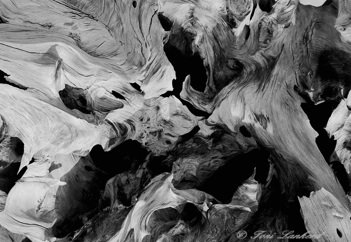
Silver Lake Driftwood + Original color version
‹ PreviousMacro & Close-up GalleryNext ›

Silver Lake Driftwood + Original color version

by Toni Lankerd

Gallery: Macro & Close-upPosted November 4, 2010211 views16 comments
In going through some of my files, I found the color version of this image but didn't really care for it, so I decided to convert it to B&W.
Taken at Silver Lake Dunes in Mears, MI.
Pentax K10D, Sigma 28-135 @130mm, F13 @1/125, iso 200

Thanks for looking!

Comments

16 comments
Comment posted by Chuck Beatty on November 4, 2010 at 8:37 PM
Toni, I think the B&W is very successful. I bet the detail on a large print is wonderful.
Registered on July 12, 2006, 82 Posts, 453 Comments
Comment posted by Toni Lankerd on November 5, 2010 at 9:29 AM
Thank you, Chuck. I haven't had it printed yet, but I think you're right. Looking at the image at even 50% size, I'm liking what I see when it comes to the details.
Registered on January 3, 2005, 360 Posts, 4004 Comments
Comment posted by Jeff Hackett on November 5, 2010 at 11:14 AM
I like the B&W. I get lost in this one quite easily... which I like!
:toast:
Registered on March 13, 2006, 65 Posts, 1119 Comments
Comment posted by Brian Vance on November 5, 2010 at 12:27 PM
I agree with Jeff. A lot of interesting elements all over the frame that hold your interest. I'd like to see the original in color for a comparison. I like the conversion a lot!
Registered on October 31, 2008, 26 Posts, 136 Comments
Comment posted by Toni Lankerd on November 5, 2010 at 4:40 PM
Thanks!

Brian...If I get the chance this weekend, I'll see about finding the original color version on my backup HD.
Registered on January 3, 2005, 360 Posts, 4004 Comments
Comment posted by beth summer on November 6, 2010 at 5:23 PM
Awesome in the B&W, Toni. Love the textures and the tonal contrasts. My eye is really pulled through and around nicely. Love it. It almost looks like you did some "liquify" filter on it :smile:
Registered on November 1, 2003, 437 Posts, 5220 Comments
Comment posted by Toni Lankerd on November 6, 2010 at 9:05 PM
Here is the original color version. It will be very interesting to see what others' opinions are regarding the difference between the B&W and color versions.
Registered on January 3, 2005, 360 Posts, 4004 Comments
Comment posted by Toni Lankerd on November 6, 2010 at 9:06 PM
No filter of any sort, Beth..
.thanks! :)
Registered on January 3, 2005, 360 Posts, 4004 Comments
Comment posted by Brian Vance on November 7, 2010 at 10:15 AM
Thanks for posting the color version, Toni. I think I like the BW a bit better because I don't notice the shadows as much. I think a reflector or fill flash would help, but perhaps the light was very contrasty and you already were using these to help with the shadows. Either way, that is one gnarly chunk of weathered driftwood, and you did a great job taking advantage of this wonderful subject.
Registered on October 31, 2008, 26 Posts, 136 Comments
Comment posted by Andy Richards on November 7, 2010 at 1:26 PM
I like it, Toni. Might be fun to see the color version for comparison. I never seem to be able to "see" in B&W and am always impressed when others do it well!

Hmn. Weird. I didn't see any of the commments or the color version when I posted this today. Thought I was an early commenter :-).

The contrarian in me likes the color version (but I like color anyway). But here, I really like the light and shadow that appears to be more pronounced in the color version.

Both are wonderful images, Toni
Registered on November 7, 2010, 37 Posts, 114 Comments
Comment posted by Ramamohan Pai on November 7, 2010 at 2:39 PM
Excellent graphical abstract, Toni. Great choice for B&W except that there is no pure white in the frame (which is OK).
Registered on November 1, 2003, 550 Posts, 9037 Comments
Comment posted by Toni Lankerd on November 7, 2010 at 5:43 PM
Thank you. I do like the warm tones of the color version, brought out by the early evening sunshine.

Brian....I don't know if reflectors or flash would have improved the image any...but I'm pretty sure neither one would have shown any details in the dark recesses of the driftwood.

Ram...the wood on the left side of the image was almost white in the B&W version, but then that area appeared too bright so I toned the whole image down a bit.

Andy...if you scroll down a bit, you'll see the original color version. :smile: It took me a long time to "see" black and white and to learn that it takes certain subjects for it to work.
Registered on January 3, 2005, 360 Posts, 4004 Comments
Comment posted by Philip Schwarz on November 7, 2010 at 11:50 PM
Great idea to convert it to B&W. You did a good job with the B&W conversion but I like the color version better.
Registered on November 29, 2006, 236 Posts, 1210 Comments
Comment posted by Toni Lankerd on November 9, 2010 at 9:48 AM
Thank you, Phil :)
Registered on January 3, 2005, 360 Posts, 4004 Comments
Comment posted by Kerry Leibowitz on December 11, 2010 at 3:53 PM
I'm a bit late to the party, but so what? :smile:

Absolutely the right choice (IMO) to convert to b/w, Toni. The pattern, lines, form and details all come out far more emphatically in black & white than color. You certainly could ramp up the contrast, but that's entirely a matter of taste.
Registered on November 1, 2003, 167 Posts, 5800 Comments
Comment posted by Toni Lankerd on December 17, 2010 at 8:03 PM
Thanks Kerry.
For what it's worth, I entered this image (the color version) in our local camera club's competition this week, with the category being Textures in Nature. I can happily report that it received high honors!
Registered on January 3, 2005, 360 Posts, 4004 Comments