Nature Photographers Network
This is the preserved archive of the original Nature Photographers Network. The community continues at naturephotographers.network.
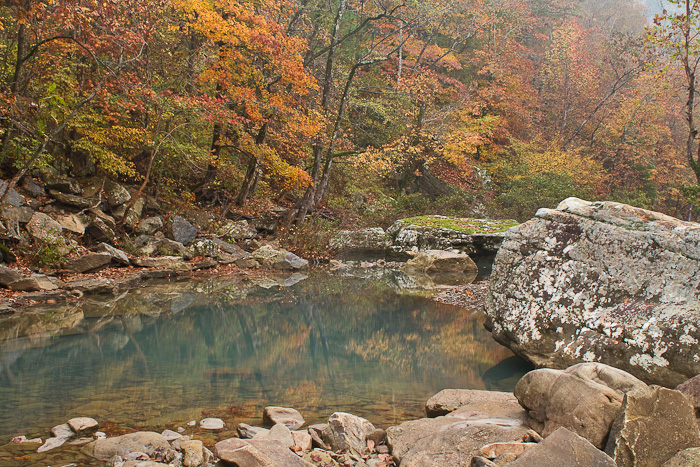
Haw Creek Color
‹ PreviousLandscape GalleryNext ›

Haw Creek Color

by Bryan Simpson

Gallery: LandscapePosted October 29, 2010106 views5 comments
I've been a regular participant in the CSNP forum, but have never posted in the galleries. Thought it was about time to get feedback from elsewhere.

This shot was taken last weekend at Haw Creek in the Arkansas Ozarks.

Canon 7D (tripod mounted) - Tokina 28-80 lens (polarizer) - ISO200
30mm - f/16 - 1.3 secs

Comments

5 comments
Comment posted by Dean Sauskojus on October 30, 2010 at 12:07 AM
Nice fall image Bryan. I love the colors and would like to see them more pronounced. They seem a little flat unless you intended it that way. What a beautiful serene place.
Registered on September 29, 2009, 137 Posts, 2659 Comments
Comment posted by Eva McDermott on October 30, 2010 at 12:16 AM
Welcome to NPN Byran. Very nice scene / comp but I would boost the contrast / saturation a bit. The reflection also looks like it could use a little more adjustment to the polarizer to optimize the contrast and depth of color. Just my 2 cents for what it is worth. NPN is a great plce place for learning.
Registered on January 4, 2009, 1015 Posts, 13229 Comments
Comment posted by Lon Overacker on October 30, 2010 at 2:04 PM
Bryan,

Can't really say welcome to NPN, but I can welcome you to ES&S!! Glad you decided to post here. This is a lovely first post and autumn image. I really like the background of this scene. The foreground rocks I'm less thrilled about simply because there's not as much detailed interest as the lichen and patterns on the big boulder.

Technically I would consider darkening this a little bit in general and adding some contrast. I think that would help with the colors that the previous folks have mentioned. Definitely an autumn image worth making it's best !

Welcome!

Lon
Registered on November 24, 2006, 521 Posts, 19147 Comments
Comment posted by Eric Good on October 31, 2010 at 3:41 PM
This has a horizontal pano written all over it for me. I think adding a bit more contrast (darker midtones and brighter brights) with a wee bit crop off the top and most of the fg rocks cropped off the bottom and this really begins sing for me. Love the collection of color captured here and particularly that milky reflection. Nice work!
Registered on March 17, 2007, 116 Posts, 4764 Comments
Comment posted by Morris McClung on October 31, 2010 at 3:47 PM
A nice serene scene. I like the subtley you have employed here.
Registered on May 7, 2007, 670 Posts, 19650 Comments