Nature Photographers Network
This is the preserved archive of the original Nature Photographers Network. The community continues at naturephotographers.network.
Cradled
‹ PreviousFlora GalleryNext ›

Cradled

by beth summer

Gallery: FloraPosted October 25, 201058 views12 comments
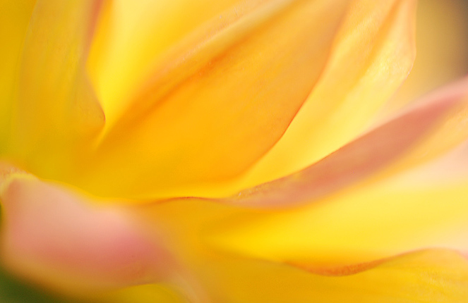
I enjoyed the colors in this one. I liked how the petals seem to be cradled. I decided to leave a bit of the green in the llc for separation purposes.

Any critiques and comments are very welcomed and appreciated.

Nikon d80, 105 mm, f2.8

Comments

12 comments
Comment posted by Pat Sampson on October 25, 2010 at 6:37 PM
Great lines, light and color Beth. Gorgeous image. I like the green you left. I love the mood of this. If you wanted to carry the wash on out of the frame in the upper right corner you could but as is the opposite corners are balanced and I like that too. Superb as is ...

Pat
Registered on May 19, 2007, 953 Posts, 15989 Comments
Comment posted by Carol Hyman on October 25, 2010 at 7:12 PM
I too like the colors, Beth. And the green in the opposing corners looks good. Also nice lines in the image.

Carol
Registered on January 18, 2007, 597 Posts, 8062 Comments
Comment posted by Catherine Reilly on October 25, 2010 at 7:22 PM
How lovely, Beth, with the warm colors and flow of the petals. Dahlia? Love the shallow dof and glowing light.
Registered on August 16, 2006, 603 Posts, 9192 Comments
Comment posted by Ramamohan Pai on October 25, 2010 at 7:41 PM
Great sherbety colors, Beth. I am OK with the hint of green in the corner to pivot the frame and I like leading lines throughout the frame. Nice Work :cool:
Registered on November 1, 2003, 550 Posts, 9037 Comments
Comment posted by Gary Yeoh on October 25, 2010 at 8:45 PM
Beth:
Gorgeous. The bright colors really reminds me of summer. Like the radiating lines.
Registered on September 1, 2009, 588 Posts, 8184 Comments
Comment posted by Anne K. Rusk on October 25, 2010 at 8:54 PM
Very painterly and soothing. I agree with your decision of the green inclusion as it gives the image an anchor point. Excellent subject and execution!
Registered on October 10, 2010, 65 Posts, 904 Comments
Comment posted by Bob Duff on October 25, 2010 at 9:25 PM
I think keeping the green in the llhc does indeed provide the cradled theme and context. Love the lines and colours.
Registered on April 21, 2010, 160 Posts, 1675 Comments
Comment posted by Albert Darmo on October 25, 2010 at 9:35 PM
Hi Beth :wavey: I love the soft flowing lines, and the pastel colors in this composition :smile: that green corner stone works very well!! Beautiful work :cool: :smile:
Albert Darmo. Canada
Registered on November 25, 2008, 1386 Posts, 11978 Comments
Comment posted by Krunal Janani on October 26, 2010 at 1:05 AM
Lovely Image Beth!!
Registered on September 16, 2010, 60 Posts, 1370 Comments
Comment posted by Nathan Buck on October 26, 2010 at 3:48 PM
Great lines and wonderful colors Beth. Very nice comp.

Nathan
Registered on November 1, 2003, 1101 Posts, 13589 Comments
Comment posted by Morris McClung on October 26, 2010 at 6:55 PM
Just lovely.
Registered on May 7, 2007, 670 Posts, 19650 Comments
Comment posted by Bill Fach on October 30, 2010 at 11:32 PM
Beth: I like the overall feel of this very much and the color palette is wonderful. I'm going to be a bit contrary with regard to the green in the LLC as I think it works against the overall softness of the shot. Well seen and captured. >=))>
Registered on November 1, 2003, 1805 Posts, 26981 Comments