Nature Photographers Network
This is the preserved archive of the original Nature Photographers Network. The community continues at naturephotographers.network.
Rainy Slag [+edit]
‹ PreviousLandscape GalleryNext ›

Rainy Slag [+edit]

by John Williams

Gallery: LandscapePosted October 13, 2010391 views27 comments
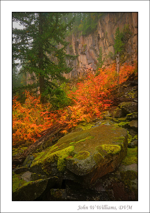
Vine Maple in Oregon's Mt. Hood Wilderness.

It's been warm here in the Pacific Northwest, and fall color seems to be running well behind. Here and there though, there are small patches doing well. I spent Saturday afternoon hiking around in the rain, struggling to find a composition that caught a bit of fall. (This ended up being a silly thing to do, because clambering around on the moss-covered rocky slopes with my backpack on used my legs a lot more than I expected. My wife and I walked the Portland Marathon the next day and I paid for my foolishness.)

For those not familiar with the term slag, it is the molten waste produced when smelting metallic ore. When I was a child in Arizona, I was always fascinated when they would dump the slag at night. It would form a ribbon of glowing golden-red that gave me visions of volcanoes.


Nikon D80
Nikon 12.0-24.0 mm f/4.0 at 12 mm
0.5 and 1.0 sec at f/16 and ISO 100
Hand Blend of three photos for DOF and DR
Despite wiping my lens frequently, I've had to clone out several water spots from the tall tree.

Comments

27 comments
Comment posted by Luis Argerich on October 13, 2010 at 11:03 AM
Hi John,
The colors and details are really wonderful, the blending is perfect. I really enjoy how your composition captures different layers of colors and textures.
Registered on December 22, 2009, 91 Posts, 1349 Comments
Comment posted by Kah Kit Yoong on October 13, 2010 at 11:12 AM
I'm a real fan of your work John. This is a great example of your great way with colour and composition.
Registered on September 27, 2006, 636 Posts, 10682 Comments
Comment posted by Michael J Greene, on October 13, 2010 at 11:19 AM
Hi John,

Strong diagonal lines and colors and I like the dark grey in the sky - it adds quite a bit of moodiness to the scene. I like the shot and think it is a keeper, but falls short of your best work primarily because of the subject matter. I could also see a slight crop down off the top to eliminate the overlapping branches in the ULC. Out of curiousity - the image taken at f/4 - what part of the scene was that used for and why?

Thanks,

Michael :wavey:
Registered on June 18, 2009, 86 Posts, 2317 Comments
Comment posted by John Williams on October 13, 2010 at 11:22 AM
Thanks all! (Kah, that means a lot coming from such a Master Photographer.)

Michael, it was all shot at f/16 (f/4.0 is the speed of the lens).
Registered on September 6, 2007, 221 Posts, 5985 Comments
Comment posted by Larry Fischer on October 13, 2010 at 12:15 PM
Great composition, texture, lines, etc.
The orange foliage is over saturated on my monitor.
the fisch
Registered on July 28, 2008, 155 Posts, 874 Comments
Comment posted by Michael Lowe on October 13, 2010 at 12:21 PM
Outstanding work, John. Fantastic colors. Love that orange foliage and moss covered boulder. :toast:
Registered on February 11, 2004, 777 Posts, 5252 Comments
Comment posted by Bill Chambers on October 13, 2010 at 1:33 PM
Beautiful shot John - very strong composition and the color is great. No nits at all from me.
Registered on April 10, 2005, 753 Posts, 21216 Comments
Comment posted by Andreas Resch on October 13, 2010 at 1:40 PM
The comp works well and I like the soft light very much. The orange colors look a little strong on my display and feel a little separated from the soft mood.
Registered on November 14, 2007, 322 Posts, 6101 Comments
Comment posted by Ron Pederson on October 13, 2010 at 2:29 PM
I agree with Andreas' comments (and others)...dial back on the orange and it's a winner.
Registered on August 12, 2010, 29 Posts, 108 Comments
Comment posted by Michael J Greene, on October 13, 2010 at 3:04 PM
Thanks John. I misread your technical information. :wink:
Registered on June 18, 2009, 86 Posts, 2317 Comments
Comment posted by Walt Sterneman on October 13, 2010 at 3:12 PM
Very pretty John. I like the way the different layers go through the image.
Registered on March 24, 2010, 73 Posts, 1268 Comments
Comment posted by Floris van Breugel on October 13, 2010 at 3:28 PM
What an amazing mix of colors, John. Overall, it doesn't move me as much as most of your other work because it seems to lack some kind of depth - it's mostly just a collection of color candy - though it's still beautiful!
Registered on December 19, 2008, 306 Posts, 4840 Comments
Comment posted by Eric Good on October 13, 2010 at 3:53 PM
Lots of interest captured here... top to bottom. Love the way the rainy weather brought out the saturation and preserved the detail here. No nits... good stuff!
Registered on March 17, 2007, 116 Posts, 4764 Comments
Comment posted by Lon Overacker on October 13, 2010 at 7:39 PM
John,

A very lovely PNW autumn kind of image - damp and saturated with color! :wink: The orange may be a shade too much, but I think the overall sat is pretty good and I really like the color combo with the green moss. The only comment I have that hasn't been made yet is the background sky in the UL. Not a major distraction per se, but does draw my eye and makes me wish it wasn't there. Otherwise, a solid and well captured image.

Lon
Registered on November 24, 2006, 521 Posts, 19147 Comments
Comment posted by Stan Rose on October 13, 2010 at 7:54 PM
I totally love the bottom 2/3--personally id crop the top and go with qa diaganol 50/50 mix of the competing colors here. The contrast up top looks a bit 'pastey' as well, but that may be the atmosphere here.
Registered on September 15, 2005, 836 Posts, 17099 Comments
Comment posted by Chris Chamberlain on October 13, 2010 at 11:27 PM
You really pulled every nuance of color and detail out of this scene! The vine maple is on fire! I knew there was fall color in PNW :wink:

Chris
Registered on March 13, 2007, 500 Posts, 8365 Comments
Comment posted by John Williams on October 14, 2010 at 12:16 AM
Thanks for the thoughts! Here's a version with the red backed down a bit.

I agree with the comments. The color was sparse enough that comps were limited. I would have loved to have shot in the opposite direction (to the south), it had a lot more depth to it and I think I could have had a solid cliff background without the distracting ulc. But the leaves were very dull when viewed form the north, so I went with the better color. A return trip will be in order.
Registered on September 6, 2007, 221 Posts, 5985 Comments
Comment posted by Vance Gese on October 14, 2010 at 2:05 AM
Beautiful image, John. Love the color and I really like the composition with the strong diagonals. As Lon pointed out, the sky popping through in the upper left corner is a slight distraction but not sure what you could have done about that. No deal breaker for me though. Outstanding.
Registered on November 13, 2008, 298 Posts, 6629 Comments
Comment posted by Steve Sieren on October 14, 2010 at 10:27 AM
I like the warm color pallete John. It has flow to it.
Registered on January 2, 2008, 360 Posts, 5321 Comments
Comment posted by Dean Sauskojus on October 14, 2010 at 2:27 PM
Very likable shot John. The colors throughout are lovely. I think the repost serves the image well as it evens it out a bit. The ULC is much less bothersome. I think you got a winner here in my book.
Registered on September 29, 2009, 137 Posts, 2659 Comments
Comment posted by Jimmy Gekas on October 14, 2010 at 3:07 PM
Very nice, John! The color of those leaves is wickedly intense. I like your comp and story, too. Good work to find the colors :toast:
Registered on July 26, 2007, 244 Posts, 2807 Comments
Comment posted by Eva McDermott on October 14, 2010 at 6:36 PM
Fantastic color John. I like the various textures as well
Registered on January 4, 2009, 1015 Posts, 13229 Comments
Comment posted by Anthony Vincent on October 14, 2010 at 7:19 PM
Wow this has got a lot of great textures John. The vibrant oranges and reds just pop out at you.
I think you found a really nice comp as well. Curious how you made the colors pop so much?
Great job all around
Registered on February 5, 2009, 199 Posts, 2775 Comments
Comment posted by Bruce King on October 14, 2010 at 7:29 PM
I like this one John and the original gets my vote. I don't think the colors are too intense, sometimes that's the reality of it. Nice handling of the highlights in the ulc. I've found it hard to compose scenes like this in a way they dont seem too busy but this works well.
Registered on January 14, 2010, 276 Posts, 2212 Comments
Comment posted by Morris McClung on October 14, 2010 at 8:11 PM
I don't care for the sky, but the rest of the image is knocking my socks off. Outstanding color and light! :toast:
Registered on May 7, 2007, 670 Posts, 19650 Comments
Comment posted by Scott Smorra on October 14, 2010 at 11:21 PM
Very nice shot John. The vine maple colors really make this one interesting. It seems like fall is really late to arrive this year in the Pac NW. I'm definitely not complaining about the warm weather though!
Registered on November 2, 2009, 161 Posts, 2143 Comments
Comment posted by Anil Rao on October 15, 2010 at 12:48 AM
This has turned out very nicely. The complex subject matter is presented superbly by your chosen composition. I also love the rich color.
Registered on November 15, 2003, 234 Posts, 4923 Comments