Nature Photographers Network
This is the preserved archive of the original Nature Photographers Network. The community continues at naturephotographers.network.
Swirling Colours
‹ PreviousLandscape GalleryNext ›

Swirling Colours

by Jonathan Sinclair

Gallery: LandscapePosted October 6, 2010129 views10 comments
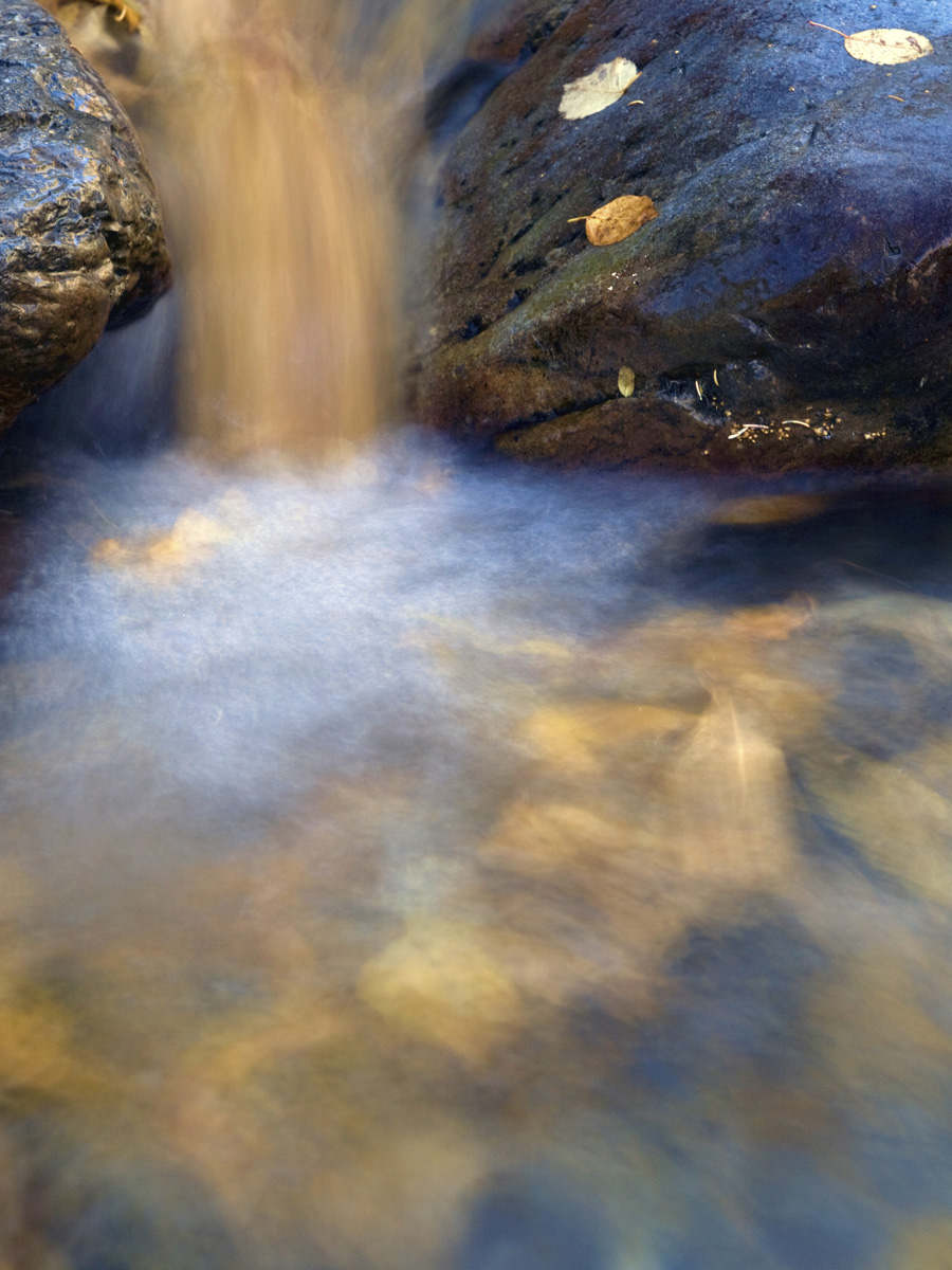
To create this image, I gather a large quantity of yellow leaves from the surrounding area, and I timed the release of the leaves with the shutter open. I had to use a neutral density to slow down the water without the scene being too bright. When I slowed down the water and the leaves, they streaked a lovely golden colour in the water!

f/7.1 @ 1.0 second
ISO 100

Comments

10 comments
Comment posted by Jorne de Bruin on October 6, 2010 at 6:57 AM
Very creative Jonathan, I like it! Nice colour and composition :wavey:
Registered on June 26, 2008, 178 Posts, 2136 Comments
Comment posted by Andrew Finlayson on October 6, 2010 at 7:10 AM
Nice work and a great idea, well executed.
Registered on July 29, 2010, 26 Posts, 404 Comments
Comment posted by Stan Rose on October 6, 2010 at 11:06 AM
Pretty! This is a much stronger comp and is more visually striking than the last one. Im still not totally sold on the water effect/exposure, but that's just personal bias. Good stuff!
Registered on September 15, 2005, 836 Posts, 17099 Comments
Comment posted by Wayne Jones on October 6, 2010 at 12:36 PM
Interesting technique. In this one, I am wondering if a smaller bunch of leaves might have looked more natural -- just wondering. Very imaginative and original!
Registered on April 18, 2007, 953 Posts, 6435 Comments
Comment posted by Fran Gallogly on October 6, 2010 at 12:47 PM
Beautiful dreamy landscape. Great contrast in the golds and blues.
Registered on January 11, 2010, 3 Posts, 19 Comments
Comment posted by Tom Dobrzanski on October 6, 2010 at 4:08 PM
I like the effect and the colour...very much. Great idea! Perhaps only one a bit too bright spot (only IME) is where the water falls. The flow above is beautifully gold however, the spot where it falls is a bit too much in the contrast. Anyway, wel done and a very good idea :)
Registered on September 27, 2010, 17 Posts, 164 Comments
Comment posted by Tom Dobrzanski on October 6, 2010 at 9:00 PM
I like the effect and the colour...very much. Great idea! Perhaps only one a bit too bright spot (only IME) is where the water falls. The flow above is beautifully gold however, the spot where it falls is a bit too much in the contrast. Anyway, wel done and a very good idea :)
Registered on September 27, 2010, 17 Posts, 164 Comments
Comment posted by Tony Kuyper on October 6, 2010 at 10:32 PM
A leaf falls. Pretty cool. I really like the fact that some of them are surfacing in the foreground to give a clearer idea of what's happening. Nicely creative.
Registered on November 1, 2003, 364 Posts, 22328 Comments
Comment posted by Eric Good on October 7, 2010 at 7:58 PM
What a great idea and well executed. Though I enjoy the overall image, I'm particularly fond of the subtle colors and shapes in the lower third. That would make an interesting image by itself. Nice work!
Registered on March 17, 2007, 116 Posts, 4764 Comments
Comment posted by Daniel Cartamil on October 7, 2010 at 11:39 PM
Great concept, interesting textures and colors.
Registered on November 15, 2007, 50 Posts, 601 Comments