Nature Photographers Network
This is the preserved archive of the original Nature Photographers Network. The community continues at naturephotographers.network.
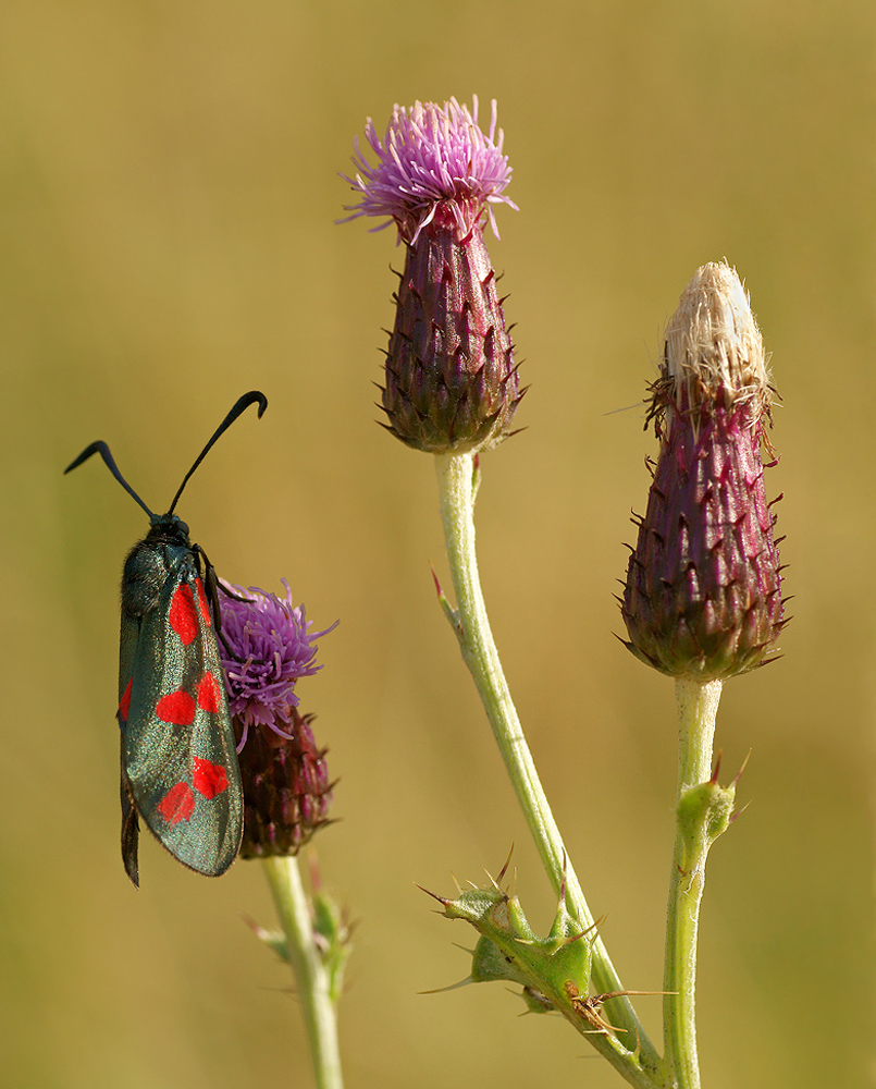
6 spot Burnet Moth
‹ PreviousMacro & Close-up GalleryNext ›

6 spot Burnet Moth

by Geoffrey Baker

Gallery: Macro & Close-upPosted September 18, 201093 views9 comments
I took this shot of a 6 spot Burnet moth on Meadow Thistle out in the field next to my home one evening after work.
The lighting is just the warm evening sunlight.

I took this shot with the camera in portrait position but I'm uploading one taken in landscape format also to see which one the experts on here think is the best composition.

Sony A350
Tamron 90mm f2.8 macro
1/200th second
f8
ISO 200
-0.3 stop exposure compensation
Tripod
Cable release

Comments

9 comments
Comment posted by Geoffrey Baker on September 18, 2010 at 11:10 AM
Was I right to choose the portrait version over this one?

Geoff.
Registered on August 20, 2010, 192 Posts, 980 Comments
Comment posted by Buck Ward on September 18, 2010 at 12:15 PM
Yup. Portrait.

I like the simple, elegant composition with the three stems. I would say the picture is of three thistle heads, one of which just happens to have a moth on it, which exponentially adds to the interest, btw.

The horizontal version is okay, to, but the vertical wins the prize. Good picture
Registered on December 8, 2003, 96 Posts, 1917 Comments
Comment posted by Carol Hyman on September 18, 2010 at 12:30 PM
Geoffrey, I think you have lovely detail on the flowers, but IMO, both images say, "Look, there's a visitor in the thistles..."

And they are both great images with a nice DOF; both have nice compositions.

Cheers,

Carol
Registered on January 18, 2007, 597 Posts, 8062 Comments
Comment posted by jamie pringle on September 18, 2010 at 12:55 PM
Tough one, but I like the vertical better. The landscape is interesting, but the moth is a little too far over on the left side. Great comp, detail, and background :toast:
Registered on August 10, 2005, 323 Posts, 1216 Comments
Comment posted by Sam Rua on September 18, 2010 at 3:28 PM
I am no expert, Geoffrey, but I do prefer the vertical comp for the same reason as posted by Jamie. :smile:
Registered on September 9, 2006, 130 Posts, 2281 Comments
Comment posted by Daniel & Loana on September 18, 2010 at 4:08 PM
Nice shot, Geoffrey. I prefer the portrait version; I find it more balanced.

D&L
Registered on October 7, 2008, 166 Posts, 3044 Comments
Comment posted by Luke Ormand on September 19, 2010 at 8:16 PM
Really nice colors and detail. I think I like the 2nd version better...but I'm not sure. To be honest I think the fact that it is on the left in the shadows hurts no matter which composition you use - but that's minor.
Registered on February 4, 2009, 1093 Posts, 7035 Comments
Comment posted by Gary Yeoh on September 20, 2010 at 6:32 AM
Geoffrey:
It depends what you want to convey. The second is more of a flora shot with an uninvited guest on one of them and the first gives more emphasis on the moth. The image is well captured with rich colors from the warm light. :toast:
Registered on September 1, 2009, 588 Posts, 8184 Comments
Comment posted by Patricia Brundage on September 20, 2010 at 6:45 AM
I'd like either in my portfolio. The original post where the butterfly is the main subject works best for me. Both the flowers and insect are bright and in sharp focus. Well done!
Registered on March 23, 2006, 1111 Posts, 6531 Comments