Nature Photographers Network
This is the preserved archive of the original Nature Photographers Network. The community continues at naturephotographers.network.
Nuit américaine +repost
‹ PreviousLandscape GalleryNext ›

Nuit américaine +repost

by Paolo De Faveri

Gallery: LandscapePosted September 6, 2010449 views16 comments
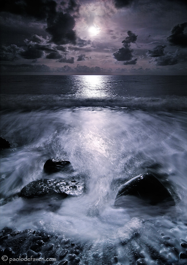
Well, this is just an exercise of "day for night" techniques or, at least, this is what I wanted to do when I initially took it. I had indeed a lot of fun today processing this picture, but while I was working on it I realized that I kinda like it better in black and white, and that's what I will probably go for with this one, at the end. However, I decided to post the colour version just to hear what you fellows think of it, and I will also post the B/W here below for comparison.

I took this picture at the beach of Camogli in Liguria, Italy, more than a year and half ago but I've never processed it before. It was taken in broad daylight (4pm) with a strong ND filter (6 stops) and another GND, probably 8x.

Your critiques and suggestion are highly appreciated, thanks in advance for your time.

PS larger image provided

Comments

16 comments
Comment posted by Paolo De Faveri on September 6, 2010 at 9:43 PM
Here's the black and white
Registered on August 29, 2007, 318 Posts, 1651 Comments
Comment posted by Tony Kuyper on September 6, 2010 at 10:05 PM
I actually like the color version best, except for the color. That is, the color of the water and foreground look great. If you could duplicate this in the sky, I think the cooler tones work really well with this comp.
Registered on November 1, 2003, 364 Posts, 22328 Comments
Comment posted by Jeremy Kessler on September 6, 2010 at 10:52 PM
Pretty fantastic if you ask me, I like the color version but I'd like to see it with the suggestion Tony mentioned.
Registered on September 13, 2007, 36 Posts, 1283 Comments
Comment posted by Kory Lidstrom on September 6, 2010 at 11:15 PM
Wow, this is epic. I've never heard of "day for night" techniques. I must say it does quite a convincing job of making a day scene look like a beautifully lit moonscape. I honestly prefer the color version -- it's more moody feeling.

Paulo, can ask where you learned that technique? Also, some EXIF would be nice if you are ok with that.
Registered on November 19, 2008, 49 Posts, 1035 Comments
Comment posted by Kent Mearig on September 7, 2010 at 12:33 AM
I like the black and white version because it looks more like a [monochrome] photograph of the planet I live on and less like a figment of someones imagination. Even the composition seems more coherent without the odd colors.
Registered on September 4, 2006, 237 Posts, 4748 Comments
Comment posted by Andrew Finlayson on September 7, 2010 at 2:04 AM
There are some lovely little details in this one that work a treat. The colour version for mine mainly as I feel it has a bit more depth, and I don't mind the colouration. Day for night certainly, thought it was the moon initially.
Registered on July 29, 2010, 26 Posts, 404 Comments
Comment posted by Jorne de Bruin on September 7, 2010 at 6:57 AM
That is just plain awesome! I agree with the suggestion Tony gave, somehow the colour version appeals to me more as well (except for the colour) :wink: :wavey:
Registered on June 26, 2008, 178 Posts, 2136 Comments
Comment posted by Nick Bristol on September 7, 2010 at 9:03 AM
Great shot, Paolo. Very interesting to look at. I like the b/w version better myself as they are here.

Nick Bristol
Lone Rock, WI
Registered on February 1, 2004, 752 Posts, 14140 Comments
Comment posted by Paolo De Faveri on September 7, 2010 at 9:28 AM
Thanks all for the comments. I've reworked the image according to Tony and other's suggestions and here's the new version. How about it?

Kory, "day for night" is a technique used quite frequently in movie making, as in film production the schedule is often tight, actors are perhaps working at two or more productions at a time, and you do not have always the time for shooting a night scene when is actually night. If you google it you will find tons of reference, here's one I just found http://www.videomaker.com/article/8150/
Registered on August 29, 2007, 318 Posts, 1651 Comments
Comment posted by Mitch Erwin on September 7, 2010 at 10:48 AM
Paolo, I prefer the color version over the B&W as well. The color conveys that coolness one often thinks of when thinking of an evening at the seaside. A preference for the 2nd color version over the 1st is slight. :toast:
Registered on April 24, 2006, 98 Posts, 656 Comments
Comment posted by Phil Pogledich on September 7, 2010 at 12:27 PM
Hard choice between the color versions (though I prefer the second) and the B&W. I probably prefer the B&W overall. Really cool shot. I've seen this technique before, but only rarely and never executed this well.
Registered on August 24, 2009, 123 Posts, 3099 Comments
Comment posted by Wendy Blanchard on September 7, 2010 at 2:08 PM
I like the mood in the color version. I would definitely pick the color version. Beautiful shot! :toast:
Registered on June 11, 2006, 58 Posts, 647 Comments
Comment posted by Stan Rose on September 7, 2010 at 9:12 PM
Definitely the color, and the repost!! The color makes the shot--it adds to the mood. Excellent work! :wavey:
Registered on September 15, 2005, 836 Posts, 17099 Comments
Comment posted by Dean Sauskojus on September 8, 2010 at 2:33 PM
Paolo, I agree with the others. The color just has a lot more life to it. The repost is also much better.
Registered on September 29, 2009, 137 Posts, 2659 Comments
Comment posted by Paul Wegemann on September 9, 2010 at 8:30 AM
The repost works for me, Paolo. A very beautiful and dramatic image. Thanks for sharing your technique.
Registered on December 14, 2006, 58 Posts, 1888 Comments
Comment posted by Morris McClung on September 10, 2010 at 6:21 PM
It was already a powerful image, but your repost takes it to another level. Very evocative! :toast:
Registered on May 7, 2007, 670 Posts, 19650 Comments