Nature Photographers Network
This is the preserved archive of the original Nature Photographers Network. The community continues at naturephotographers.network.
Rockface
‹ PreviousLandscape GalleryNext ›

Rockface

by Andreas Resch

Gallery: LandscapePosted August 23, 2010349 views15 comments
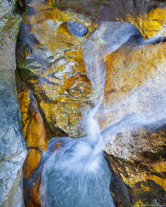
Another shot from my archive. Taken in a nearby gorge that isn't very long, but has some interesting rock formations along the way.
The shot was taken from a little footbridge straight down onto the narrow waterfall - that's why it's hard to figure out a direction here.

Canon 5DMII, Zeiss VS 35-70mm, Polarizer.

I hope to get back out again soon - still some desk work on my schedule.

Thanks for all comments & critiques.

Comments

15 comments
Comment posted by Floris van Breugel on August 23, 2010 at 5:58 PM
Fantastic! What an incredible collection of colors, textures, motion, and shapes. The gold/blue contrast is particularly effective. One of the more fascinating abstracts I've seen in a while, love it!
Registered on December 19, 2008, 306 Posts, 4840 Comments
Comment posted by Ben Horne on August 23, 2010 at 7:10 PM
When I saw this image on the main page, then viewed it at full size, I was very surprised to see that this was *not* shot with film. I would have bet that this was shot on 4x5 with Velvia or Provia. Very nice job with the complimentry colors, and the even tonality. I'm not sure how well the left side works with the composition as a whole, but that doesn't necessarily mean I think it should be cropped off. It does mirror the shape of the water a bit.
Registered on August 27, 2009, 51 Posts, 959 Comments
Comment posted by John Williams on August 23, 2010 at 8:18 PM
I have to agree Andreas, one of the better abstracts I've seen in awhile. There is just enough disconnect to really make you ponder what's up and what's down, and yet the water flow keeps you on track. The colors are perfect.
Registered on September 6, 2007, 221 Posts, 5985 Comments
Comment posted by Benjamin Glatt on August 23, 2010 at 8:37 PM
Absolutely no sense of scale or perspective, but that's what I dig. Great colors and abstract quality. Nice work, Andreas. :toast:
Registered on July 15, 2007, 171 Posts, 3566 Comments
Comment posted by Kah Kit Yoong on August 23, 2010 at 10:29 PM
I like the abstract nature to this. I feel disoriented not quite sure of the scale and position of this view and makes me look harder. Well done in creating such an intriguing shot.
Registered on September 27, 2006, 636 Posts, 10682 Comments
Comment posted by Wade Hardy on August 23, 2010 at 11:21 PM
Wonderful abstract! the colors and textures are outstanding.
Registered on May 2, 2006, 121 Posts, 1824 Comments
Comment posted by Dean Sauskojus on August 23, 2010 at 11:59 PM
Not sure how to look at this one which makes it an excellent abstract. I like the colors and the textures. Great job Andreas.
Registered on September 29, 2009, 137 Posts, 2659 Comments
Comment posted by Dietrich Gloger on August 24, 2010 at 1:05 AM
Great colour contrast in this one Andreas! Gold and blue - the perfect match. The composition as such is also really interesting and engaging to look at. A very good one!
Registered on January 26, 2007, 360 Posts, 9876 Comments
Comment posted by Rafael Rojas on August 24, 2010 at 3:28 AM
Wow Andreas. VERY abstract. I love it. Maybe I would like having more deep shadows though or slightly under exposed...it seems a bit too "clear" all over it...But this is really SO special!!
Registered on March 1, 2009, 56 Posts, 623 Comments
Comment posted by Ron Pederson on August 24, 2010 at 8:36 AM
Very nice, Andreas. The colors are great. Keeps you looking and wondering. Was this rotated right? That water flow coming from the RH side is the one element that draws my eye away...still, well done. Definitely keeps you engaged.
Registered on August 12, 2010, 29 Posts, 108 Comments
Comment posted by Anand Narayanan on August 31, 2010 at 6:30 PM
Awesome :toast:
Registered on October 25, 2009, 110 Posts, 835 Comments
Comment posted by SandyRichardsBrown on August 31, 2010 at 11:19 PM
Andreas, congrats on a very fine EP!
Sandy r
Registered on November 24, 2003, 3937 Posts, 12909 Comments
Comment posted by Andreas Resch on September 1, 2010 at 12:48 AM
Oh WOW - thanks a lot for the editors pick. Never thought I would get one with such an unusual shot.
Registered on November 14, 2007, 322 Posts, 6101 Comments
Comment posted by Wayne Jones on September 1, 2010 at 3:34 PM
Andreas,
As everyone has already said, the colors and comp make a wonderful abstract. Another thing I like is your choice of shutter speed. Ir preserves enough literal reality and sense of scale to keep this grounded. Congratulations on the EP.
Registered on April 18, 2007, 953 Posts, 6435 Comments
Comment posted by Stephen Cunliffe on September 5, 2010 at 4:46 PM
Vertigo!
Registered on May 25, 2009, 62 Posts, 202 Comments