Gallery: LandscapePosted August 9, 201073 views3 comments
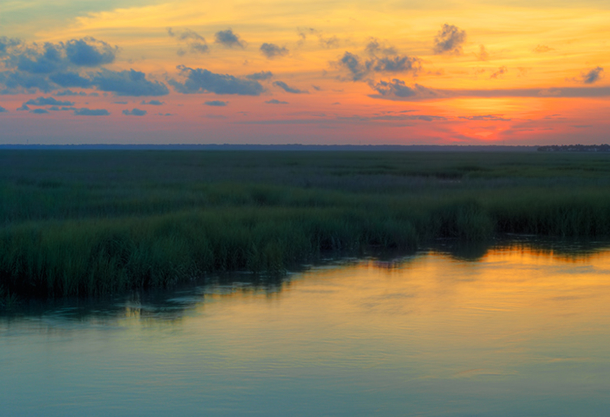
HDR image processed in PS5 and Photomatix
Comments
3 comments
Comment posted by Tony Kuyper on August 9, 2010 at 11:10 PM
I like this, Todd. Dramatic colors with a contrasting softer foreground for contrast. On the laptop some of the colors in the sky seem a bit over-saturated, but it's really hard to say on this monitor.
Registered on November 1, 2003, 364 Posts, 22328 Comments
Comment posted by Kah Kit Yoong on August 10, 2010 at 12:21 AM
Nice tranquil scene. It does have that odd lacking in contrast look that HDR can have. I would have expected the scene to be more dark.
Registered on September 27, 2006, 636 Posts, 10682 Comments
Comment posted by Lon Overacker on August 10, 2010 at 12:28 AM
Todd,
I think this is quite beautiful and your best posted to date, IMHO. The comp is much more balanced and comfortable than the V version and you still have maintained some of that turquoise blue at the bottom.
My only nit is that colors are little on the over-processed side. And I say that mainly because the clouds on the left to me should be more on the gray/blue/gray side rather than like a blue/cyan/bubblegum color. Honestly, the color/sat is not a far stretch and of course we all have our own artistic license and so there's nothing wrong with the colors and what I'm commenting on is just my own perceptions. YMMV. Regardless, this is a very serene and inspiring sunset/rise.
On a side note, it would be helpful if you let us know what kind of feedback you're looking for, if any? Some folks just want to share and others are looking for suggestions for improvement. It's helpful to those who wish to comment to know what you're looking for.
Thanks for posting!
Lon
Registered on November 24, 2006, 521 Posts, 19147 Comments

Comments
3 commentsI think this is quite beautiful and your best posted to date, IMHO. The comp is much more balanced and comfortable than the V version and you still have maintained some of that turquoise blue at the bottom.
My only nit is that colors are little on the over-processed side. And I say that mainly because the clouds on the left to me should be more on the gray/blue/gray side rather than like a blue/cyan/bubblegum color. Honestly, the color/sat is not a far stretch and of course we all have our own artistic license and so there's nothing wrong with the colors and what I'm commenting on is just my own perceptions. YMMV. Regardless, this is a very serene and inspiring sunset/rise.
On a side note, it would be helpful if you let us know what kind of feedback you're looking for, if any? Some folks just want to share and others are looking for suggestions for improvement. It's helpful to those who wish to comment to know what you're looking for.
Thanks for posting!
Lon