Nature Photographers Network
This is the preserved archive of the original Nature Photographers Network. The community continues at naturephotographers.network.
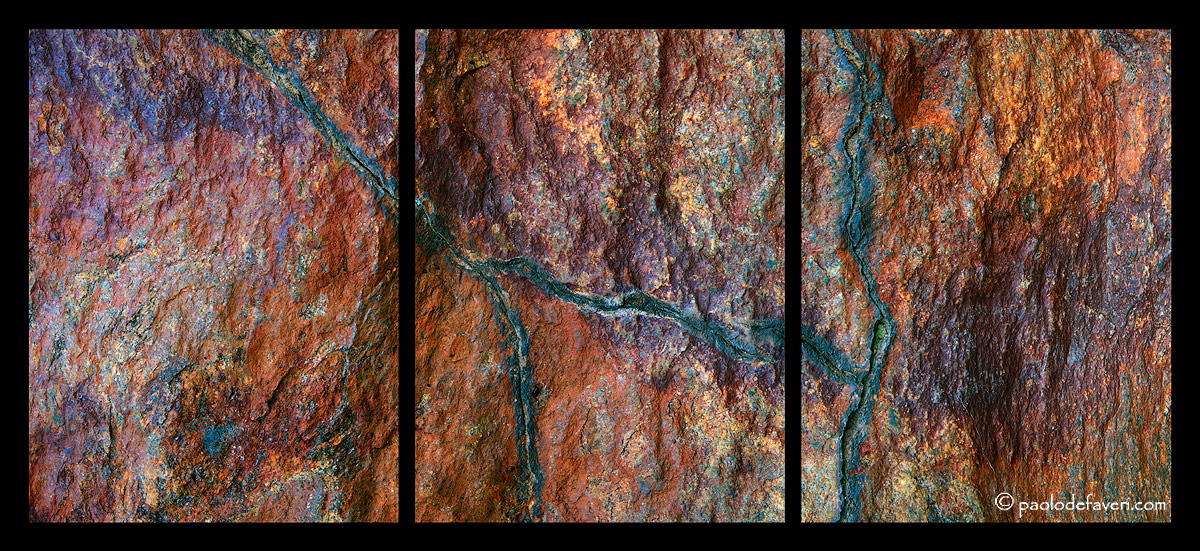
Earth's veins [and more]
‹ PreviousLandscape GalleryNext ›

Earth's veins [and more]

by Paolo De Faveri

Gallery: LandscapePosted July 30, 2010560 views21 comments
I went to the Alpi Marittime natural park yesterday, in a small plateau which is so full with nice coloruful rocks that you can stay there for weeks and never run out of images. Here's just another addition to my geoglyphs series.

Your C&C are as always highly appreciated, thanks in advance for your time.

Techs: Eos 50D, Tamron SP 28-75 f2.8, tripod. Mosaic of 6 images.

PS: compression here's a killer, the larger file I've attached looks a bit better than the standard size at 200kb :wink:

Comments

21 comments
Comment posted by Eva McDermott on July 30, 2010 at 4:11 PM
Splendid texture, color, and light Paolo. The mix of diagonal and horizontal lines really enhances this image.
Registered on January 4, 2009, 1015 Posts, 13229 Comments
Comment posted by Bill Chambers on July 30, 2010 at 4:12 PM
Can't believe there hasn't been any comments on this yet! This is absolutely beautiful Paolo, and the presentation is excellent as well.
Registered on April 10, 2005, 753 Posts, 21216 Comments
Comment posted by Keith Bauer on July 30, 2010 at 4:40 PM
I like this very much. The presentation is wonderful. I can just imagine this as a large tryptic. The larger image begins to show the texture, but I'm sure you have so much more. Very nice.
Registered on November 20, 2003, 458 Posts, 4836 Comments
Comment posted by beth summer on July 30, 2010 at 5:17 PM
Excellent, Paolo. Love the vibrant colors and the details are wonderful. I like the tryptich as presented. Nicely done and seen.
Registered on November 1, 2003, 437 Posts, 5220 Comments
Comment posted by Daniel & Loana on July 30, 2010 at 5:17 PM
Very nice shot! The light and the colours are incredible.

The larger version is superb.

D&L
Registered on October 7, 2008, 166 Posts, 3044 Comments
Comment posted by Julia Flanagan on July 30, 2010 at 6:03 PM
I agree with everyone that the light, colors and textures are quite alluring. The greenish lines tie everything together beautifully. On the large version I think I am seeing some artifacts of the stitching. In the right hand panel there are some repetitive lines and colors that make me think this is an area of overlap/stitching. I could be wrong - I just don't see that repetition elsewhere so it makes me wonder... Nonetheless this is warm and intriging and very engaging to the eyes. Lovely.

Registered on November 13, 2003, 59 Posts, 986 Comments
Comment posted by Kah Kit Yoong on July 30, 2010 at 6:26 PM
Lovely textures and patterns. Well seen. I do prefer this as a straight pano though. The divisions in the tryptich seem to interfere with my appreciation of the natural bold lines that cut the rock up into 4 pieces.
Registered on September 27, 2006, 636 Posts, 10682 Comments
Comment posted by Harley Goldman on July 30, 2010 at 6:43 PM
Excellent colors, patterns and textures. Works beautifully.
Registered on November 19, 2003, 586 Posts, 11271 Comments
Comment posted by Paolo De Faveri on July 30, 2010 at 6:50 PM
Thanks all for your comments, I appreciate that.
Julia, I think you mean the area that I've attached here at print size (24" x 54" @240 dpi). As you can see, those are just "wrinkles on the rock face :biggrin: , very close one to another. But of course, it's impossible to see this at web size, and now that you made me notice it, I think it might really look like some kind of overlap/poor stitching. Can't help it, unfortunately :frown:

:wavey:
Paolo
Registered on August 29, 2007, 318 Posts, 1651 Comments
Comment posted by Julia Flanagan on July 30, 2010 at 6:59 PM
Yes Paolo - that is one of the areas - the darkest portion of the enlargement you added - about 1/3 of the way in from the right side. Some of the rock has exact duplicate patterns like two or three skinny vertical lines copied next to each other. I'm more sure now that it is a blending thing. The other area I thought might be the same is in the brighter orange area above and a little to the right of the area you enlarged. Hope that helps. I'd be inclined to print this image big!
Registered on November 13, 2003, 59 Posts, 986 Comments
Comment posted by Paolo De Faveri on July 30, 2010 at 7:22 PM
Kah Kit, your wishes are my commands :biggrin:
I do like this more as a straight pano too, it is just that tryptichs sell so well... :wink:

Cheers,
Paolo
Registered on August 29, 2007, 318 Posts, 1651 Comments
Comment posted by Tony Kuyper on July 30, 2010 at 11:43 PM
I love this, Paulo and the triptych works especially well. The non-triptych feels a bit too homogenous. This would make a fascinating wall hanging. Very nicely done.
Registered on November 1, 2003, 364 Posts, 22328 Comments
Comment posted by Stan Rose on July 31, 2010 at 3:49 AM
Its all good! :toast:
Registered on September 15, 2005, 836 Posts, 17099 Comments
Comment posted by Dean Sauskojus on July 31, 2010 at 3:51 AM
Beautiful colors Paolo. That crack adds a nice focal point to the image. Beautifully framed also.
Registered on September 29, 2009, 137 Posts, 2659 Comments
Comment posted by Kah Kit Yoong on July 31, 2010 at 5:43 AM
I think the triptych does look better now.
Registered on September 27, 2006, 636 Posts, 10682 Comments
Comment posted by Paul Marcellini on July 31, 2010 at 9:30 AM
Very interesting detail study. I also think it works much better as a triptych. I can imagine it big face mounted on plexi.
Registered on November 27, 2007, 250 Posts, 2468 Comments
Comment posted by Michael Anderson on August 1, 2010 at 12:32 AM
Awesome Paolo. Great eye and a perfect subject for a triptych presentation. You lined up the rock veins very well so they are complimentary to the borders of each panel.
Registered on January 31, 2006, 228 Posts, 3072 Comments
Comment posted by Anthony Vincent on August 1, 2010 at 2:23 PM
Tryptich all the way. I think your vision of creating this that way was spot on Paolo. Way to showcase some rock.......you rock!!! :toast:
Registered on February 5, 2009, 199 Posts, 2775 Comments
Comment posted by Morris McClung on August 1, 2010 at 4:45 PM
I like this a lot. Especially the rich patina and color of the rocks. Excellent comp with the use of the lines, and the employment of the tryptich. :toast:
Registered on May 7, 2007, 670 Posts, 19650 Comments
Comment posted by Ant on August 1, 2010 at 5:15 PM
Splendid abstract image, I especially like the triptych version. Very pleasant photograph!
Registered on April 13, 2009, 27 Posts, 474 Comments
Comment posted by Vance Gese on August 2, 2010 at 12:03 AM
This is stunning Paulo. Your composition, the use of the triptych, the color and textures are all incredible. Superb art in my opinion.
Registered on November 13, 2008, 298 Posts, 6629 Comments