Nature Photographers Network
This is the preserved archive of the original Nature Photographers Network. The community continues at naturephotographers.network.
Treescape
‹ PreviousLandscape GalleryNext ›

Treescape

by Balakumar Kaushik

Gallery: LandscapePosted July 29, 201086 views6 comments
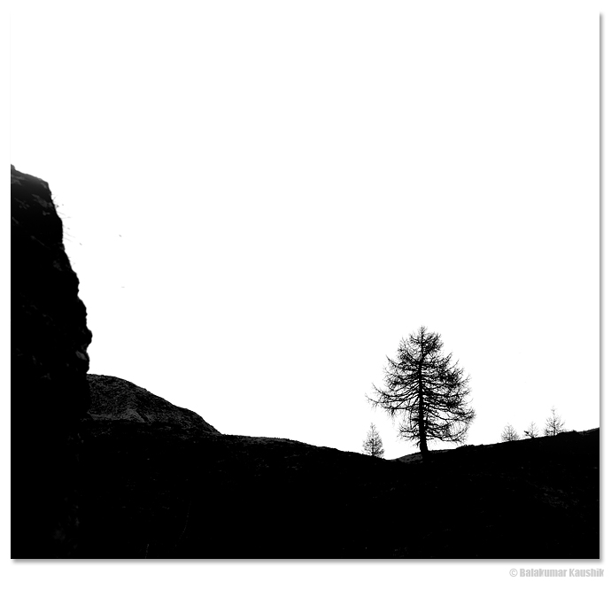
While on the hiking path, I noticed this scene with a (almost) lone tree on the ridge of the mountain.
First thought in my mind was a B&W image of the same.
The image was exposed for the sky to contains just the details (i.e. without getting blown) while the FG was looking dark.
I do have sufficient details in shadows but while PP, I deliberately pulled it down further.
There were few interfering branches from nearby + some bushes on the far grassland which I did'nt want to be seen.
I also over-exposed the sky to give a high-key effect.
My thoughts on doing so was that, the scene as such did not have any dramatic sky or interesting FG elements etc. And that retaining colour and texture in sky (that of overcast clouds) or the FG (that of grassland + bushes + few distracting branches) would make the image more complex and detract the viewer from a simpler graphic representation - which was my original intention.
The original was a 2:3 ratio, but I added some canvas on top to give it a square-ish format.

Am really unsure if this image works (for lack of more interesting elements). Would love to know your thoughts on the image.

P.S. Also posted below is the 2:3 for,at of the image.

Comments

6 comments
Comment posted by Balakumar Kaushik on July 29, 2010 at 4:14 PM
The 2:3 format of the same scene.
Registered on January 4, 2008, 98 Posts, 1403 Comments
Comment posted by Dean Sauskojus on July 29, 2010 at 5:28 PM
My thoughts were to cut some of the white out of the image, and then I noticed you did in the repost. Looks much, much better. I would also clone out the dust spots on the left side and just a few on the right.
Registered on September 29, 2009, 137 Posts, 2659 Comments
Comment posted by Eric Good on July 29, 2010 at 9:12 PM
I actually prefer the added canvas of the original post. I also like the negative like qualities (B&W shapes) this image has. The only thing that could make this better IMO is if those other trees/bushes didn't protrude over that horizon and there was just that lone tree. That would have simplified this even more... which is what this kind of image is all about. Nice eye!
Registered on March 17, 2007, 116 Posts, 4764 Comments
Comment posted by Tony Kuyper on July 29, 2010 at 11:03 PM
Artistic but also real. Agree with the speck clone suggestion.
Registered on November 1, 2003, 364 Posts, 22328 Comments
Comment posted by Floris van Breugel on July 29, 2010 at 11:28 PM
Very simple, and yet very effective image. I love the graphic nature to this. Definitely the square for me (and I usually hate squares).
Registered on December 19, 2008, 306 Posts, 4840 Comments
Comment posted by Danny Laureys on July 30, 2010 at 1:27 AM
Love this, very well seen, Agree with cloning out some of the specks and brushes on left. I also would give it a try on cloning out the surrounding trees just for the heck of it.

:toast: :toast:
Registered on January 5, 2008, 590 Posts, 1261 Comments