Nature Photographers Network
This is the preserved archive of the original Nature Photographers Network. The community continues at naturephotographers.network.
Fairy Chimneys
‹ PreviousLandscape GalleryNext ›

Fairy Chimneys

by Marsel van Oosten

Gallery: LandscapePosted July 28, 2010664 views21 comments
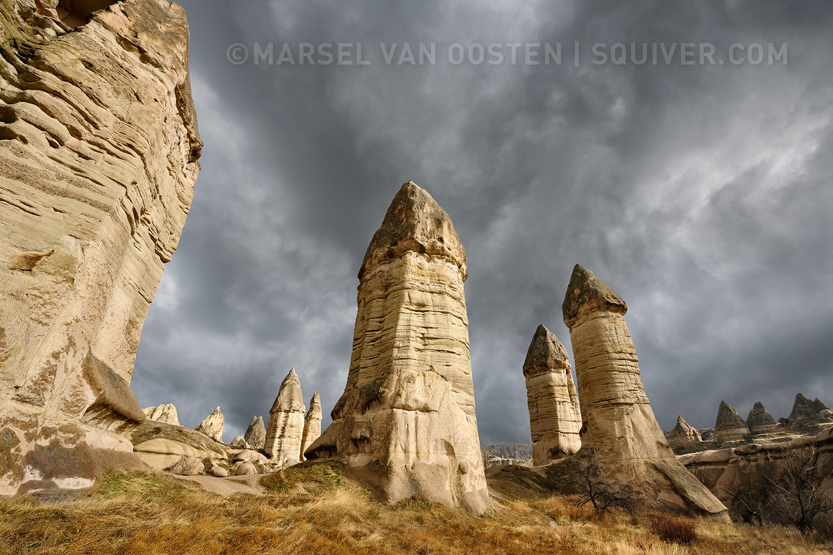
Earlier this year I visited Turkey to scout for new workshop locations. The region I selected was Cappadocia, in the south of Turkey. It's an area of exceptional natural wonders and a unique historical and cultural heritage. The volcanic landscape is entirely sculpted by millions of years of erosion. Wind and rain have created a bizarre field of hundreds of conical formations. Many of these sandstone pillars, also known as fairy chimneys, contain labyrinths and caves where Christians once hid to avoid persecution.

As usual, I had done my research before I began exploring this area, but I was stunned when I actually walked there myself. When I took this shot, I had not been very lucky with the weather that day. The sky was nothing but a featureless, dull grey blanket. So I decided to just limit myself to exploring, finding angles, looking for the best shooting positions, and putting it all in my GPS. After a couple of hours, the weather started to change. The clouds became thicker and darker, with more definition. The darkness of the clouds contrasted nicely with the yellows of the rocks, so I decided to set up my gear and wait for whatever would come. When the clouds behind me suddenly parted for a few seconds, just enough for the sun to peek through en throw some light on the pillars, I took this shot.

This kind of perspective distortion is usually something I try to avoid, but in this case I thought it emphasized the height of the pillars, while at the same time pulling your eye into the center of the shot.

Your comments and suggestions are appreciated as always.

D3X, AF-S 14-24/2.8, 1/50 @ f/16, ISO 100

Comments

21 comments
Comment posted by Stuart Williams on July 28, 2010 at 8:11 AM
the light on the formations is very good, and nicely offset from the dark grey clouds. i'm a little uncomfortable with the structure coming in from the left but can understand the constraints. undeniably phallic, though, those structures.
Registered on December 7, 2007, 247 Posts, 4792 Comments
Comment posted by Kevin Trinkner on July 28, 2010 at 8:34 AM
Looks like a really cool area to explore, those formations are very nice. I like the contrast of the nice light on the formations against that dark sky. The comp feels a bit unbalanced with the large formation on the border, but it still displays the area well.
Registered on June 30, 2008, 203 Posts, 2641 Comments
Comment posted by Bill Chambers on July 28, 2010 at 9:04 AM
I love the contrast between the sky and pillars, but have to admit the distortion is bothering me somewhat. Looks like an amazing area!
Registered on April 10, 2005, 753 Posts, 21216 Comments
Comment posted by Rick Goldwasser on July 28, 2010 at 9:20 AM
Very cool formations and the dark sky really works to give them some contrast. Always wanted to visit this place.
Registered on May 10, 2009, 127 Posts, 970 Comments
Comment posted by Kah Kit Yoong on July 28, 2010 at 9:33 AM
The dark clouds over warmly illuminated subjects makes this very dramatic. The converging verticals probably adds to the drama. They do look rather phallic though.
Registered on September 27, 2006, 636 Posts, 10682 Comments
Comment posted by Paulo A.Lopes on July 28, 2010 at 9:39 AM
i remember a few years ago when i visited Turkey and more precisely Cappadocia and made a balloon flight over the unique landscape that this location is. Did you done it? Great shot :toast:
Registered on October 14, 2008, 122 Posts, 836 Comments
Comment posted by Mark Zelinka on July 28, 2010 at 9:45 AM
Outstanding. The light and clouds make the shot. I'm not bothered by the rock on the L.
Registered on August 20, 2007, 206 Posts, 998 Comments
Comment posted by Chris Chamberlain on July 28, 2010 at 9:52 AM
I've been wanting to see something from a D3X that showed what the rezolution could do. Well this is finally it!!! Amazing details all over this image! Totally awesome . The distortion throws me a bit at first, but then I get used to it. Very nice!

Chris
Registered on March 13, 2007, 500 Posts, 8365 Comments
Comment posted by Jorne de Bruin on July 28, 2010 at 9:59 AM
Great contrast between the sky and the pillars, I also think the perspective works very fine here. I might be tempted to crop a sliver off the left, that pillar is very dominant now. :wavey:
Registered on June 26, 2008, 178 Posts, 2136 Comments
Comment posted by Marsel van Oosten on July 28, 2010 at 11:43 AM
Just for fun; a version with corrected perspective.
Registered on March 9, 2004, 285 Posts, 2277 Comments
Comment posted by Eva McDermott on July 28, 2010 at 12:29 PM
Marvelous detail in the large view Marsel. I like the striking contrast of the pillars against the dark, dramatic sky.
Registered on January 4, 2009, 1015 Posts, 13229 Comments
Comment posted by Abdullaziz Bin Ali on July 28, 2010 at 1:03 PM
I love the light
well composed
All the best
Registered on May 31, 2009, 112 Posts, 1590 Comments
Comment posted by Tien-Chien Chen on July 28, 2010 at 2:25 PM
Beautiful light and overall mood. I especially like the detail on the grass. Thanks for sharing!
Registered on September 2, 2005, 34 Posts, 225 Comments
Comment posted by Floris van Breugel on July 28, 2010 at 7:22 PM
Very cool place, Marsel. The drama of the light and clouds makes the (rather phalic) structures stand out really nicely. The distortion doesn't bother me so much as the dominant left wall, and the proximity of the third largest tower to the second largest tower - small nits though.
Registered on December 19, 2008, 306 Posts, 4840 Comments
Comment posted by Tony Kuyper on July 28, 2010 at 9:34 PM
WOW. I like the convergence, actually. It pulls me right up to the sky.
Registered on November 1, 2003, 364 Posts, 22328 Comments
Comment posted by Morris McClung on July 28, 2010 at 11:26 PM
A very interesting landscape. Great light and comp. Very well done.
Registered on May 7, 2007, 670 Posts, 19650 Comments
Comment posted by Mark Metternich on July 29, 2010 at 4:46 AM
VERY interesting formations with nice light. Nice job.

I find the dominant wall on the left quite distracting.
Registered on June 19, 2009, 276 Posts, 6240 Comments
Comment posted by Andreas Resch on July 30, 2010 at 3:29 AM
The original is much better. Great colors & details.
Registered on November 14, 2007, 322 Posts, 6101 Comments
Comment posted by Mark Metternich on July 30, 2010 at 4:25 AM
Why not just square crop it and maybe eliminate the wall altogether?
Registered on June 19, 2009, 276 Posts, 6240 Comments
Comment posted by Marsel van Oosten on July 30, 2010 at 4:30 AM
Mark - I'll give it a try. Thanks for your feedback, much appreciated.
Registered on March 9, 2004, 285 Posts, 2277 Comments
Comment posted by Bill Chambers on July 30, 2010 at 12:15 PM
Love the corrected version - superb! :toast:
Registered on April 10, 2005, 753 Posts, 21216 Comments