Nature Photographers Network
This is the preserved archive of the original Nature Photographers Network. The community continues at naturephotographers.network.
Variation on a Theme
‹ PreviousLandscape GalleryNext ›

Variation on a Theme

by Chad Merrell

Gallery: LandscapePosted July 12, 2010154 views12 comments
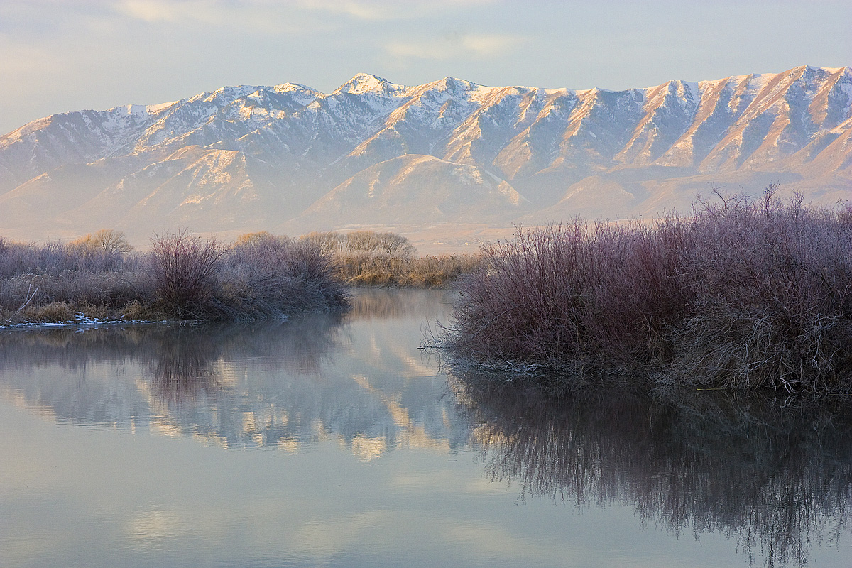
On my first post Kevin asked for a view without the foreground elements. I looked through my files and found this one. Not one of my favorites but a pleasant scene nonetheless. Any suggestions on processing?
Canon 450D
Canon 15-85 EFS @ 44 mm
f11
1/25
ISO 400

Comments

12 comments
Comment posted by Kent Mearig on July 12, 2010 at 2:11 AM
I like this variation. There are some scenes that seem to have endless variations, and it's hard to know just what will work best. From a picky photographers perspective, I wish the reflected brush didn't reach to the bottom of the frame the way it does in the LRC. The unique atmosphere stands out more to me in this image compared to your last.
Registered on September 4, 2006, 237 Posts, 4748 Comments
Comment posted by Youssef Ismail on July 12, 2010 at 4:08 AM
I love the luminance in the mountain range. The subtle purple tones in the scrub is very appealing in the image. Really nice.
Registered on November 1, 2003, 474 Posts, 5555 Comments
Comment posted by Luis Argerich on July 12, 2010 at 10:02 AM
Hi Chad,

this is an excellent image, the water feels very cold the colors are amazing and the reds on those bushes are really eye-catching.
Excelent landscape!
Registered on December 22, 2009, 91 Posts, 1349 Comments
Comment posted by Kah Kit Yoong on July 12, 2010 at 12:41 PM
This is beautiful. I like the crisp textures of the vegetation and also in the details of the mountain ridges. Very very nice!
Registered on September 27, 2006, 636 Posts, 10682 Comments
Comment posted by Bill Chambers on July 12, 2010 at 1:44 PM
Actually, I prefer this one over your previous post. I love the subtle color in the grasses. Great work.
Registered on April 10, 2005, 753 Posts, 21216 Comments
Comment posted by Ian Haskell on July 12, 2010 at 3:37 PM
This is a stunning scene...dreamy and beautiful. :smile:

The subtle frosty reds and reflection really makes the shot for me.

Ian
Registered on October 30, 2008, 24 Posts, 673 Comments
Comment posted by Lon Overacker on July 12, 2010 at 5:28 PM
Chad,

A beautiful follow up from your last image. And just like the previous image, I'm really enjoying the frosty colors in the willows. I'm trying to decide if the mountain range and background is too bright, but if I'm just even thinking about it, that must mean that it could be fine just the way it is too. :wink:

I've enjoyed both images very much. thanks for sharing!

Lon
Registered on November 24, 2006, 521 Posts, 19147 Comments
Comment posted by Chris Chamberlain on July 12, 2010 at 8:44 PM
While on a personal note, I prefer the first one, there are a lot of things I really like about this one as well! Beautiful tonality, and atmosphere in this.

Chris
Registered on March 13, 2007, 500 Posts, 8365 Comments
Comment posted by Andreas Resch on July 13, 2010 at 9:04 AM
Very well done, Chad. Love the soft tones here.
Registered on November 14, 2007, 322 Posts, 6101 Comments
Comment posted by Doug Roane on July 13, 2010 at 8:36 PM
Oooo, I like this one, Chad - excellent, cool mood to it. I prefer this comp to the last one. If it were mine, I would crop off about 10% of the bottom to get rid of that awkward area at the bottom of the right bush reflection. I would also consider darkening the mountains and the water, without darkening the bushes, by 1/2 to 3/4 stop.
Registered on December 12, 2008, 213 Posts, 2226 Comments
Comment posted by Chad Merrell on July 14, 2010 at 12:51 AM
Thanks for the help guys. Here it is with the suggested crop. I have darkened all but the willows by 1/2 stop and added just a little tweak in curves. I like it better. I knew I needed some mentors. I am sure there will be times when you suggest things that I have no idea how to do them. My PS skills are weak.
Registered on July 8, 2010, 91 Posts, 304 Comments
Comment posted by Doug Roane on July 14, 2010 at 12:08 PM
a definite improvement, Chad .... I like it alot. Some of this stuff is so darn subjective, and you will often get differring opinions and you just have to go with what makes sense and looks best to you. I think this is great as it is, though if it were mine (again, take that with a grain of salt), I would crop just a teensy bit closer in to eliminate 90% of the sky showing through the bottom corner of that bush, and I would darken the mountains and reflection even a little bit more. BTW, thank you for the compliment on my Canyonlands image.
Registered on December 12, 2008, 213 Posts, 2226 Comments