Nature Photographers Network
This is the preserved archive of the original Nature Photographers Network. The community continues at naturephotographers.network.
Liquid landscape
‹ PreviousLandscape GalleryNext ›

Liquid landscape

by Lon Overacker

Gallery: LandscapePosted June 10, 2010377 views36 comments
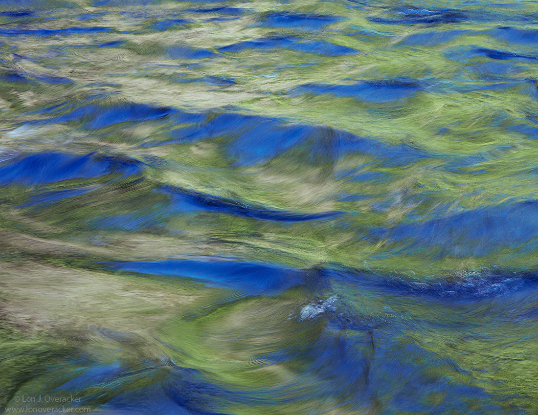
Right on the heels of Youssef's post and a last follow up on a series of images I captured of the Merced River in Yosemite last month. These have progressed from the soft and minimalistic presentation the first to this last one that is "harder" in terms of color and also substance. This is a fairly significant crop from the larger version linked to earlier.

I thought of the title "Liquid landscape" because the standing waves in the water look like mountains and valleys to me. It's also interesting how the steep slopes of the "mountains" pick up the blue of the reflecting sky, where as the shallow valleys and gentle slopes pick up the reflections of the spring greens on the far shore.

Anyway, I appreciate all the feedback and comments you've given on this little mini series. thanks!

4x5, V100, Nikkor 300mm, f/9 @1/4s and LOTS of TK masking, painting and general "crafting" of this image.

Lon

Comments

36 comments
Comment posted by Benjamin Glatt on June 10, 2010 at 5:06 PM
I'm diggin this one, Lon. It looks like a painting of valleys. :toast:
Registered on July 15, 2007, 171 Posts, 3566 Comments
Comment posted by Karsten Wrobel on June 10, 2010 at 5:09 PM
Lon, pretty cool title... I'll echo your comment, doesn't necessarily look like water to me... this could well be an aerial of desert dunes or hills (except for the colours, that is)... in fact, if it wasn't for the colours I probably wouldn't think it was water...
very original work!
Registered on November 1, 2008, 117 Posts, 851 Comments
Comment posted by Anish Desai on June 10, 2010 at 5:10 PM
Lon,
I'm enjoying this recent series of yours. The way the blues and greens play off each other here is really a joy to look at. This is probably my favorite of the series so far as it emphasizes texture (which incidentally is beautifully rendered by your chosen shutter speed) as much as it does color.
Registered on May 23, 2009, 49 Posts, 410 Comments
Comment posted by Youssef Ismail on June 10, 2010 at 5:36 PM
Lon,

I like it. I have been very much enamored by water reflections lately in how they portray color in such a fluid manner. The colors just blend seamlessly and it all flows together chaotically but uniformly as well.

This is a particularly good example of it. Your corp was a good choice as it is strong compositionally and leads the eye well into the frame.
Registered on November 1, 2003, 474 Posts, 5555 Comments
Comment posted by Mark Windom on June 10, 2010 at 6:09 PM
I've always seen these water reflection type images presented with silky smooth water but the way you'e done it here is very interesting and unique.....well done!
Registered on November 1, 2003, 176 Posts, 2302 Comments
Comment posted by Ben Horne on June 10, 2010 at 6:24 PM
This crop works very well for me. It looks very fluid, and refreshing. This would print beautifully on Fuji Flex.
Registered on August 27, 2009, 51 Posts, 959 Comments
Comment posted by Luis Argerich on June 10, 2010 at 6:37 PM
The title is excellent because it really feels liquid. I like the tiny specs of sharp detail on the water those are really nice touches. A wonderful image that can elighten a room in a big print.

:toast:
Registered on December 22, 2009, 91 Posts, 1349 Comments
Comment posted by scott lanz on June 10, 2010 at 6:38 PM
Yep, definately works as well. Nice patterns, blues and greens, and textures.
Registered on November 14, 2003, 840 Posts, 12902 Comments
Comment posted by Guy Tal on June 10, 2010 at 7:12 PM
Extremely well crafted, Lon, both in vision and processing. I love the patterns in the water and the beautiful verdant palette.

Guy
Registered on November 1, 2003, 566 Posts, 15507 Comments
Comment posted by Rick Lundh on June 10, 2010 at 7:19 PM
Another very beautiful image here, Lon! Cant offer any areas to nitpic...
Registered on April 28, 2004, 774 Posts, 4351 Comments
Comment posted by Rudy Ruberti on June 10, 2010 at 8:49 PM
Nice greens and blues here. It almost has a metallic look that I really like. Great scene, Lon.
Registered on October 28, 2008, 179 Posts, 1875 Comments
Comment posted by Eva McDermott on June 10, 2010 at 8:58 PM
I really like the structure here especially in the large view Lon. The blues and greens work well together on top of that. Nice abstract on many levels.
Registered on January 4, 2009, 1015 Posts, 13229 Comments
Comment posted by Steve Sieren on June 10, 2010 at 9:23 PM
Is this the ocean or Yosemite? j/k It certainly looks like the ocean. Nice framing of the chaotic elements Lon. If I was scubba Steve I would hang this in the aqua green room. :biggrin:
Registered on January 2, 2008, 360 Posts, 5321 Comments
Comment posted by Tony Kuyper on June 10, 2010 at 9:58 PM
What a fantastic series, Lon. Each image different, but each sharing many of the same color qualities. This is a finely crafted image, IMO. So well-crafted, in fact, that I don't see any "craft" at all. Beautifully done!
Registered on November 1, 2003, 364 Posts, 22328 Comments
Comment posted by Younes Bounhar on June 10, 2010 at 10:11 PM
I find water reflection shots quite hard to pull off, but you did just that. Love the colours at play here.
Registered on November 25, 2007, 81 Posts, 1234 Comments
Comment posted by Russell Colletta on June 11, 2010 at 12:58 AM
This is very refreshing Lon. Both the qualities of the image and the concept meet that criteria, IMHO. This is breath of fresh air and a well constructed image. Great job!.
Registered on October 31, 2009, 114 Posts, 1008 Comments
Comment posted by Dietrich Gloger on June 11, 2010 at 12:59 AM
This is my favourite Lon. There is just a lot to explore for me and the title liquid landscape fits great to what the image conveys. This makes it so interesting.
Registered on January 26, 2007, 360 Posts, 9876 Comments
Comment posted by Vance Gese on June 11, 2010 at 1:32 AM
Wasn't around to comment on your other images in this series, but this is stunning in my opinion Lon. the colors, tones, and the textures you have pulled out of the water all make this a captivating and mesmerizing image to me. Abstract fine art photography. Superb work.
Registered on November 13, 2008, 298 Posts, 6629 Comments
Comment posted by Verena & Georg Pop on June 11, 2010 at 1:57 AM
thats my favorite of the 3 for now. I wasn't completely sold on the softness of the other 2 and here there is enough texture to hold the eye and let it wander over the waves. colors were great in all 3.
I hate to say it ( :wink: ) and I know its virtually impossible to avoid, but the little foam is the only thingy here, thats distracting in any way. could/would you clone it? I mean, for a fine print I want to sell, I guess I would. (eliminate all distractions)
but most of all: I just didn't want to let go with at least some kind of nitpicking! :biggrin:
georg
Registered on July 5, 2006, 272 Posts, 2823 Comments
Comment posted by Lon Overacker on June 11, 2010 at 2:15 AM
Thank you very much everyone for your comments and keen observations. I too like the details that show surprisingly well at a relatively slow shutter speed. I'm also glad to know that the colors and saturation seem ok.
I know its virtually impossible to avoid, but the little foam is the only thingy here, thats distracting in any way. could/would you clone it?

Georg, in full disclosure there already was a bit of cloning going on. If you take a look at the original I posted in the previous post and you look carefully, there are actually a number of areas where some white foam/streaks were cloned out. And in full disclosure, the larger bluish "mountain" closest to the right edge near the bottom, is actually blended in from a second transparency at 1/2s. There was a larger white wave that was distracting to me. I decided not to use the original or a crop that contained that portion, so I never mentioned it.

To make a long answer out of the question, Yes, I would clone. To your specific part of the image Georg, I liked that one little "white cap" as well as the swirly highlights to the right of that so I left them all in.
I've cloned out car head lights, orange cones, pink surveyors flags, etc. etc. I guess what I wouldn't do is insert a shark's fin in to this particular image.... :biggrin:

Thanks again folks!
Registered on November 24, 2006, 521 Posts, 19147 Comments
Comment posted by Stuart Williams on June 11, 2010 at 5:54 AM
the processing certainly has altered the perception of this, transforming it from being instantly recongisable as water to the "landscape". this may be because it has "lost" some of the luminescence in the processing and looking back at the linked photo, i find the blues a little strong here. still, it's a very pleasing comp.
Registered on December 7, 2007, 247 Posts, 4792 Comments
Comment posted by Bruno Silva on June 11, 2010 at 7:43 AM
oh, this rocks, Lon! the thumb doesn´t do justice to this, glad you posted a larger version. the mix of blues and greens are great and the light on the reflections are cool too. I like this one over you´re previous, I feel it might be related to the water movement, more "alive" if that makes any sense. great work!
Registered on May 6, 2009, 132 Posts, 1406 Comments
Comment posted by Winnie Ho on June 11, 2010 at 8:13 AM
Superb composition, Lon. The repeating patterns are at once soothing, but there is much to explore here. I think my appreciation of this image grows the more I study it. a great example of borrowed light. Just beautiful.
Registered on January 6, 2008, 93 Posts, 1788 Comments
Comment posted by Bill Chambers on June 11, 2010 at 8:40 AM
This has a very painterly feel to it, and I love the texture of the waves. I really like ths type of shot and this is very enjoyable, but it does appear somewhat over saturated on my monitor. Excellent choice of shutter speed.
Registered on April 10, 2005, 753 Posts, 21216 Comments
Comment posted by Cory Freeman on June 11, 2010 at 9:12 AM
the colorful merced is truely enticing with it's deep green reflections. This looks like paintbrush strokes in slightly dried paint to my eye. It does have that "hard" look to it as you mentioned.
Registered on December 16, 2003, 107 Posts, 1341 Comments
Comment posted by Verena & Georg Pop on June 11, 2010 at 10:17 AM
well, maybe not a shark fin but the shiloutte of a red coho salmon would sure look cool!
appreciate your full disclosure. :cool:

georg
Registered on July 5, 2006, 272 Posts, 2823 Comments
Comment posted by Floris van Breugel on June 11, 2010 at 1:39 PM
Amazing, if I twist my mind a little *really* looks like mountains and grassy valleys.. sweet!
Registered on December 19, 2008, 306 Posts, 4840 Comments
Comment posted by Ed Lowe on June 11, 2010 at 2:32 PM
Sweet image, Lon! Looks like green and white mountains. Great eye to spot this abstract.

Ed
Registered on February 7, 2004, 414 Posts, 7115 Comments
Comment posted by Reno DiTullio on June 11, 2010 at 5:03 PM
Landscape indeed, from a far off planet maybe, or... the blues and greens are gorgeous :toast:
Registered on November 14, 2003, 130 Posts, 1644 Comments
Comment posted by Jimmy Gekas on June 11, 2010 at 5:38 PM
Another beauty! :toast:
Registered on July 26, 2007, 244 Posts, 2807 Comments
Comment posted by Mark Metternich on June 11, 2010 at 8:15 PM
Works well to me. :toast:
Registered on June 19, 2009, 276 Posts, 6240 Comments
Comment posted by Michael R Reynolds on June 11, 2010 at 10:49 PM
Lon, the reflections and colors are wonderful. The comp works on several levels. Great to see you doing some abstracts. Best Regards.
Registered on February 26, 2008, 54 Posts, 812 Comments
Comment posted by Chris Chamberlain on June 11, 2010 at 11:04 PM
I think it's a good series covering the full range of detaild to almost detailess. I like the colors in all as well. This one here is approaching battery powered for me though. That's the good thing about abstractions though too. They let us run a little.

Chris
Registered on March 13, 2007, 500 Posts, 8365 Comments
Comment posted by Stan Rose on June 12, 2010 at 11:44 AM
This is great! :toast:
Registered on September 15, 2005, 836 Posts, 17099 Comments
Comment posted by Matt Anderson on June 13, 2010 at 6:49 PM
intoxicating blues and greens
conveys a harmonic and peaceful mood
Registered on September 6, 2007, 346 Posts, 2696 Comments
Comment posted by Laura Stafford on June 21, 2010 at 12:43 PM
Very appealing, and interesting perspective. I like the color scheme and patterns. Very unique.

Laura Stafford
Registered on November 3, 2009, 52 Posts, 375 Comments